Ladies and gentlemen — I have finally found a planner to meet my needs! For several years I have struggled with the dilemma of needing to view my day and week at one time, along with having space for a to-do list. I kept going back to my computer’s calendar for the day and week views since I could easily switch between them, but that left me with blank paper for to-do lists that inevitably ended up hidden under my pile of work for the day. Enter – the Quo Vadis Notor. The Notor is a daily planner that allows me to combine my to-do list in a book format. It allows the freedom to plan my day in a format the works for me, which makes all the difference.
General: The Notor is also available in both January – December and August – July formats. It has a sewn binding and both the refill and the cover allow the planner to open flat (a true bonus!).
Cover: The Notor is compatible with a variety of Quo Vadis covers, including the Texas (faux-suede), Club (leatherette), Soho (not sure of the material on this one), and Chelsea (leather). I personally have the Club cover in Rose Grenadine, which is a darker pink color. With pink being one of my favorite colors, it was a hit right away! The cover is sturdy and slips over the refill, allowing me to keep the same cover when it’s time to refill my Notor for next year. It is sturdy and saddle-stitched with a pebble texture.
Size: The Notor is 4.75 x 6.75″ (12 x 17 cm), which is a perfect size to always keep the Notor on my desktop without it taking up too much space. It’s always handy and ready to go!
Paper: The Notor has Clairefontaine paper. Need I say more?
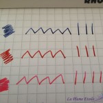
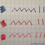
Seriously though, Clairefontaine is the best paper for fountain pens and I love writing in this planner daily. The paper is bright white and smooth, allowing my nibs to glide over the paper and my inks to really show off their unique properties. My ink colors are vibrant and pop off the page, while their shading is enhanced. As is typical with Clairefontaine paper, there is absolutely no feathering. There is also no bleedthrough and very minimal showthrough. As seen in the last writing sample photo, the showthrough is minimal enough that is does not distract from writing on a page’s backside, even with a lighter colored ink.
The only caveat is that I recommend leaving a few seconds for your ink to dry before closing the Notor, as many inks take a little longer to dry on Clairefontaine paper. I have forgotten this more than once and had ink come off on the page facing the one on which I had just written.
- Minimal Showthrough
- Light ink still highly visible over showthrough.
Layout: Each day of the week (including Saturday and Sunday) has a full page devoted to it, which I appreciate. Each day has the date printed largely and highlighted with a blue background. There are small spaces from 8 AM – 7 PM to jot down certain appointments, which I find helpful as a reminder. There is not enough space to include additional information in the time slots, but my computer’s calendar serves that purpose. Next there is a “Priority” section, which is very helpful for me to highlight one or a few specific items that must be finished that day. After that is some lined space with no timing attached to it. I love this part because this is where I write my to-do list for the day. The bottom section of the page has a separate section for notes, in case I have anything additional to add. Sometimes birthday reminders go there as well. I love this layout because it’s free form allows me to note everything I need to get done that day without having to match each task with a specific time. My list is also set on the present day instead of a random piece of paper floating around my desk.
The bottom corner of each page also has a tear-off corner so that you can easily find your place in the diary.
Improvements: I am currently using the 2014 Notor and they have made some changes for 2015. The large date at the top is has a square background for 2015, whereas the 2014 had a circle. Also the date, Priority, and Notes backgrounds also have a darker and brighter blue in 2015, whereas the 2014 was more subtle. The 2015 version also has a “Notes” title that is like a diagonal sticker, which I frankly think makes it look more comical, elementary, or “school-like.” In my opinion, the 2014 layout is much classier and it’s subtlety allows for my inks to really stand out. I hope that in future refills Quo Vadis will return to the 2014 layout.
Personally, I also prefer a ribbon bookmark over the tear-off corners. I either forget to tear the corners off or the corners I do tear off somehow miss my trashcan and I keep finding little triangles around my desk and office. Despite my personal preference, the corners are really not a deterrent for me in using this planner. I just added my own ribbon by gluing one to the back page of the Notor and leaving enough ribbon to feed through the pages. I like my little hack and actually wouldn’t mind doing it again.
Overall: I really wish the colors and details had not been changed to the more elementary look for the 2015 Notor. I fear this will annoy me on a daily basis and also distract from the beauty of my inks. But because this format really works for me and I had a great experience with the Notor in 2014, I will buy a refill and keep using it throughout 2015 and beyond. I will continue using my computer’s calendar program for my overall day/week/month views, and the Notor for my daily reminders, priorities, and to-do lists.
Depending on the retailer and cover you choose, the Notor seems to run between $15 – $25. The refill alone is between $11 – $15.
