I’m happy to bring you a review of Step Forward Paper (hereinafer “SFP”). SFP is white printer and copy paper made from 80% wheat-straw waste. The paper is made by Canadian company, Prairie Pulp & Paper, Inc. The company is co-owned by actor Woody Harrelson and his partner Jeff Golfman. The company states that their wheat-straw paper supports farmers with new revenue streams and is lower in environmental impact than 100% recycled tree paper. The company also donates 1% of sales to eco-systems, habitat, and children’s education charities.
I’ve been working on this review for quite a while because I wanted to test a variety of inks on the paper. I’m very excited about this product for two reasons: (1) it’s positive impact on the environment and (2) it is VERY fountain pen friendly. As most fountain pen users know, most copy and print paper is not fountain pen friendly. I feel this brand will be a great asset for those who like plain white paper for correspondence and to showcase their ink collections. The paper I tested is 92 brightness, 21lb/80 gsm, and 8.5″ x 11″/21.6cm x 27.9 cm. I usually use HammerMill Multipurpose Paper (hereinafter “HMMP”) from Staples, so I will be basing my comparison of SFP to “normal” paper — also known as HMMP. For reference, HMMP is 92 brightness and 20lb.
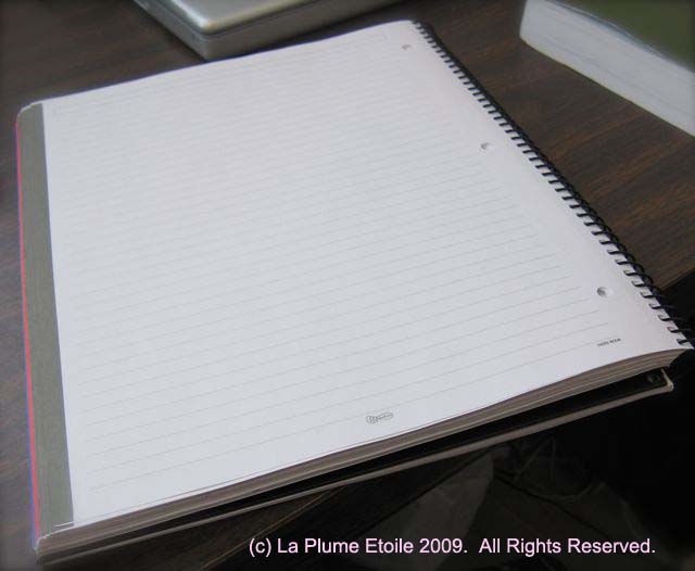
Feel, Weight, and Thickness: SFP has a slight texture and is fairly smooth to the touch, but not quite as smooth HMMP. SFP also feels to be slightly lighter in weight and thinner than HMMP, which is strange because SFP is actually slightly heavier than HMMP according to the specifications of both papers. If someone just picked up one sheet of each paper without knowing the brands or specifications of either, one might say SFP feels “cheaper” because of the texture and weight. However, as I am about to describe, one that loves fountain pens will rejoice when testing SFP.
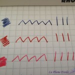
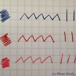
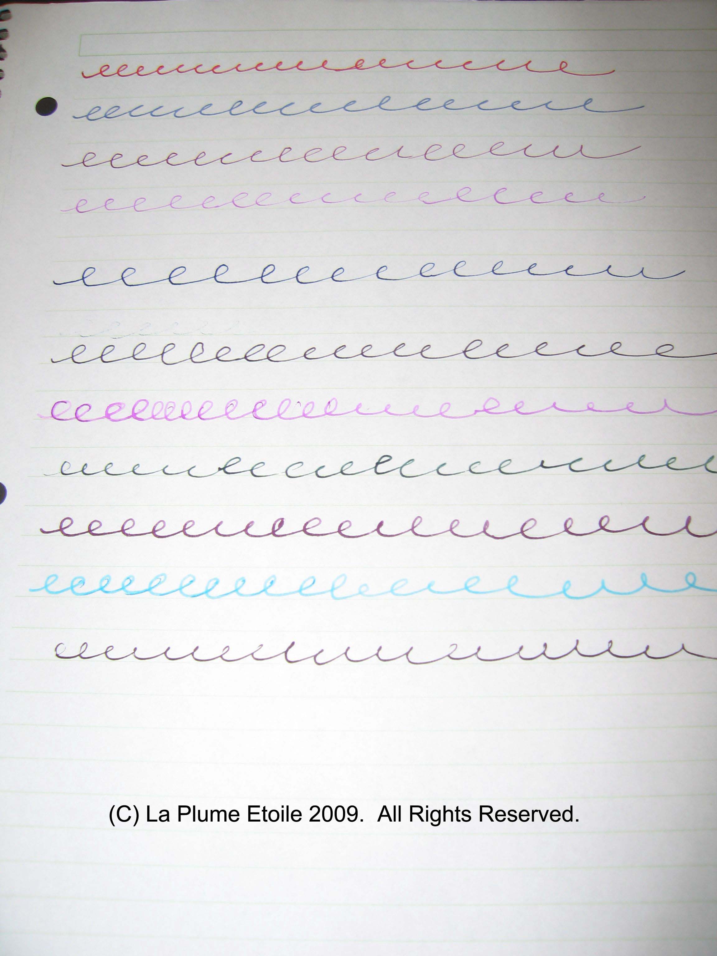
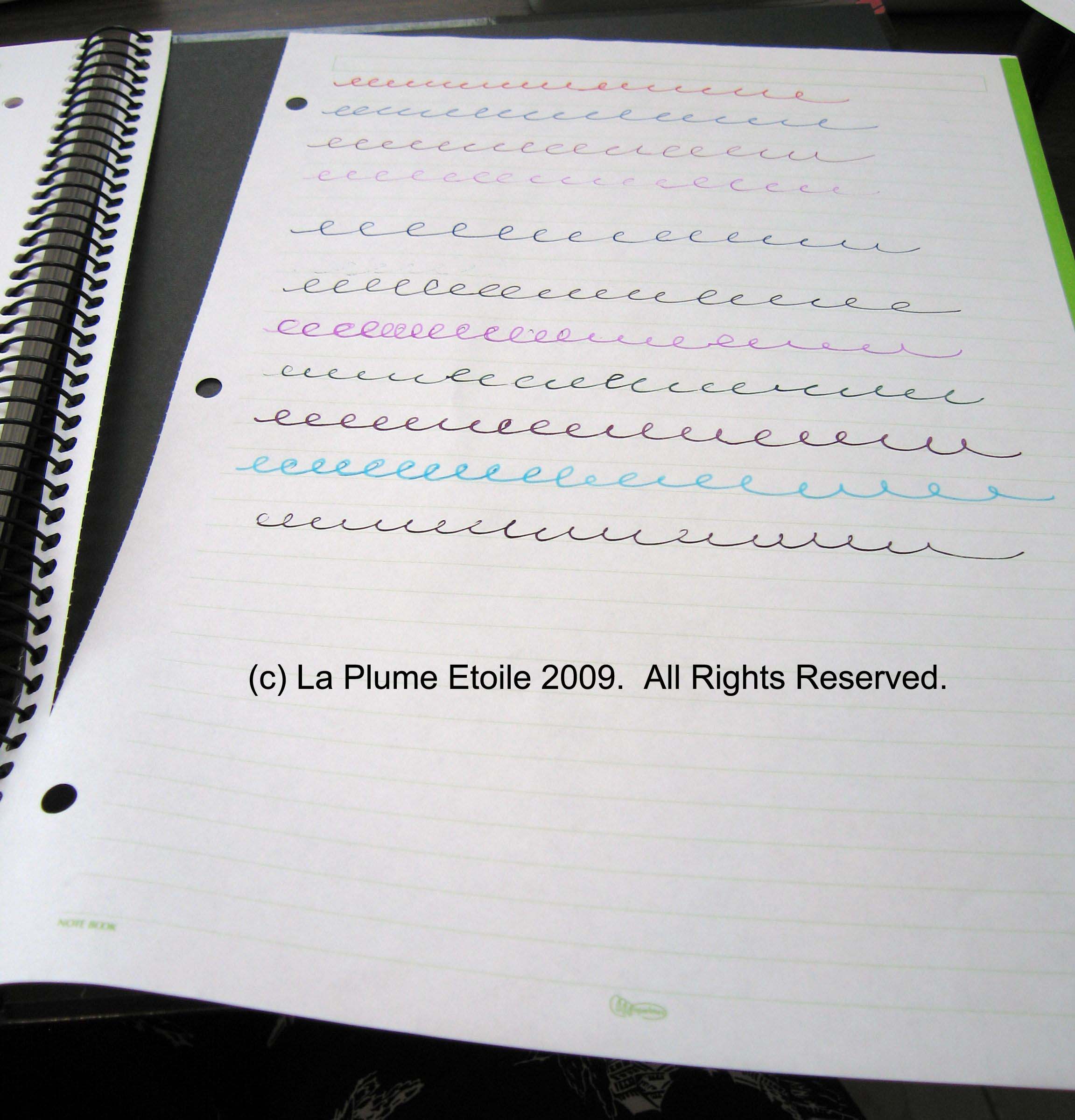
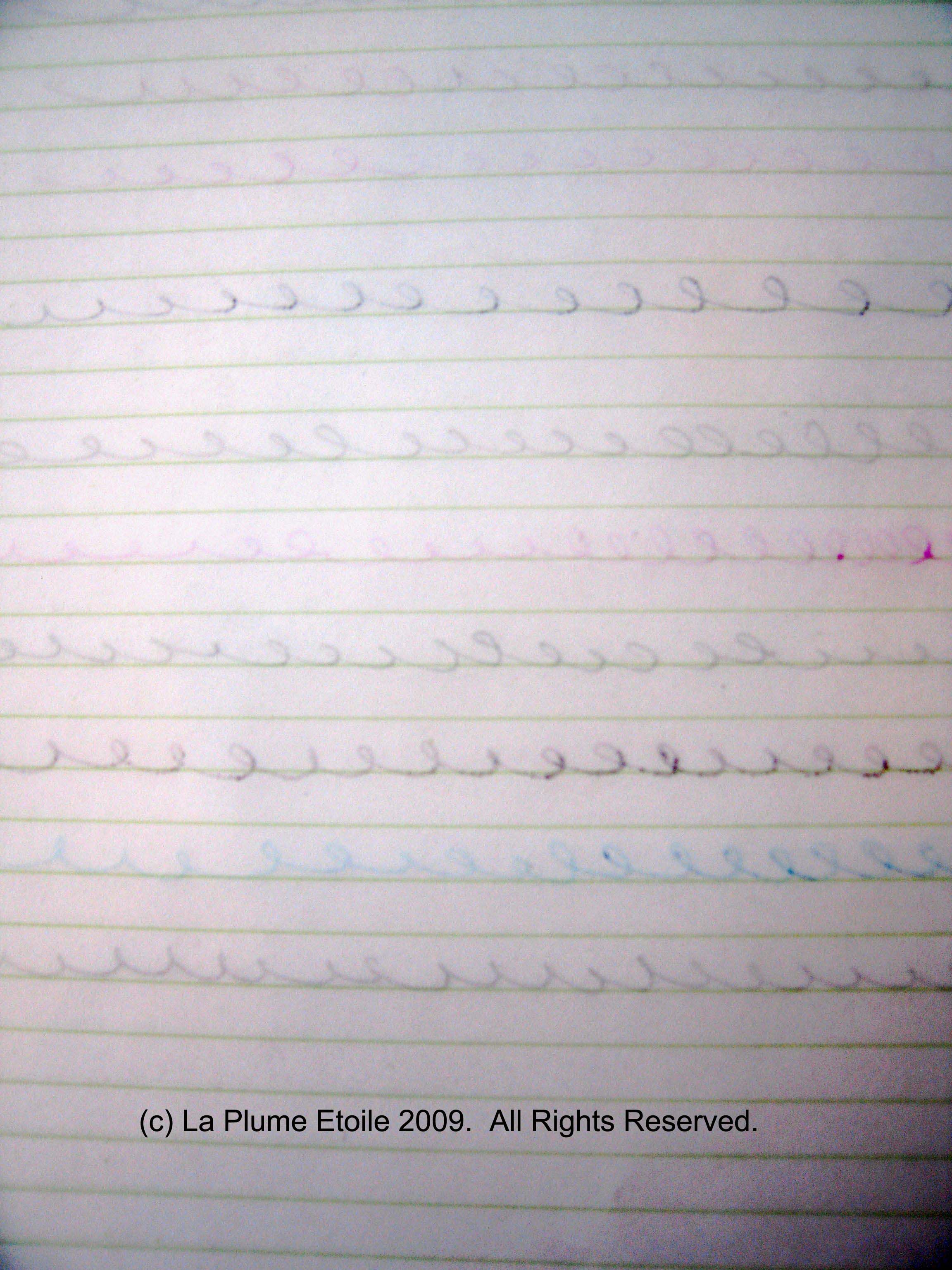
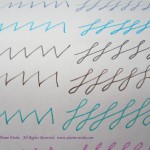
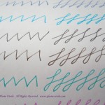
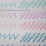
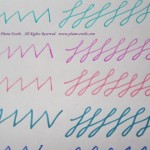
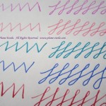
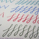
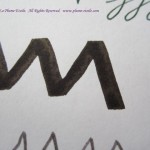
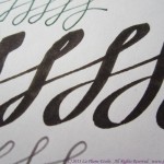
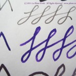
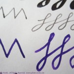
Fountain Pen Performance: As shown in the photos, I tested 19 different inks from several different brands. I personally found the results astonishing as EVERY ink performed well on SFP. I noted the pens and nib sizes where I could remember them, but note that there were a variety of different nib options used to model the variety in the average fountain pen user’s collection. The ink colors were all fairly vibrant. Iroshizuku Ku-Jaku did not shade as much as in tests on Clairefontaine or other premium paper, but otherwise all inks performed as is normal for those inks. The Pilot Parallel test was even more surprising because the Parallel ink was extremely wet and has feathered greatly on most papers I have used, especially HMMP. The Brause dip nib tests were also surprising as no feathering occurred even though those inks were also very wet from water mixed with the ink after rinsing the nib. Private Reserve DC Supershow Blue is also a very wet ink with a long dry time, however, it also performed well and dried quickly on SFP.
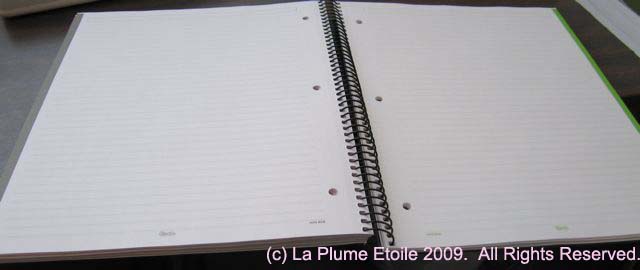
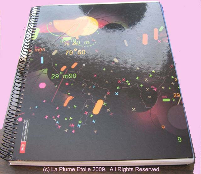
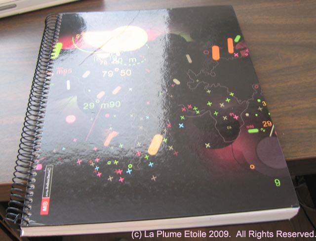
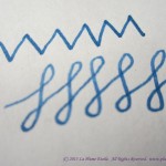
Here the inks are shown on a scan of the test sample:

A scan of all the FP/ink tests.
Here are some closeups shot with my camera:
-

-
-

-
-
-
-
-

-

-

-
-
J. Herbin
-
-
J. Herbin
-

-
J. Herbin
-
-
Pilot Parallel Black
-
-
Pilot Parallel Black
-
-
R&K Cassia
-
-
R&K Cassia
-

-
R&K Scabiosa and Salix
-

-
J. Herbin Encre Authentique
-
-
Parker Quink Blue-Black
-

-
PR DC Supershow Blue
-

-
PR DC Supershow Blue
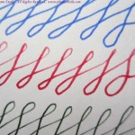
Here are some comparisons on HMMP paper — notice the feathering:
-

-
J. Herbin Rose Tendresse
-

-
Pilot Iroshizuku Ku-Jaku
-

-
Pilot Iroshizuku Kosumosu
Furthermore, despite SFP feeling slightly less smooth than HMMP, it was not fibrous and I was not concerned with any paper fibers getting caught in any of my fountain pen nibs. Even the fine and more fragile vintage nibs glided over the paper without catching or accumulating fibers.
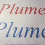
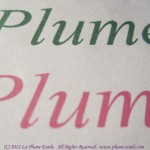
Printing Performance: As shown below, I also tested the print quality of SFP. These print tests were done on an HP OfficeJet Pro 8600 Plus. Both the large and small black text performed exactly as one would expect from printer paper, and exactly the same as HMMP. The black lines were crisp and there is strong contrast of the black ink on the white paper. However, SFP was disappointing when printing in color, especially after the grand performance with colored fountain pen ink. The printed color was matte and muted. One can still tell what the colors are, but they lack vibrancy.
-
-

-
Purple Ink — notice the inconsistency througout the color and it’s overall muted tone.
-
-

-

-
Notice the sharpness and contrast with the black ink.
-

-
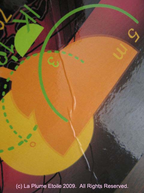
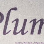
In this shot you can really see the texture of the paper and also how the ink attaches to it.
-
-
Eggplant – matte and muted.
Overall: Overall, this is fantastic paper and I love the company’s principles. I definitely recommend supporting this company and using their paper! While the color printing was slightly disappointing, the black ink printing was great. One could predominately use SFP for most printing and swap out some regular paper when vibrant color printing is desired. Using this paper all the time is also ideal because of the benefit to the environment. Of most interest to fountain pen users, it is wonderful to finally find a plain white printer paper that actually behaves well with fountain pens! At the very least, I will keep enough stock on hand to use for written correspondence.
Where to Buy: Step Forward Paper is available throughout the United States and Canada at Staples stores. In my region, a 5,000 sheet/case box is $57.99 and a 500 sheet ream is currently on sale for $6.99 (regular $9.99). You can get a $10 coupon to buy SFP through Staples here. The ream is also available on Amazon for $16.99. Visit Step Forward Paper‘s website to learn more and you can register for a free sample of SFP!
UPDATE 12/6/13: I have received correspondence from SFP’s owner Jeff Golfman. They are aware of the problems I mentioned in this review (like lack of vibrancy when printing in color) and the company will be releasing new and improved SFP in 2014. They will be sending me a sample to review, so stay tuned to La Plume Etoile for further updates SFP’s new and improved product. Be sure to subscribe to the RSS feed so that you don’t miss it!