It has finally happened — I am the proud owner of two Pilot Iroshizuku inks. (I’ll have the review of the other color shortly, but for now I’ll keep it as a surprise.)
With this brand, you can believe the hype. I’ve had a field day with some bright colors this summer, and I want to get those reviews up before I switch to some glorious fall colors.
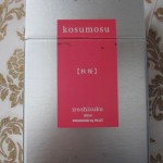
Today’s review is Pilot Iroshizuku Kosumosu, or as I like to call it, the cherry blossom ink.

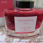
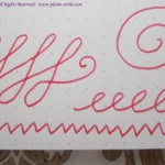
Pilot Iroshizuku Kosumosu with a vintage pink Esterbrook and a Rhodia Dot Pad
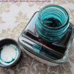
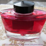
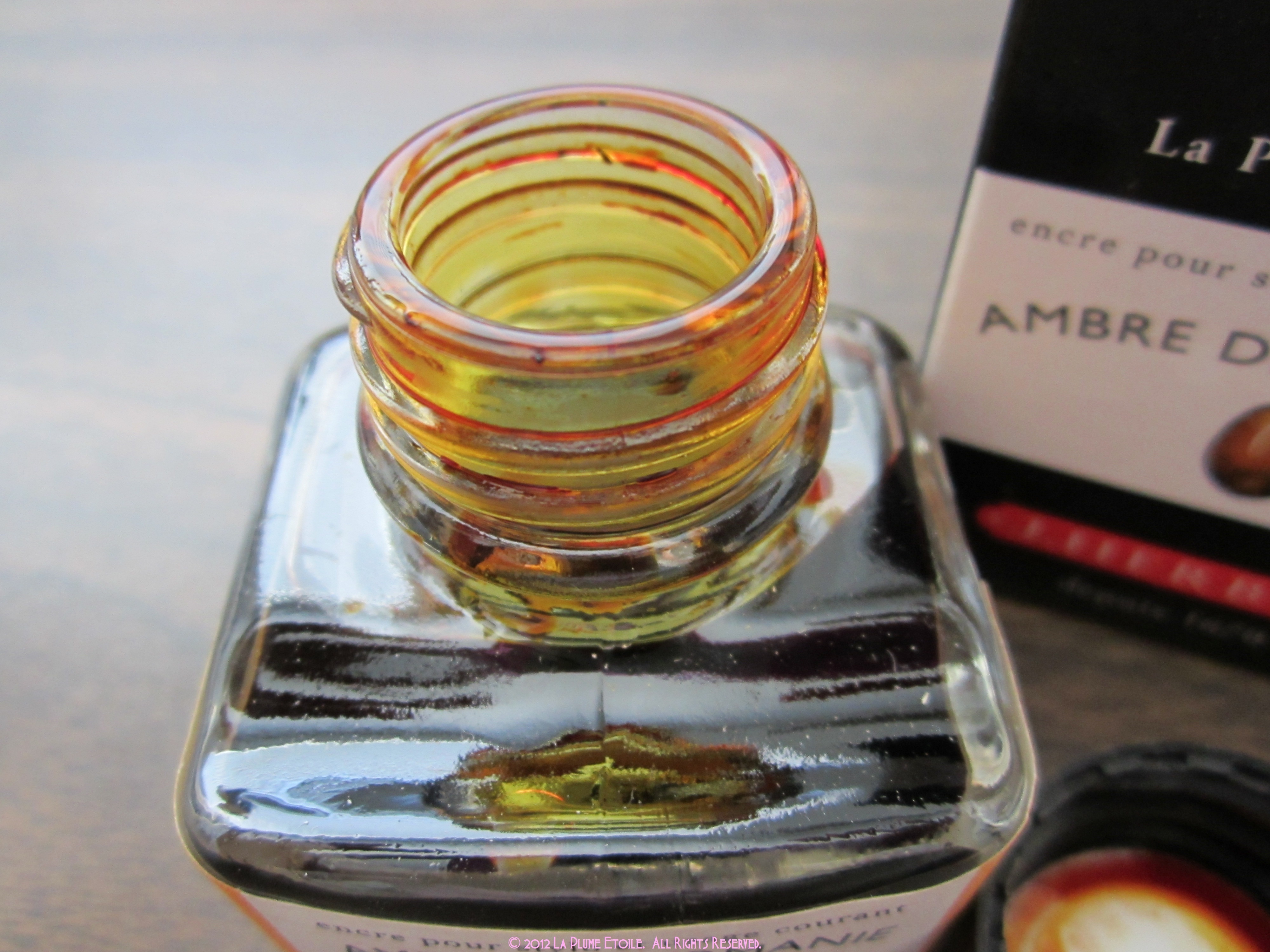
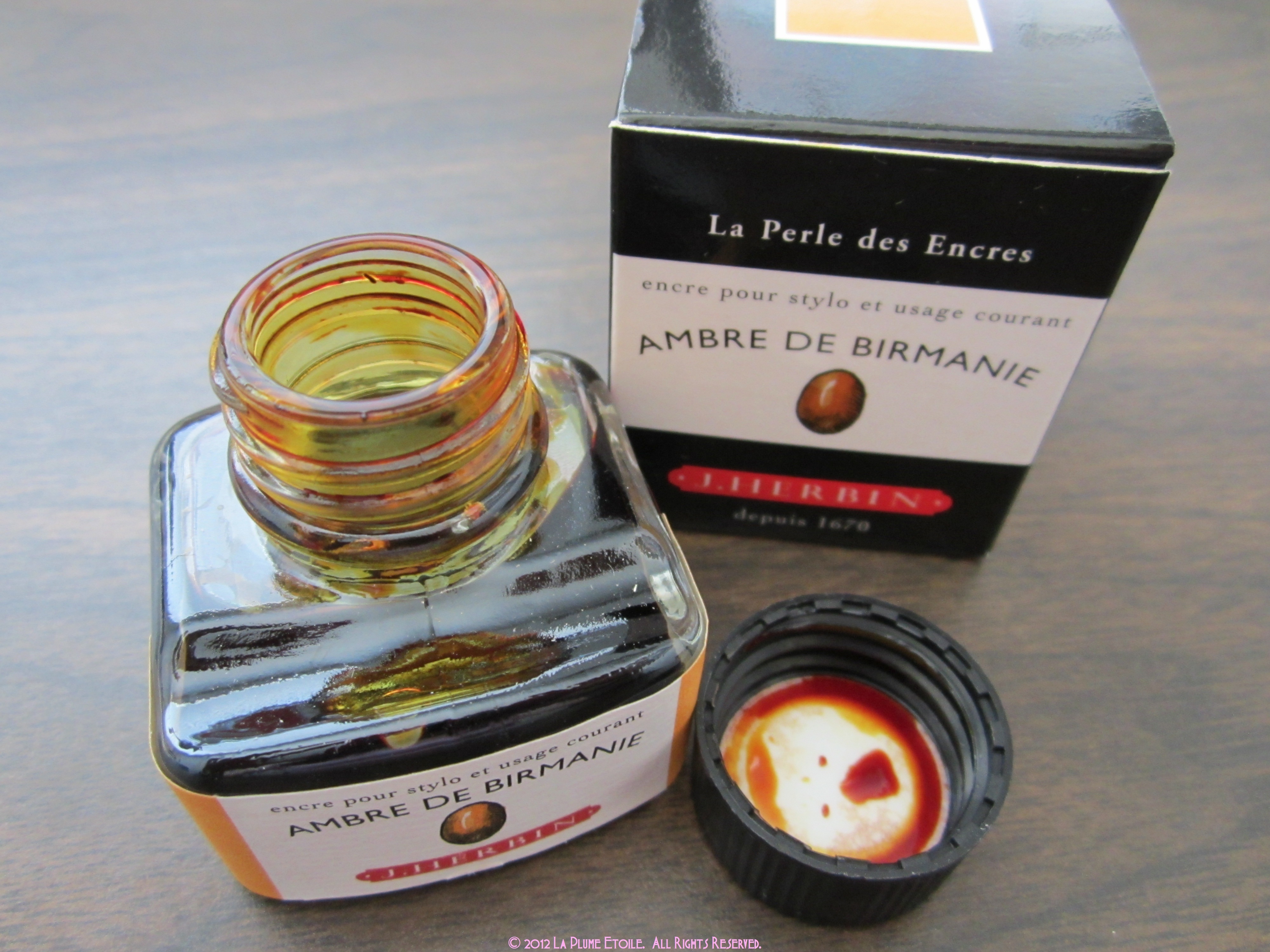
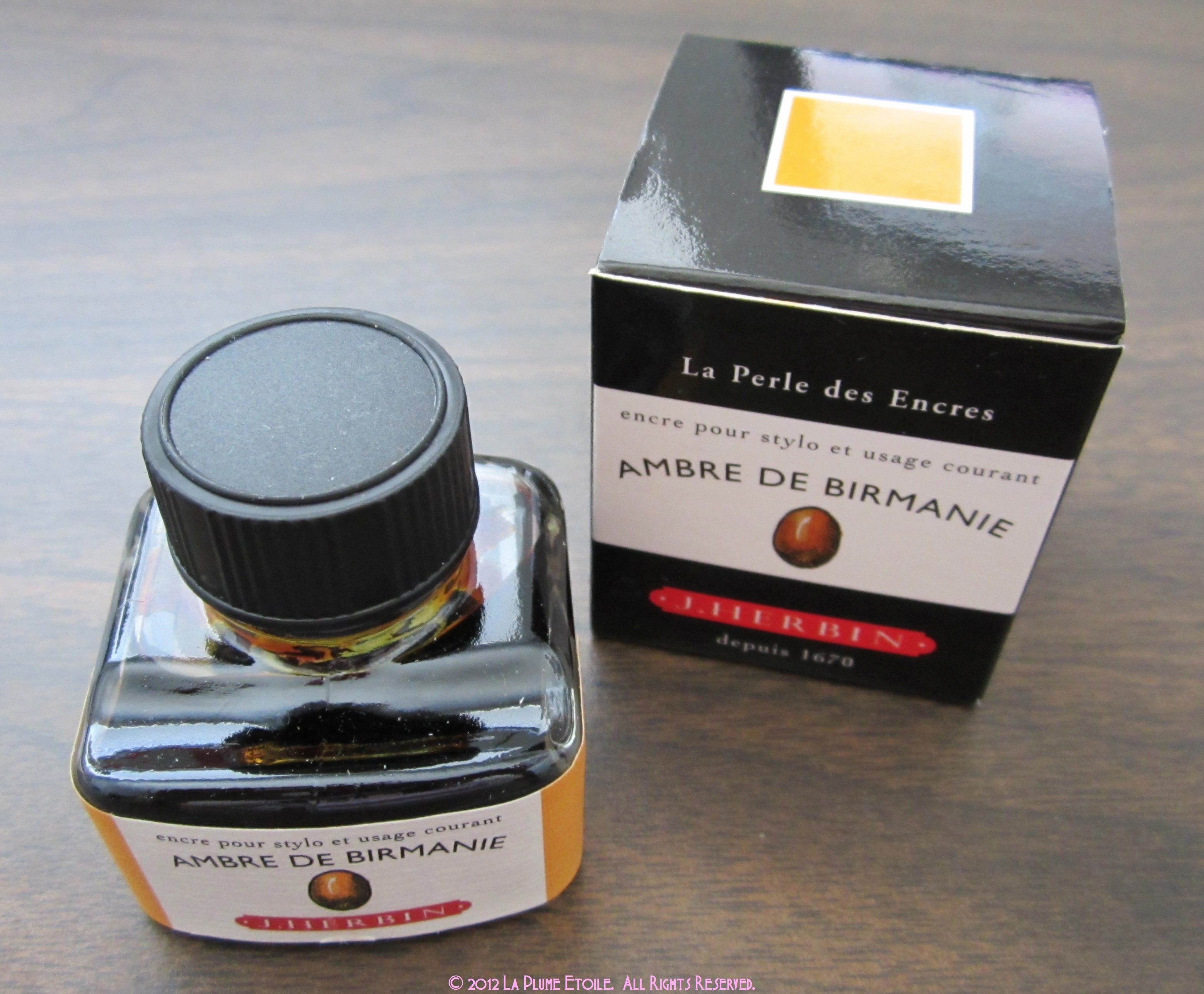
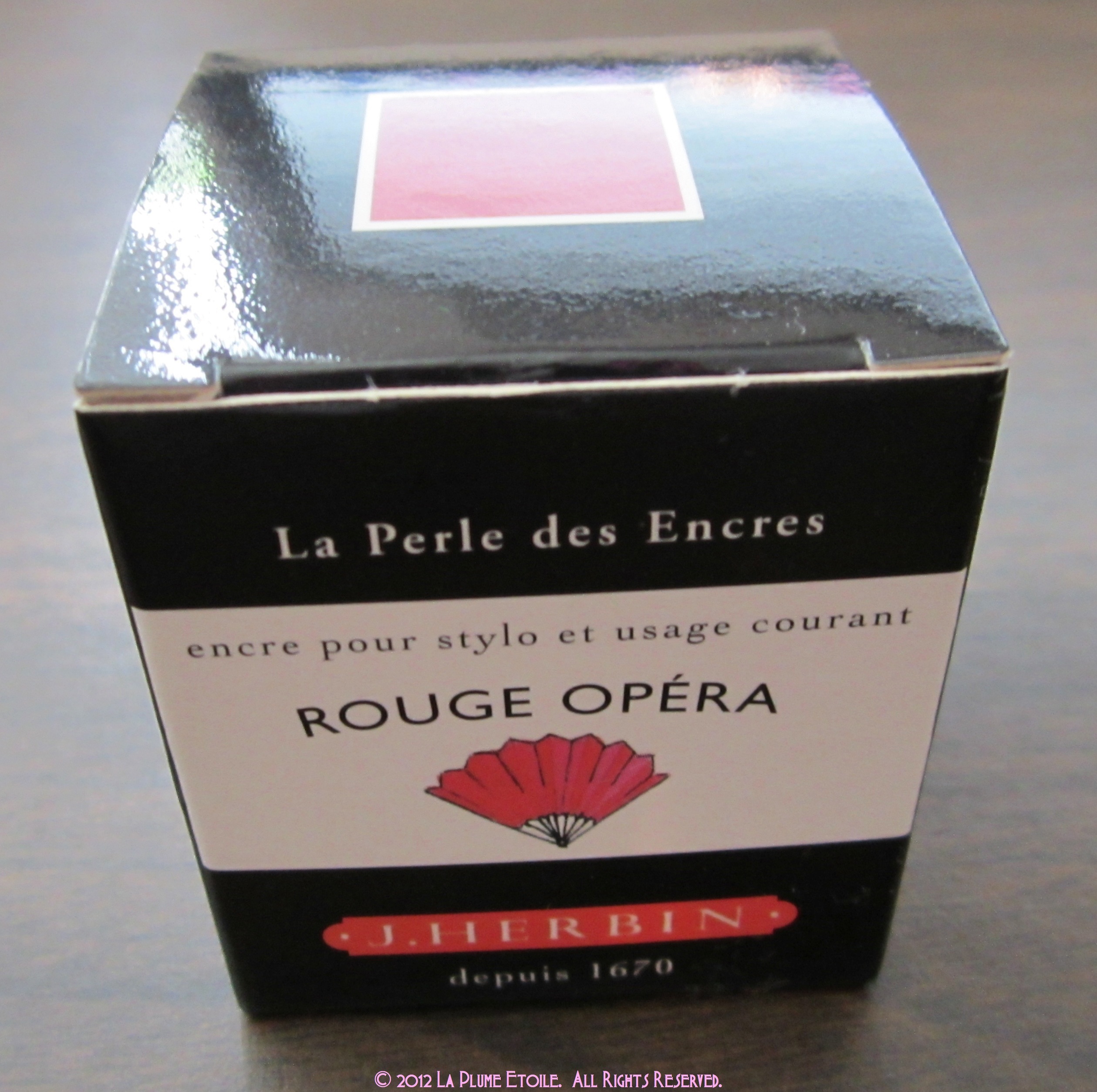
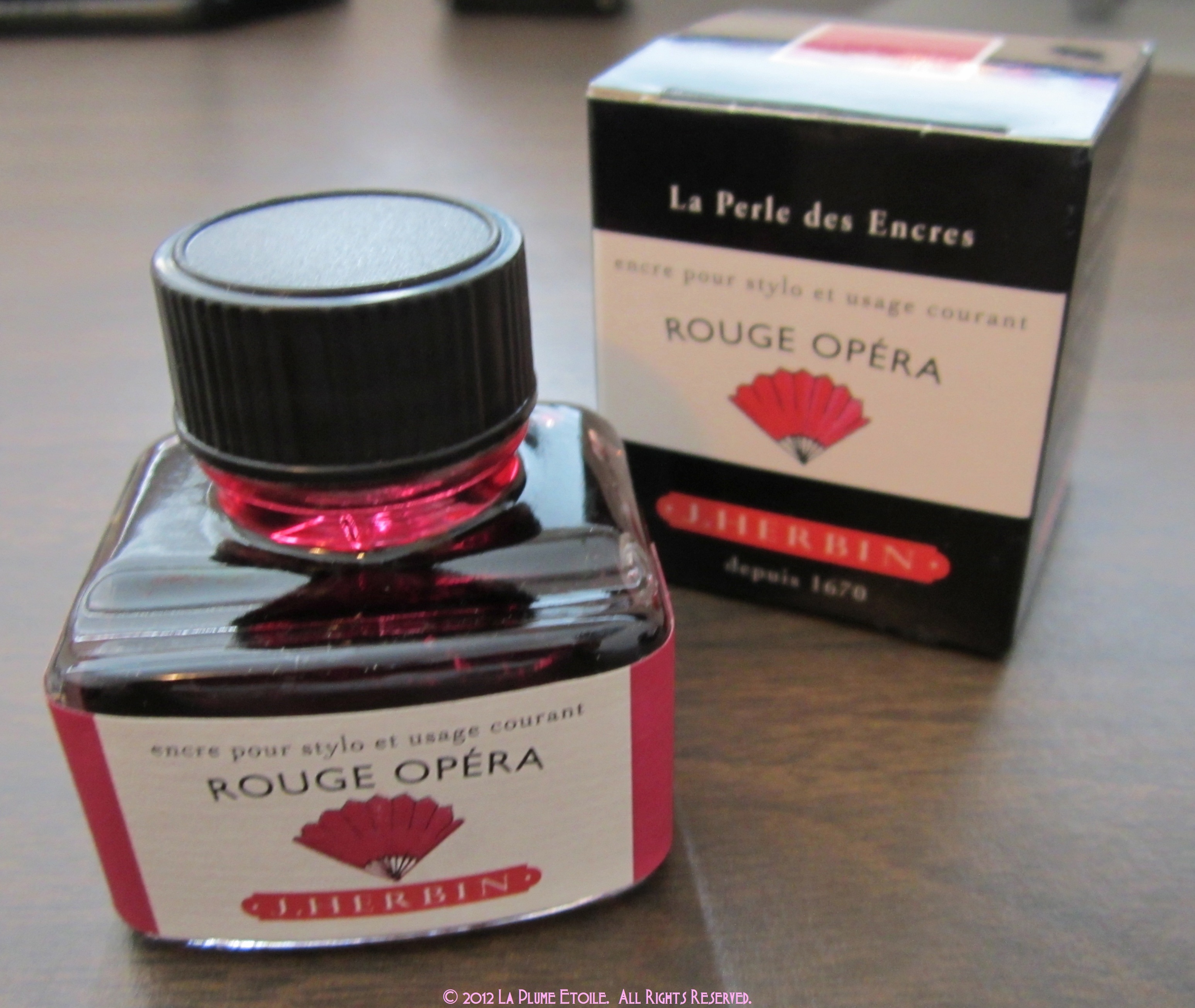
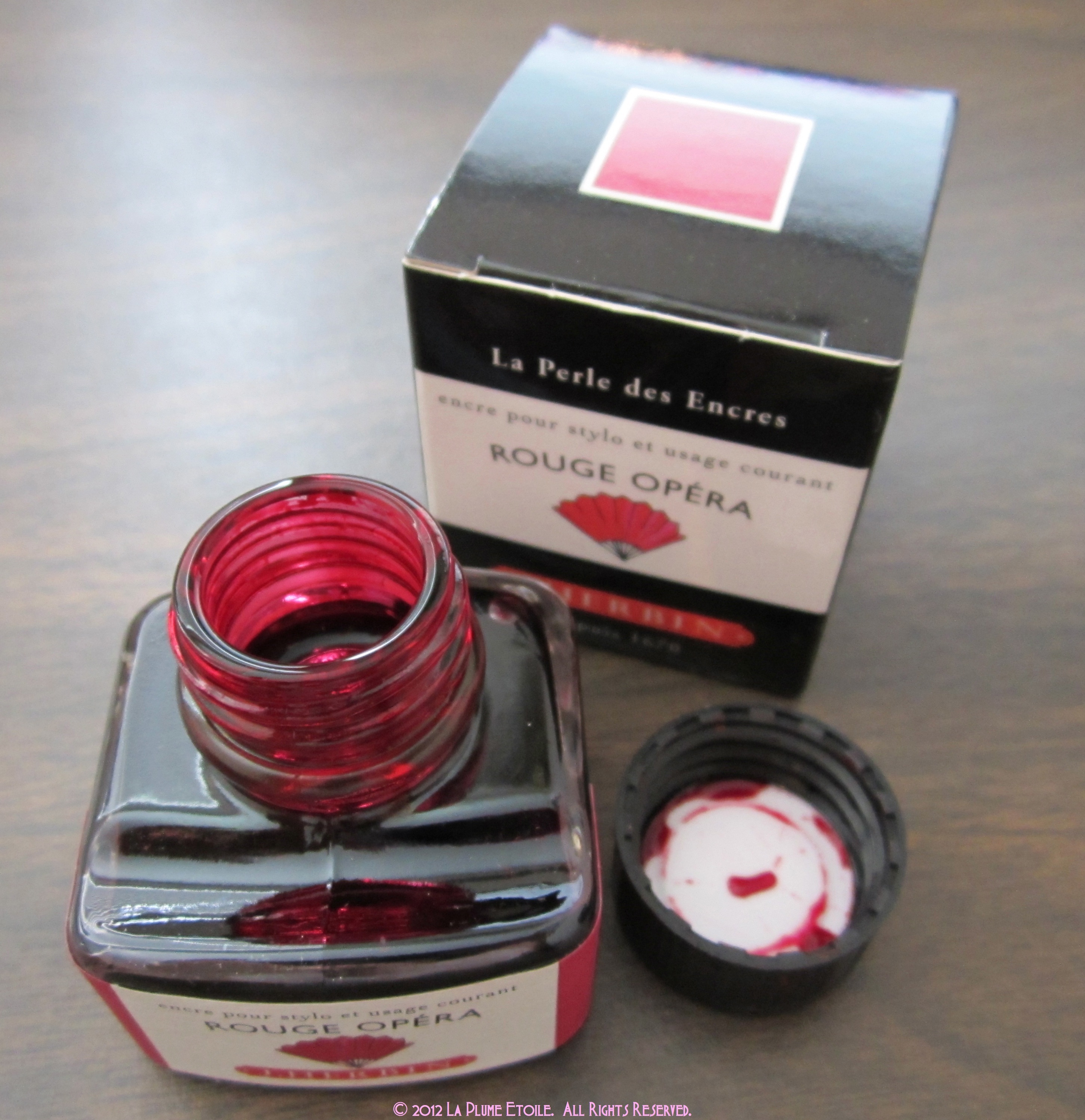
The Bottle: If you already own Iroshizuku ink or have read other reviews, you know the bottle is quite nice. It’s made of handblown glass and the ink reservoir takes up about 75% of the bottle with a little triangle at the bottom of the reservoir. The bottom quarter of the bottle is just thick clear glass, but the way that it is blown allows for some reflection from the ink in the reservoir. The cap is just black plastic, and there is a little grey cord tied around the neck. If there is a purpose to the cord other than decoration, I’m not aware of it. As far as the box, it’s silver and does have a little flap inside to hold the bottle in more securely, but it is as visually appealing as the bottle.
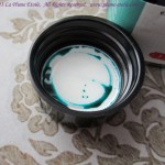
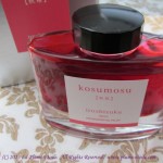
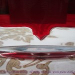
Color: This ink is Kosumoso, which means “cosmos flower.” To me it suggests cherry blossoms. It’s close to a bubblegum pink color with coral undertones, which differs from some pinks that have more purple undertones. As one of “those” people that often likes to match inks to pens, Kosumosu is a great match for my pink Esterbrook.

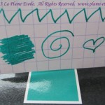
Pilot Iroshizuku Kosumosu’s color is a close match to my pink Esterbrook
Consistency/Flow: I have only been using this ink in my vintage Esterbrook and am already on my fourth refill. My Esterbrook has some flow issues and a scratchy nib that I need to refine, so I think it was a great pen for testing. My first impression of Kosumoso didn’t make me say “Wow! The flow of this ink is amazing!” However, the flow has been very stable. It’s not dry and is appropriately wet without being too wet. It has actually alleviated some of the dryness and flow issues of the pen, although did not completely resolve them.
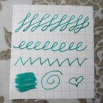
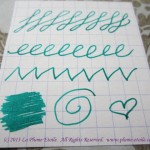
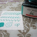
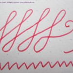
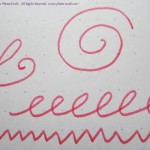
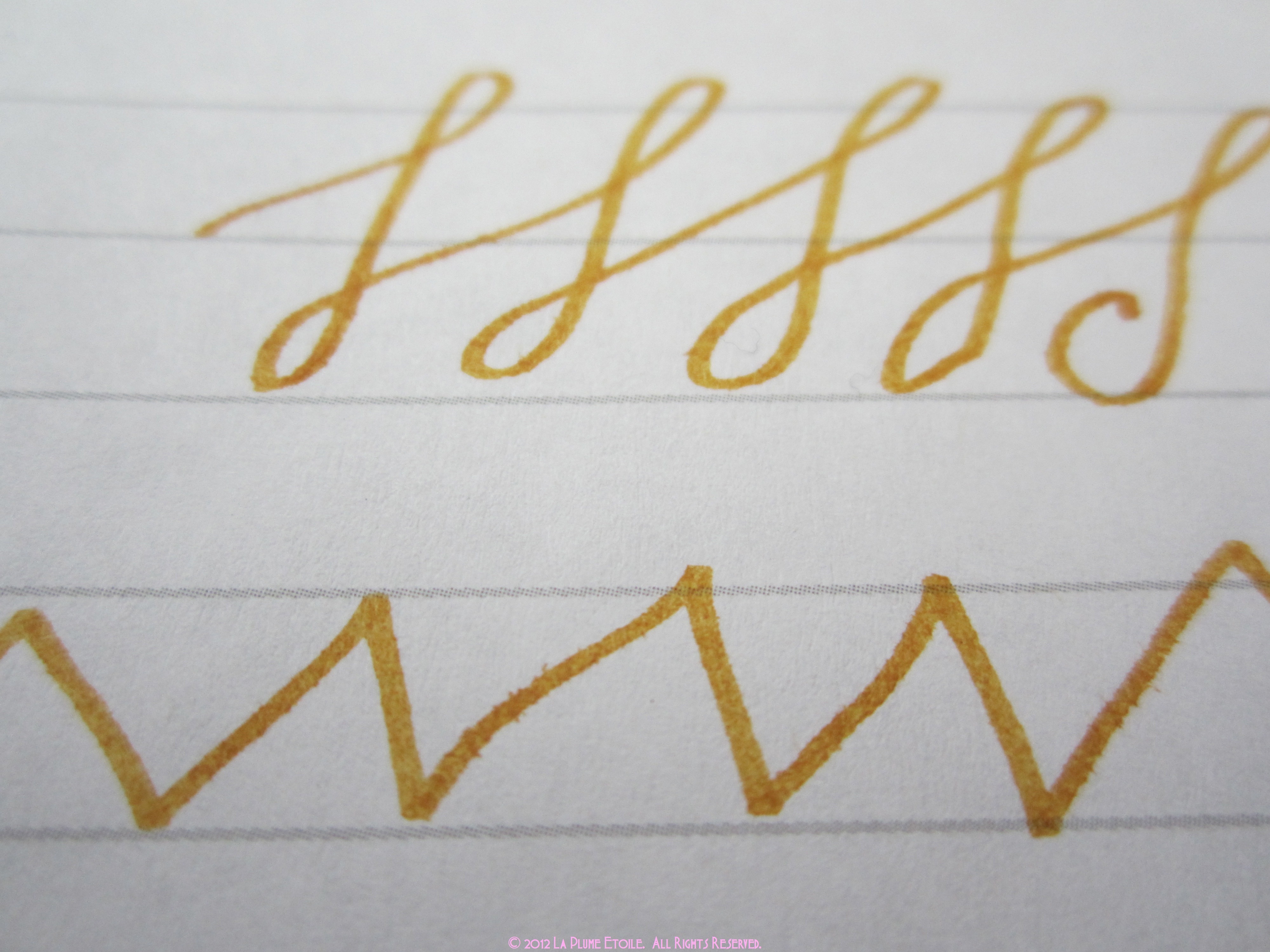
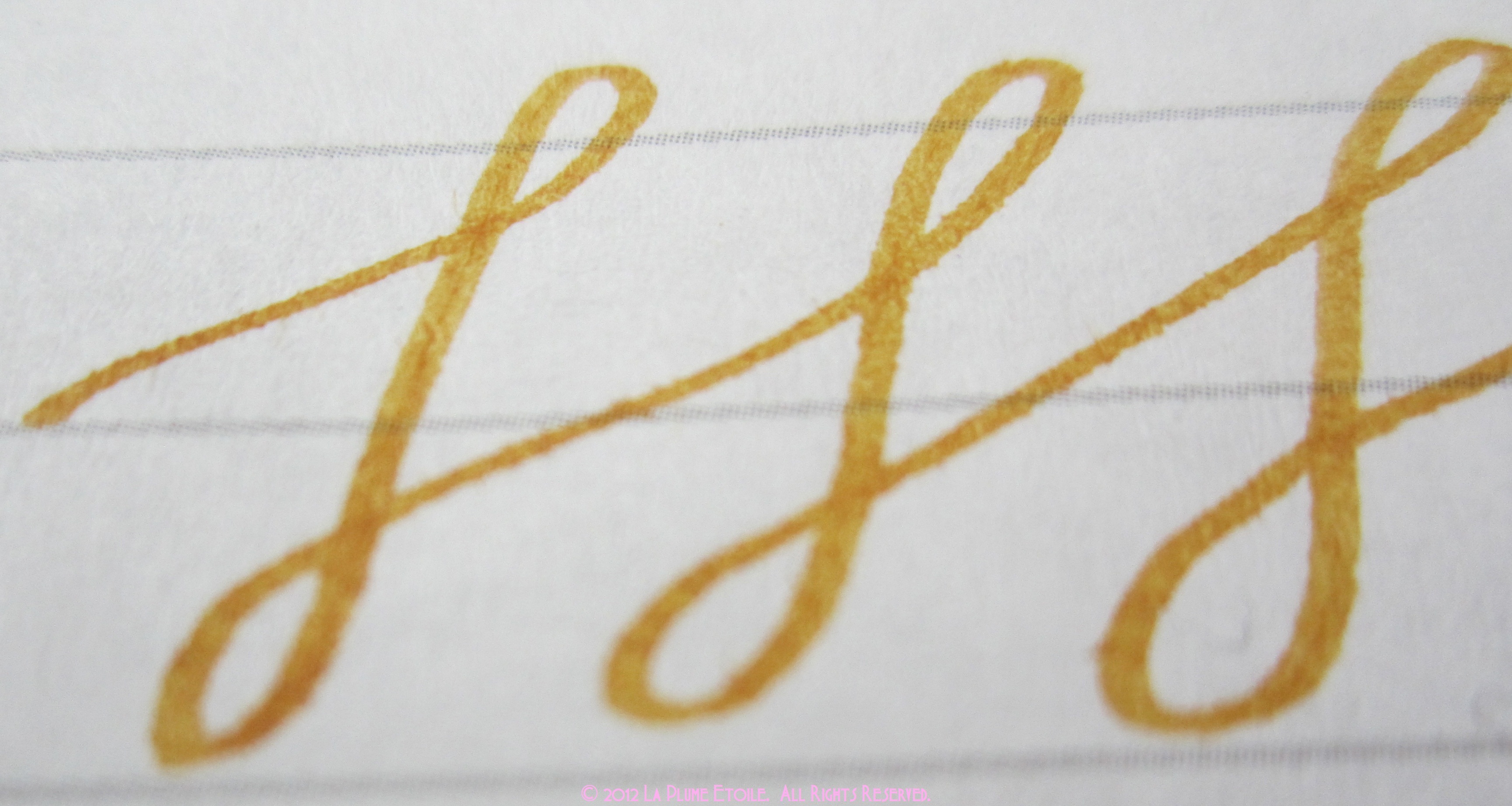
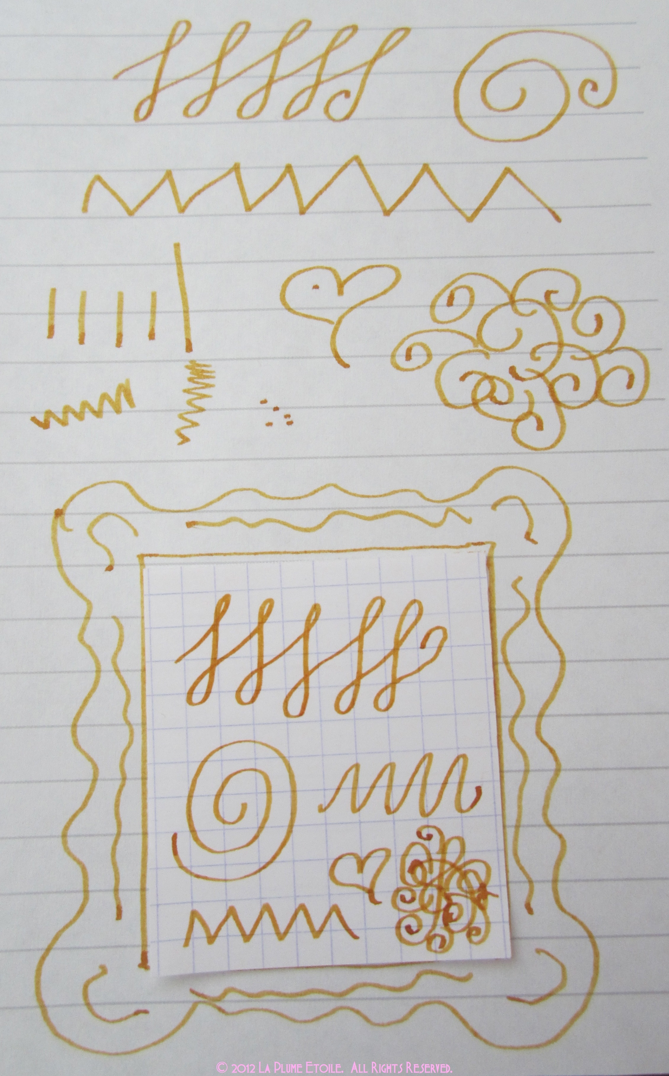
Shading, Feathering, and Other Characteristics: Kosumoso does have some shading, but not as much as I was expecting from reviews of some of the other Iroshizuku colors. It’s enough to be noticeable for those who look for shading, but would probably be lost on the non-fountain pen/ink person. I have sometimes experienced minuscule feathering on cheap paper, but I think that is really due to the absorption qualities of the paper rather than the ink’s properties. It behaves very well, especially on high quality paper. The figure 8s in the writing sample photos look like they have a little feathering, but it is because the scratchy nib was catching on the paper a bit, it is not from the ink. The writing sample was on a Rhodia Dot Pad.
Overall: This ink immediately became part of my regular rotation, especially in the warmer months when bright colors are a necessity. A great color match for my Estie makes it all the more fitting.
Purchasing and Pricing: This ink is imported from Japan and not cheap. It retails for about $27-28 on most online retailers. You can sometimes find it for a few dollars less, but after adding the shipping it doesn’t make much difference. I got mine from Amazon, which is direct from Pilot, considerably cheaper, and you can get free shipping if you spend more than $25. You can click the photo/link below to buy your own bottle of Kosumoso from Amazon and help support La Plume Etoile.