Pens

Montblanc Releases New Princesse Grace de Monaco Fountain Pen

Montblanc has just announced a New Princesse Grace de Monaco Writing Instrument.   This fountain pen features an ivory resin body with platinum plated fittings and a pink topaz stone.  It seems to only come with fine or medium nibs, which is a bit disappointing to those who like fancier nibs.  However, this pen does not seem like a “creative nib” kind of pen to me, so I think the fine or medium choice is fitting.

Photo via Montblanc.

This pen is very similar to the previous Princess Grace edition which featured the same stone and styling, but with a deep purple resin body.   I feel like the ivory body fits Princess Grace more than the deep purple, although a light baby blue would have also complimented her essence nicely.

I have not written with this pen, but my guess is that you will probably like it if you have and like other Montblanc pens.  I tried the Montblanc Ingrid Bergman pen (review here) a few years back, and was disappointed with a dragging nib.  Just based on looks alone, this new Princess Grace pen is a winner as it completely compliments my style.

The new Princess Grace de Monaco Fountain Pen retails at $1,035 at Montblanc’s website and stores.

Review: Levenger True Writer Obsidian Fountain Pen

It’s been a little while since I’ve posted a pen review, but I’m now happy to tell you about one of my new favorite pens, the Levenger True Writer in Obsidian.

Appearance:  This is a nice looking pen!  This True Writer (“TW”) is black with “silver” accents.  I say “silver” because it is unclear from the product information whether the rings and clip are chrome or some other type of silver-colored metal.  The cap is black with a “silver” contoured clip and ring and then pen also has a cap ring engraved with “Levenger” and “True Writer.”  The body has another “silver” ring at the bottom and both the cap and bottom end of the pen have black jewels to match the body.  The section is also black.  The photo on the pen’s product page makes the black look more matte, but it’s actually very glossy.

LPE-TWinbox

LPE-TWjewel

Body:  The pen measures 5 1/2″ in length, 5/8″ diameter and weighs 0.77 oz.

I normally prefer thinner/medium pens over fat pens, and upon first use I felt the body/section was a little too wide.  However, after using the TW for only a few minutes I got used to the the width and now I barely notice it — even after switching between the TW and thinner pens.  It’s actually nice to have a bit of a fatter pen on certain days as it is quite comfortable to hold and use.

Nib:  Levenger nibs (this one included) are stainless steel and interchangable.  I requested a fine nib for this pen, but was sent a medium.  I was initially disappointed at this oversight, but upon first test my disappointment turned to pleasant surprise as this particular medium is on the fine side of medium and is actually just about the width for which I was hoping.  Levenger nibs have a tendency to be inconsistent in their widths, meaning some fines are finer than others, some mediums are more fine or more broad, etc.  It really just depends on which nib you get.  The nibs unscrew at the bottom of the section and thus can be exchanged with any other Levenger nib.  I had a slight problem with the converter/section/nib combo where the nib started unscrewing on its own and the ink leaked onto my fingers.  However, once I tightened it all was well again.

On first test the nib also seemed really stiff, however, I flexed it a little to spread the tines and after that the nib has been springy and very comfortable to use.

Caution:  be careful if you flex the tines on your Levenger nib because these nibs are not flex nibs.

LPE-TWnibcloseLPE-TWpiecesboxLPE-TWuncapped

Performance:  Some TW users recommend cleaning or soaking the nib to remove any factory oils that may be present, but I decided to try it as is and see how it performed.  The flow was great from the first touch of nib to paper and the nib was perfectly smooth.  I filled the converter only part way the first time, and the nib started drying out close to the end of the ink reservoir, but before the pen was actually out of ink.  Concerned, I filled it again so it was full and while I did have one more dry nib issue, it has been performing reliably since then.

This pen comes with one mini-cartridge and one converter.  I chose to use the converter so I could pick my ink of choice.  I initially inked the TW with Iroshizuku Ku-Jaku (review forthcoming) and they have been great friends.  The flow is wet, although I think that is due to both the pen and the ink, as Ku-Jaku tends to have excellent flow.

levengertw-writingsampleLPE-TWbox2

Overall:  The Levenger TW is now one of my new favorite pens, and definitely my favorite modern pen so far.  It is visually sleek, well-balanced, comfortable to use, and reliable.   I would definitely recommend this pen.

However, I did have some problems with the Levenger employees/customer service reps.  I had called the company’s toll-free number for some information and both people I spoke to were extremely rude to me and refused to answer my questions.  For that reason I am hesitant to support the Levenger company itself with my hard-earned money.  I found this to be unfortunate, as it seems they make good products and I was hoping to become a regular Levenger customer.

***UPDATE 4/7/14****  I was contacted by Levenger’s Director of Marketing to find out about my bad customer service experience.  He was quite apologetic and the company has already taken steps to handle the conduct of the employees.  It seems my experience was rare and now I feel much more comfortable endorsing Levenger’s commitment to excellent customer service.  The company really does care about their products and reputation, so I am glad this situation was corrected. I am happy to continue to support Levenger and will bring you more reviews of Levenger products in the future.

Price:  The pen retails for $59 on Levenger.com.  Also available on Amazon – medium nib here and fine nib here.

Here’s a bonus box shot for those of you who love the boxes!

LPE-TWbox

Sharpies Galore! (Review)

I was fortunate to receive a collection of Sharpie pens from Shoplet.com.  My package contained:

Sharpie Neon Permanent Markers

Sharpie Metallic Permanent Markers (Gold and Silver)

Sharpie Premium Pen.


I won’t go through my usual pen review categories on this review since most people have used Sharpie pens before and will be familiar with them.  Click on the thumbnails for the full photos.

The Neon markers are what you would expect from Sharpie, although they smell a little different.  The colors in the pack are neon yellow, pink, blue, green, and orange.  When first writing with the yellow, the ink looks like a dark marigold, but once it dries it is a bright yellow that is bright enough to be readable on white paper, but can also double as a highlighter if needed.  The orange is quite bright, while the green and pink are tolerable and the blue is actually a somewhat calming color.  They perform exactly as one would expect from a Sharpie.  This pack of five neon Sharpies sells for $8.94 on Shoplet.com.


The gold and silver Metallic Sharpie markers are also what you would expect from a Sharpie, but the metallic ink and felt tip is a little softer than non-metallic Sharpies, especially with the silver ink.  The gold is in the middle between the silver and a non-metallic Sharpie.  These also smell like regular black Sharpie pens and are the same in body, etc. to the classic Sharpie.  These metallic pens are some of my favorite Sharpie markers because the metallics work great on white, black, or colored paper — plus, I love metallics!  You can also use these markers to decorate plastic.  I used it on a planner cover and am thinking about using them on the Kantek Desktop Tablet Stand as well.  I have even seen DIY projects where people use the Sharpies on dishware and then bake it in the oven to set the design!  Although I received this gold/silver two-pack from Shoplet.com, also available is a three-pack with gold, silver, and bronze.  The gold/silver two-pack sells for $4.56 on Shoplet.com.


The Sharpie Premium Pen really got me excited.  I had heard about this pen before and jumped at the chance to try it.  The body and cap are stainless steel with a chrome clip.  The pen sports a black jewel at each end and a black band where the cap meets the body.  The pen does have black lettering on the side that says “Sharpie | Pen” and frankly I would prefer if that was omitted.  I think it makes the pen look less high-end than it would without the logo.  The section is a soft and smooth rubber grip that is extremely comfortable to use.  The pen is light enough to be comfortable for long writing sessions, but heavy enough that it doesn’t feel too light.  I’d say it’s just right.

I find the pen to be better balanced when writing unposted as it’s a little tall and top-heavy when posted in my opinion.  The fine tip is a pourous point, which is basically like a felt-tip.  It’s similar to the fine tipped Sharpies, but I find a better comparison is to the Cross Porous-Point (Felt-Tip) 8443 Refill.   The two best parts about this pen are that 1) it’s refillable! and 2) NO SMELL!  It’s so nice to use a Sharpie product without that terrible smell that is guaranteed to give me a headache.  I have been using this pen consistently since receiving it and it has become one of my most used pens.  It is comfortable to use, even for those of us with arm/wrist issues and I find myself reaching for it frequently – especially for jotting notes that require faster writing than is ideal for a fountain pen and for papers that don’t do well with a nib.  The ink has very minimal show-through and no bleed-through.  This one was definitely a score!  Plus, the price is definitely write for such a quality-made pen.  The Sharpie Premium Pen sells for $6.13 on Shoplet.com.


(Shoplet asked me to include the following links to products/services provided by Shoplet, so here they are:  Office SuppliesSharpie Premium PenMetallic Permanent Sharpie markersNeon Permanent Sharpie markersPromotional ProductsPromotional ShirtsOffice Stationery)

Review: Bexley Admiral Fountain Pen

I haven’t had a pen review for you for a while, so today’s review is of the new Bexley Admiral fountain pen in Reef Blue.

The ink used for this pen test is J. Herbin’s Eclat de Saphir (my review here).

I would like to express thanks to Howard Levy of Bexley Pens for loaning me this pen to review.  I have some mixed feelings about this pen, all of which I have discussed with Howard.  I will express all my opinions to you because I feel the honesty and integrity of La Plume Etoile and my reviews are of the utmost importance.  Also, please note that my current layout is chopping the photos, so please click on the photos for a full view.

Appearance:  The pen has a nice overall appearance.  I personally was not a fan of the Reef Blue crackle pattern because I thought it looked “plasticky,” but that is just personal preference.  Reef Blue comes with rhodium plated accents, and the two cap rings are a nice touch.  I also enjoyed the unique clip design that ends in a ball framed with a crescent shape.

Body:  The body is short in the hand, similar to vintage demi and junior sized pens.  I have included one photo of the Admiral with a vintage demi-sized Parker Vacumatic for comparison.

Here are the Admiral’s measurements:

–  5.25″  posted

– 4.5″  body + section with nib (no cap)

– 3.5″  body + section without nib (no cap)

–  just under 1″  for the nib by itself

– 2.5″  for the cap alone

– weight is just under 1 oz (about 0.8 oz) according to my food scale.

The width of the pen is fat, but not too fat.  The pen body is made from solid body cast acrylic, but it is really lightweight and much too light for my taste.   Frankly, I couldn’t tell the different between the solid body cast acrylic and thin plastic.  Companies like MontBlanc use injection mold acrylic which makes for more substantial, yet more fragile pen, so the benefit of Bexley’s acrylic is that it will withstand dropping, etc. much better than other pens.  However, I personally prefer a more expensive feeling pen and am careful to use more caution.

bexleyandparker

Nib:   The nib I tested was a Fine.  It is mostly stiff but does give a little if forced.  There is slight variation as seen in the photos.  The two-tone decorative nib is attractive, but too large for the pen.  The choice of large nib by Bexley is due to inventory, as it is easier for the company to stock one size of nib than different sized nibs to fit different pens.  Although it would be more difficult and expensive for the company, I think it would be better to stock different nib sizes so that the nibs are properly in proportion with each pen’s body size.  However, for the price of the pen, you definitely get quite a lot of nib!

Using the Pen:  As previously stated, the pen is very lightweight.  This is good for long writing sessions and people with hand/wrist/arm issues, but I felt the lightness slighted the balance just a tad.  The cap comes down too low so it rests in the crook of my hand when writing.   If I didn’t post the cap securely, the movement of my hand would loosen it and keep knocking it off the end of the body.   However, this can be avoided by post the cap tightly.  Because the cap posts onto the pen body inside the top of the cap, there should not be a risk of cracking the lip of the cap.   I found the weight a little too light when using unposted, but I did mostly write with it unposted because I didn’t like the cap position.

penwith8s-2

Converter:  The Admiral takes mini-cartridges and comes with a Monteverde mini-converter.  Admittedly, it took me three tries to fill this pen because I kept trying to twist the converter.  Most converters operate by twist, so I thought this to be the same.  This converter, however, does not twist.  You just pull up the black plunger and it sucks up the ink like a vacuum.  The good thing was that the operation of this conveter is easy.  The bad is that is holds a VERY small amount of ink and it needed to be refilled after one evening and one morning of normal writing.  The bonus was that cleaning the pen was one of the easiest I have ever cleaned.  I removed the converter, sucked up and released water a few times and that part was done.  I flushed the nib unit under the faucet and only had to drain it twice before there was no ink in the tissue.  That was definitely a benefit!

Performance:   The best part of this pen was the performance.  The nib was very smooth with no scratchiness.  There was no specific sweet spot to the nib and it wrote well at all angles, except if you turned the nib completely on it’s side (which you wouldn’t do anyway).  There was almost no skipping (a couple small skips on letter starts) and the ink flow was continuous.  This could definitely be a daily workhorse pen if the body is comfortable for you and you like its weight.

figure8s

Price:  All pens in the Bexley Admiral Collection retail for $139.  Richard Binder has it for $104.

Overall:  I have been told the pen has been selling well and customers are very happy with it.   At that price point, I was personally disappointed at the look, feel, and weight of the acrylic; the too-large nib; and the small converter.  However, the performance was very steady and the acrylic is supposed to withstand breaking, so you might like it if you want a very lightweight pen that you could carry around with you and be a daily workhorse.

Here are a few miscellaneous photos for the box fans:

I Am a Nibmeister!

Okay, well I would not put myself in the same category as some of the renowned nibmeisters and modifiers known throughout the fountain pen community.  However, today was a very exciting day for me.  I ground my own custom oblique nib!

I have a vintage Lady Sheaffer from the 1970s and the nib was never quite right.  It was a decent fine nib, but always a little scratchy.  I had used some fine grit emery paper on the nib before to smooth it out, but it was still never quite right.  I decided to take another shot at smoothing it out today, but had no intention of a full nib modification.  When using emery paper on a nib, one minor adjustment is actually huge.  If you change one little thing, it throws off the whole balance of the nib and you have to keep grinding it to get it back to a comfortable state.  After continually grinding the nib down for what must have been about an hour, I ended up with a slanted, oblique nib.  And now, the nib is actually smoother than it’s ever been and it’s oblique!

I don’t really have a tutorial on which way to grind the nib, I just kept grinding it and it sort of happened organically.  I’ll just let the photos speak for themselves.  (The writing sample was made with J. Herbin’s Ambre de Birmaine.)

2013 Pen Resolutions!

First, I want to wish all my readers a Happy New Year.  Thank you for reading La Plume Etoile and sharing your comments and experiences with me.  I hope 2013 is a great year for you!

Now, onto today’s post topic:   I’ve been thinking about making changes to my pen maintenance routine for a while now, but didn’t necessarily think it was a post topic.  However, when I saw the Inkophile’s post about her 2013 pen resolutions, I decided to post my own as well.  (I didn’t think she would mind that I used her post as inspiration.)   Besides, announcing one’s resolutions makes one more accountable to follow through with them, right?

1.  Like the Inkophile, I resolve to be better about keeping my pens clean.  I went through a MAJOR overhaul of my pens recently and took weeks flushing and draining and soaking and draining them.  I followed that with more flushing and draining and soaking and draining.  I had groups of pens in about 10 plastic cups stuffed with tissues at one time all strewn on my counter.    Some cups even had more than one pen in them.  It thought this process would last forever, but eventually most pens were clean enough to refill or store.  Rather than go through that ordeal again, I will be more regular in cleaning them.

2.  Resolution #2 is to only fill the pens I am currently using.  I had a habit of keeping ALL pens in my rotation inked at all times.  I did this because all pens and inks were ready to use at my whim.  However, I found this to be less than ideal because ink dried inside the nib.  I couldn’t see it, but the extended flushing procedure told me it was there.  To avoid this in the future, I am going to only ink the pens I regularly use.  I will ink other pens as the mood strikes me, but will have to use that pen until all the ink is used before I fill another.  I will allow myself 2-3 “extra” inked pens outside of the few every day staples.

3.  Lately, I have been defaulting to some of the cheap plastic fountain pens on a regular basis.  So I will continue to make an effort to use the pretty pens more often.

What are your 2013 Pen/Ink/Paper Resolutions?

Fountain Pen Day is November 2nd!

The first annual Fountain Pen Day will be November 2, 2012!  The holiday will occur the first Friday of November for each year to follow.

There is a website for Fountain Pen Day where you can learn more about it.  The site lists some suggestions to celebrate Fountain Pen Day (FPD), and the organizers are also holding a contest to win a handmade journal by TMLee.  Click here to see how to enter the contest.

As an extra special treat for me, the organizers of FPD have listed La Plume Etoile as one of their resources under “Blogs and Websites.”  Click here to check it out!

I am really excited about Fountain Pen Day and plan to celebrate by using my pens and writing with them for the day.  How will you celebrate?

Lamy Safari and Lamy AL-Star

This review features a Lamy Safari in Shiny Black with a Fine nib and a Lamy AL-Star in Rasberry, also with a Fine nib.  I decided to review the Lamy Safari and Lamy AL-Star pens together because they are almost the same pen.

Appearance: The black Safari’s plastic is shiny, whereas the AL-Star has a brushed metal look.   Both pens are not completely round, but have chiseled edges to give them a rounded-square look.  They feature a transparent section that is molded with grooves for finger placement.  There is also a rubber seal between the section and body.  The clip is a chrome-colored brass wire metal clip, which looks like part of a paper clip.

Nib: I believe the nib is stainless steel and is engraved with the name “Lamy.”  They write great (see below), but have more nib creep than any of my other pens.  This doesn’t affect the pens’ performance, but can be annoying.

Opening and Closing: These pens have a pull-off cap that removes easily. When capping the pens, the caps seal with a satisfying click and stay on securely.

Size/Weight: The main difference between the pens is the Safari is made out of plastic and the AL-Star is made of lightweight aluminum.   The AL-Star is also slightly lighter than the Safari, but the difference is so slight that I don’t notice it while using either pen.

I like to write with the Lamys unposted because I feel they are unbalanced and too top heavy when posted.

Writing: Writing with these pens is almost a dream.  The exceptional flow highlights the vibrancy of the ink and makes for an extremely smooth writing experience.  The pen also does not skip.  My personal problem with these pens is the molded grip.  The placement of grooves does not match my finger placement when holding a pen.  Trying to conform my finger placement in the grips is uncomfortable and thus decreases my satisfaction when writing with the Lamys.  I think the grooves are a great tool for someone that needs to learn how to properly hold a pen.   However, even though I do hold my pen in the proper manner, the grooves are still slightly off from my grip.

Ink: This is a cartridge/converter pen and I have been using it with a converter. As stated above, the flow is also quite wet and enhances the features of the ink.  I used J. Herbin’s Vert Empire in the black Safari and J. Herbin’s Rose Cyclamen in the Rasberry AL-Star.  I especially loved how the wet flow enabled Rose Cyclamen’s brightness to come through on the paper.

The Box: The boxes were nothing special, just vented cardboard.  I didn’t think photos would be necessary for them.

Price: The Safari retails for $30 and the AL-Star is at $40.

Overall: The Lamy Safari and Lamy AL-Star are great for someone who is just getting started with fountain pens, someone who doesn’t have a lot of money to spend on a pen, and someone who wants a daily workhorse that will really perform.  Aside from the molded grip not matching my personal writing grip, these are great pens for fountain pen lovers at all levels.

The Lamy Safari in Shiny Black with a Fine Nib.

Followed by:

The Lamy AL-Star in Rasberry with a Fine Nib.

(The color is more pink in reality.  The photos make it have an orange tint.)

Diplomat Esteem Fountain Pen Review

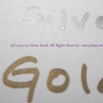
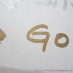
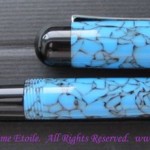
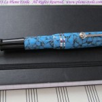
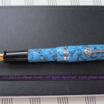
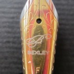
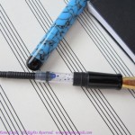
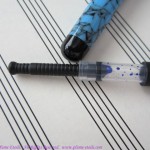
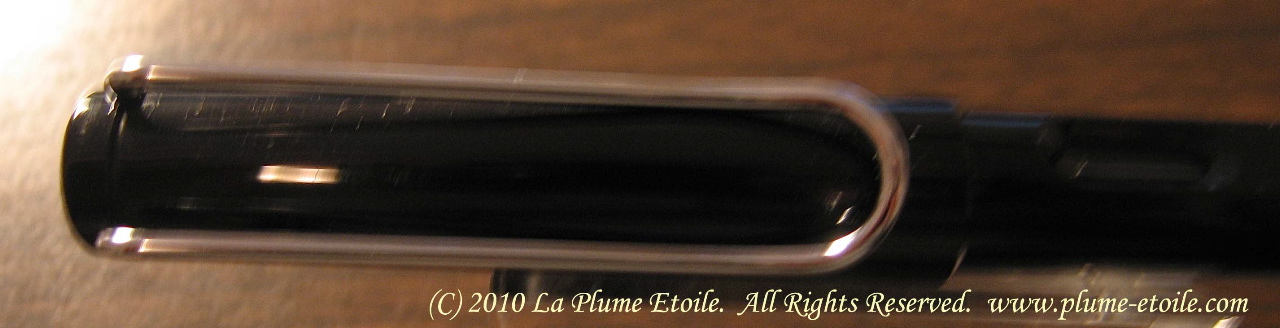
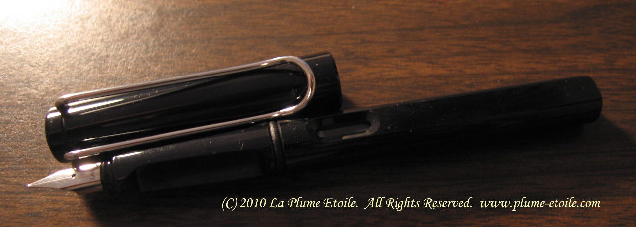
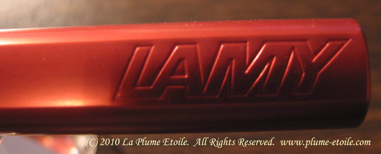
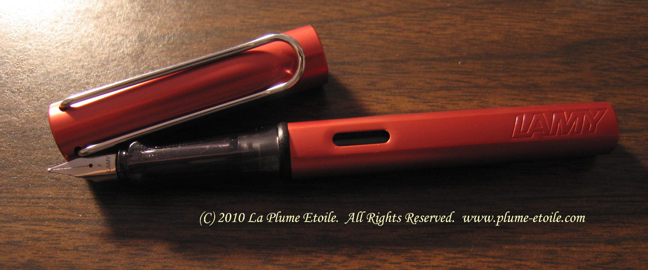
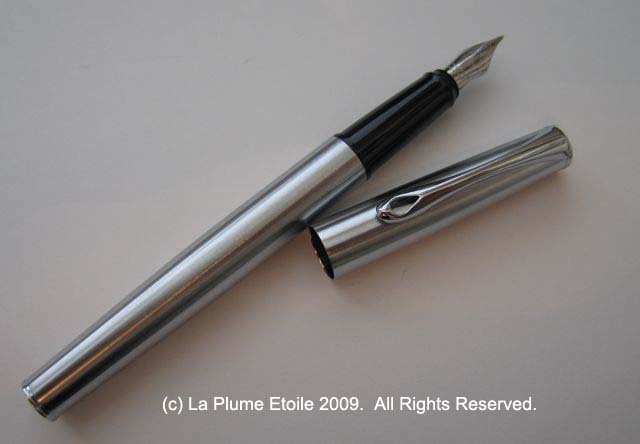
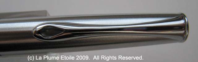
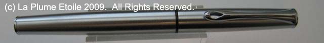
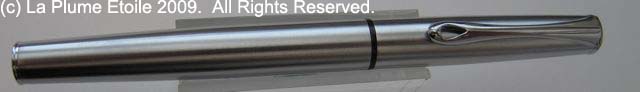
Appearance: The Diplomat Esteem fountain pen is a lovely, full-size fountain pen that will appeal to men and women. The exterior of my pen is a brushed chrome with a shiny chrome decorative clip, but it comes in many different colors and finishes. The Diplomat logo is also located at the top of the pen. The section of the pen is black and you can see the black line when the pen is capped, making a nice break in the body of the pen.

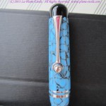
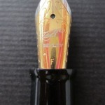
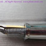
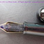
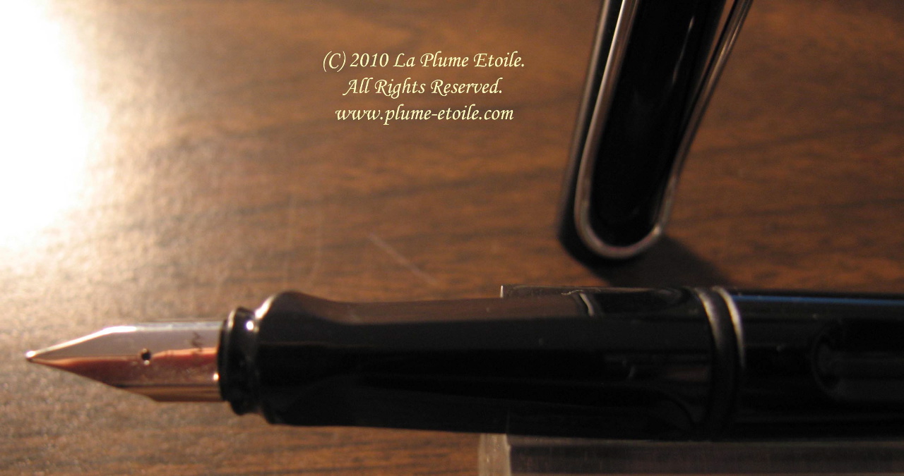
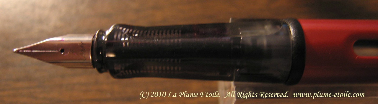
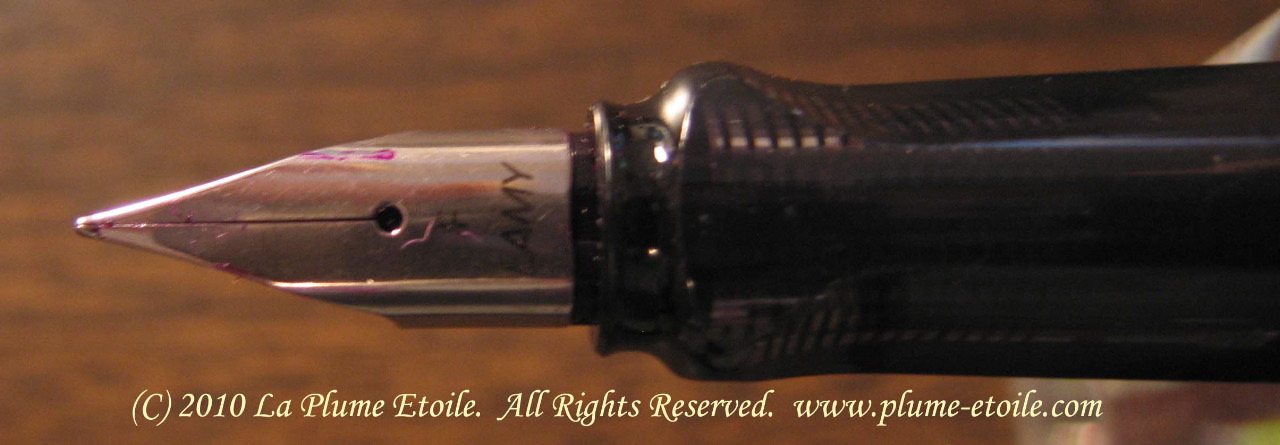
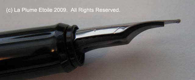
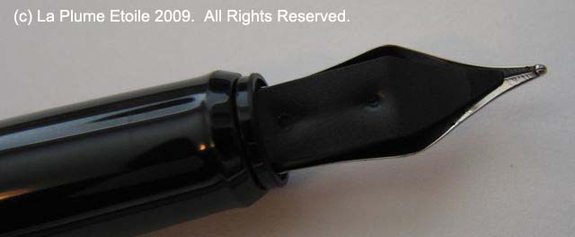
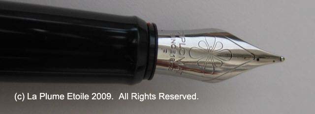
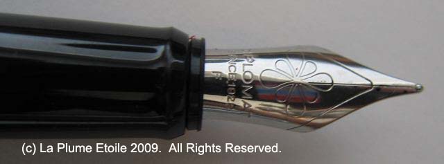
Nib: The nib is stainless steel, etched with the Diplomat logo and the words “DIPLOMAT Since 1922 F.” The F is for my nib choice of Fine, and I imagine the letter will change depending on which nib size you select. The nib is connected to the section, so if for any reason you change nibs, you change the whole section piece with the nib, not just the nib itself. There is usually no nib creep, although, if there is, it is only a few tiny dots of ink.

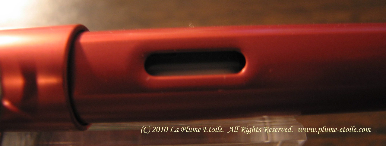
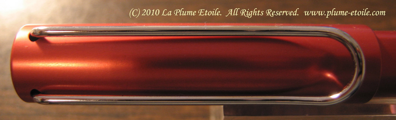
Opening and Closing: This pen has a pull-off cap that removes easily. When capping the pen, the cap seals with a satisfying click and stays on securely.

Size/Weight: This pen is a good width, neither too skinny nor thick. It is comfortable for me to wrap my fingers around when writing, but someone with very large hands might find it small.

I find the pen to be well balanced and I prefer to write with it unposted because the pen’s body is made of metal instead of celluloid and it is slightly to heavy for me. It is lighter if I do not post the cap. I like extremely light pens because my hand and arm fatigue easily due to my tendonitis. However, the Esteem is not a heavy pen, yet it feels substantial in the hand.

Posting the cap on the Esteem requires a bit of pressure; yielding a slight click and a snug seal. If the cap is not pressed down enough to post properly, it will flop around and fall off, so I advise making sure it seals.

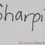
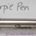
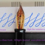
Writing: Writing with the Esteem is smooth and easy. I have actually written with it for significant periods of time, although this varies for me due to my tendonitis. For someone without any hand or wrist problems, this pen should prove useful for short or long writing sessions and could also be a daily workhorse.

Ink: The Esteem is a cartridge/converter pen. Like the previously reviewed Monteverde Mini Jewelria, the Esteem takes mini-cartridges. I have been using it with one of these cartridges and it works well, however, I prefer my bottled ink. I have a converter for it, but have not tried it in the Esteem yet as I do not want to waste the cartridge. I have also been using another Diplomat pen (review to come) with a converter and the flow is excellent. I expect the Esteem will be the same with the converter.

Other Considerations: I’m sure any regular fountain pen user expects a pen to dry out after sitting for a few days, which then requires a quick run under water from the faucet to get the ink flowing again. I had not used the Esteem for at least a week while I was trying a few other pens, and I was pleasantly surprised when I went to use the Esteem and it wrote immediately after sitting for all that time. Very refreshing!

My next point is to illustrate Diplomat’s wonderful customer service and professionalism. When I first got the Esteem, it had a slight nib issue. I alerted Hillary at Diplomat of the problem. First, she immediately knew it was a nib problem, as I was not sure of the problem’s cause. I liked this because it showed she had knowledge about the Diplomat products and how they work. One might think this would be obvious, but sadly, this is often not the case at many companies. Next, she immediately sent me out a new nib, and the problem was solved. I sent the old nib back to her and she alerted the factory to the problem. Not only did she know the cause of the problem, but she fixed the problem quickly AND alerted the factory to make sure the problem does not happen again.

I hesitated to share this information because I do not want it to appear that Diplomat pens commonly have problems – they do not. Furthermore, this was a problem that could happen with ANY pen. Again, it was merely to illustrate the great business of the company, with which I was highly impressed.

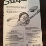
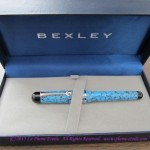
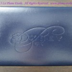
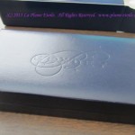
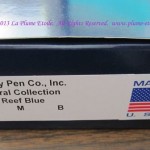
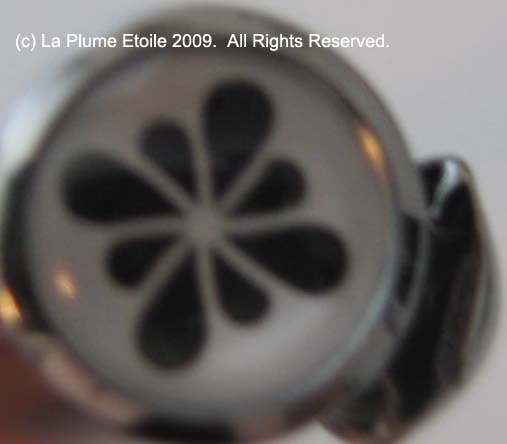
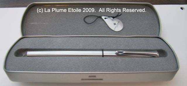
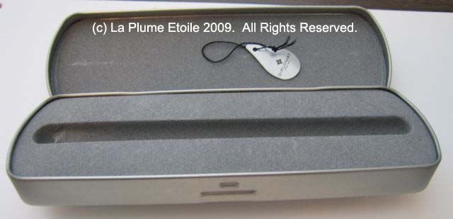
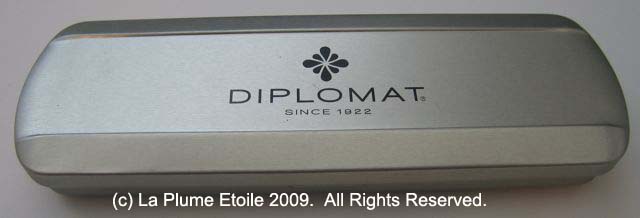
The Box: The Esteem comes in a simple and modern brushed chrome, hinged box. The shape and manner of opening the box are similar to an eyeglass case. The top of the case is printed with “DIPLOMAT Since 1922” and the Diplomat logo that reminds me of a flower. The inside of the box is lined with a soft, felt-type material with a groove cut specifically for the pen.

Overall: Diplomat’s website at www.mydiplomatpen.com, accurately states their products are “Fine German Writing Instruments.” While the Esteem’s price varies depending on the color, finish, and type of pen (fountain pen, rollerball or ball pen), the Esteem is not very expensive and a nice choice for a daily writer that writes well and looks great. Diplomat also offers various other collections, all of which are affordable, stylish, streamlined and classy.