Mini-Iroshizukus are here!

The new mini Iroshizuku ink bottles have arrived!  They are 15 mL each, and just as classy looking as the larger size.  They come in individual bottles, plus some colors come in a 3-bottle gift set.  They are still pricey, as it’s practically $1 per mL, whereas the large version supplies 50 mL for about $30, but it’s still a nice solution for someone who doesn’t want to spend $30 or knows (s)he doesn’t need or want 50 mL of ink.

The cheapest price I have seen is $12.19 (with free shipping!) on Amazon, although it doesn’t seem that all colors are available.

They are also at JetPens.com for $14.00 + shipping (shipping price depends on your order).

New Iroshizuku Mini Ink Bottles are coming!

Just got word from the folks at JetPens.com that they will soon be getting in mini-sized bottles of Iroshizuku inks. No word yet on ounces or pricing, but I find this to be very exciting news for those looking to try some Iroshizuku colors without committing to the large bottle and hefty price tag.  More info as it’s released…

My Go-To Daily Planner: the Quo Vadis Notor

Ladies and gentlemen — I have finally found a planner to meet my needs!  For several years I have struggled with the dilemma of needing to view my day and week at one time, along with having space for a to-do list.  I kept going back to my computer’s calendar for the day and week views since I could easily switch between them, but that left me with blank paper for to-do lists that inevitably ended up hidden under my pile of work for the day.  Enter – the Quo Vadis Notor.  The Notor is a daily planner that allows me to combine my to-do list in a book format.  It allows the freedom to plan my day in a format the works for me, which makes all the difference.

General:  The Notor is also available in both January – December and August – July formats.  It has a sewn binding and both the refill and the cover allow the planner to open flat (a true bonus!).

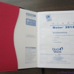
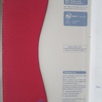
Cover:  The Notor is compatible with a variety of Quo Vadis covers, including the Texas (faux-suede), Club (leatherette), Soho (not sure of the material on this one), and Chelsea (leather).  I personally have the Club cover in Rose Grenadine, which is a darker pink color.  With pink being one of my favorite colors, it was a hit right away!  The cover is sturdy and slips over the refill, allowing me to keep the same cover when it’s time to refill my Notor for next year.  It is sturdy and saddle-stitched with a pebble texture.

notorcover


Size:  The Notor is 4.75 x 6.75″ (12 x 17 cm), which is a perfect size to always keep the Notor on my desktop without it taking up too much space.  It’s always handy and ready to go!

Paper:  The Notor has Clairefontaine paper.  Need I say more?

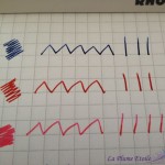
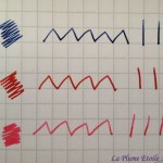
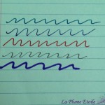
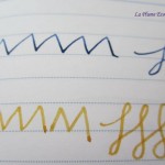
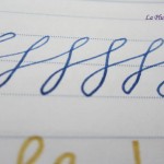
Seriously though, Clairefontaine is the best paper for fountain pens and I love writing in this planner daily.  The paper is bright white and smooth, allowing my nibs to glide over the paper and my inks to really show off their unique properties.  My ink colors are vibrant and pop off the page, while their shading is enhanced.  As is typical with Clairefontaine paper, there is absolutely no feathering.   There is also no bleedthrough and very minimal showthrough. As seen in the last writing sample photo, the showthrough is minimal enough that is does not distract from writing on a page’s backside, even with a lighter colored ink.

The only caveat is that I recommend leaving a few seconds for your ink to dry before closing the Notor, as many inks take a little longer to dry on Clairefontaine paper.  I have forgotten this more than once and had ink come off on the page facing the one on which I had just written.
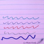
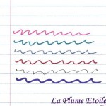
notorwriting


Layout:  Each day of the week (including Saturday and Sunday) has a full page devoted to it, which I appreciate.  Each day has the date printed largely and highlighted with a blue background.  There are small spaces from 8 AM – 7 PM to jot down certain appointments, which I find helpful as a reminder.  There is not enough space to include additional information in the time slots, but my computer’s calendar serves that purpose.  Next there is a “Priority” section, which is very helpful for me to highlight one or a few specific items that must be finished that day.  After that is some lined space with no timing attached to it.  I love this part because this is where I write my to-do list for the day.  The bottom section of the page has a separate section for notes, in case I have anything additional to add.  Sometimes birthday reminders go there as well.  I love this layout because it’s free form allows me to note everything I need to get done that day without having to match each task with a specific time.  My list is also set on the present day instead of a random piece of paper floating around my desk.

notor12 notorweekday notorweekend

The bottom corner of each page also has a tear-off corner so that you can easily find your place in the diary.

notorcorner

Improvements:  I am currently using the 2014 Notor and they have made some changes for 2015.  The large date at the top is has a square background for 2015, whereas the 2014 had a circle.  Also the date, Priority, and Notes backgrounds also have a darker and brighter blue in 2015, whereas the 2014 was more subtle.  The 2015 version also has a “Notes” title that is like a diagonal sticker, which I frankly think makes it look more comical, elementary, or “school-like.”  In my opinion, the 2014 layout is much classier and it’s subtlety allows for my inks to really stand out.  I hope that in future refills Quo Vadis will return to the 2014 layout.

Notor 2014 Version

Notor 2014 Version

Notor 2015 Version - via Quo Vadis website

Notor 2015 Version – via Quo Vadis website

Personally, I also prefer a ribbon bookmark over the tear-off corners.  I either forget to tear the corners off or the corners I do tear off somehow miss my trashcan and I keep finding little triangles around my desk and office.  Despite my personal preference, the corners are really not a deterrent for me in using this planner.  I just added my own ribbon by gluing one to the back page of the Notor and leaving enough ribbon to feed through the pages.  I like my little hack and actually wouldn’t mind doing it again.

Overall:  I really wish the colors and details had not been changed to the more elementary look for the 2015 Notor.  I fear this will annoy me on a daily basis and also distract from the beauty of my inks.  But because this format really works for me and I had a great experience with the Notor in 2014, I will buy a refill and keep using it throughout 2015 and beyond.   I will continue using my computer’s calendar program for my overall day/week/month views, and the Notor for my daily reminders, priorities, and to-do lists.

Depending on the retailer and cover you choose, the Notor seems to run between $15 – $25.  The refill alone is between $11 – $15.

The Rhodia Ice Pad: It’s as Cool as Ice

There has been a lot of online buzz around the new Rhodia Ice notepad, and I have to say I was also swept up in the excitement.  When Margana the Inkophile recently hosted a giveaway for the Ice, I jumped at the chance to win one.  Luckily, I did!

Cover:  The cover is simple, pure white, with a metallic silver Rhodia logo.  For me, it’s very calming.  It is stapled at the top and has a few creases to fold back the cover for writing.  I’m a huge fan of the white/silver cover, my decor involves those colors much more than orange and black.

Size:  My Ice is a No. 16 notebook, which measures 5.8″ x 8.3.”  However, the Ice is also available in No. 11, 12, 13, 16, and 18 sizes.


Paper:  The notebook has 80 sheets of High Grade Vellum Paper.  I was given the graph paper with 5×5 mm squares.  The lines are a light grey, which makes them less obvious than regular Rhodia pads — a plus in my opinion.  However, I did notice that the paper in the Orange/Black pads is a brighter white than the Ice, something that might have been nice to carry over.   The notebook is also available in a lined version in addition to the graph paper.   My personal preference is lined, so next time I would definitely like to get one of those.

The paper is exactly what you would expect in a Rhodia pad — smooth and very fountain pen friendly.  All inks show up well and shade beautifully with minimal to no feathering.  In addition, there is no bleedthrough and very minimal showthrough so that both sides of the page can be used.  There is a tiny perforation line at the top of each page to tear out that page neatly as well.


Overall:  Another great product that I will happily use and highly recommend.  You can’t go wrong with anything from Rhodia, anything distributed by Exaclair, or anything with Clairfontaine paper.  The fact that there is a white and silver cover available in addition to the classic black and orange makes me even happier.   I’m grateful for the opportunity to have such an attractive pad that is a pleasure to use, and grateful that a wonderful company makes them.   The No. 16 Ice is available on Amazon here (grid) and here (lined), or you can also check a list of online pen retailers that stock it here.

View and purchase other sizes from the widget below:

Make Notes for Your Life

After the last review posted regarding Roaring Spring Paper Products from Shoplet.com, I was not eager to post another.  Thankfully, this next set of notebooks proved to be much better quality and much more affordable.

The “Life Notes” spiral notebooks from Roaring Spring Paper Products are small, personal notebooks measuring 7″ x 5″.  They have 380 college ruled sheets and include one double pocket page in the front.   I received four of these notebooks in varying colors:

  • a blue cover with metallic silver music notes and blue paper,
  • a purple cover with a metallic purple steaming coffee mug graphic and purple paper,
  • a green cover with a metallic green beach chair and umbrella graphic and green paper, and
  • a pink cover with a metallic gold chef’s hat graphic and pink paper.


I was initially concerned about how fountain pen ink would perform and look on the colored paper, as I most prefer bright white paper to preserve the integrity of the ink colors and properties.   However, I was actually really pleasantly surprised once I started using these notebooks.  The ink actually showed up quite well on all the different colored papers and I was still able to see some of the inks’ special in properties such as shading.   There was also no bleedthrough and very minimal showthrough, allowing me to successfully write on both sides of the page and get as much usage and longevity of these notebooks as possible.  The sheets also have a perforation if you need to cleanly remove any sheets.

I posted the purple and green paper samples, but the results are the same on all of the colors.  The inks used for testing are (from top to bottom):  Iroshizuku Ku-Jaku, J. Herbin Bleu Nuit, Sheaffer Red, Sharpie Premium Pen, and a purple Sharpie Marker.

These notebooks came in really handy to take to conferences and other events for taking notes and I did enjoy using them.  While I would probably invest in higher-end notebooks for home use, I would purchase these to take on trips, conferences, or other locations where I wouldn’t be upset if a notebook was damaged or lost.  Shoplet.com sells this pack of 4 notebooks for $10.75 per pack, and they are on Amazon for $12.


This is a Good Sign

Today’s review is of a set of notebooks from Roaring Spring Paper Products.   Shoplet.com sent me several different products from Roaring Spring so you’ll see several reviews from Roaring Spring products over the coming weeks.  Let’s get to it!

“This is a Good Sign” Notebooks

The first set of products is a few different notebooks from the “This is a Good Sign” series.  These notebooks are 70 sheets, college ruled, and measure 11 x 8.5.”   These are spiral notebooks with a three hole punch and are very typical of spiral notebooks one would use in school.  These would be good for children or students that need single subject spiral notebooks in their classes.  I have personally been using them on my desk at work, on phone calls to take notes, or to jot down whatever things I need to jot down. The cover designs are not ones I would typically choose, but I do really like the messages they display.   All of the covers have a traffic-type sign that says “This is a Good Sign” —  a funny pun and a positive message.  My favorite of the group is probably the purple cover that that says “Do What You Love / Love What You Do”  because I like how they combined both sentences of this important truth of life.

The paper in the notebook works very well with your normal ball point pen.  When using fountain pens and fountain pen ink there is significant showthrough and bleedthrough, such that when using a fountain pen you can only write on one side of the paper.  I find this is actually quite wasteful and I would rather be able to use both sides of the paper on each page.   Fountain pen ink also tends to feather on this paper, and while it’s not the worst I’ve seen, it is slightly noticeable.  Ballpoint pens are really the ideal type of pens for these notebooks.  The ballpoint still yields minimal showthrough, although not enough to prevent using both sides of the paper.  This notebook also works well with pencils so they would be good for people who like to write with pencils or for students that need to do math homework in a notebook.

Another unfortunate aspect of purchasing these notebooks is that they only seem to be available in a case quantity — a fact I was not made aware of when Shoplet.com sent me the product.  So if you are interested in a case of 24 notebooks, it is available on Shoplet.com for $75.60.  Personally, I would rather save the $3.14 a notebook and put it towards one I can buy individually with better paper quality.  Apologies to you for having not known about the price issue ahead of time, but I still had to post the review after receiving the product.


Montblanc Releases New Princesse Grace de Monaco Fountain Pen

Montblanc has just announced a New Princesse Grace de Monaco Writing Instrument.   This fountain pen features an ivory resin body with platinum plated fittings and a pink topaz stone.  It seems to only come with fine or medium nibs, which is a bit disappointing to those who like fancier nibs.  However, this pen does not seem like a “creative nib” kind of pen to me, so I think the fine or medium choice is fitting.

Photo via Montblanc.

This pen is very similar to the previous Princess Grace edition which featured the same stone and styling, but with a deep purple resin body.   I feel like the ivory body fits Princess Grace more than the deep purple, although a light baby blue would have also complimented her essence nicely.

I have not written with this pen, but my guess is that you will probably like it if you have and like other Montblanc pens.  I tried the Montblanc Ingrid Bergman pen (review here) a few years back, and was disappointed with a dragging nib.  Just based on looks alone, this new Princess Grace pen is a winner as it completely compliments my style.

The new Princess Grace de Monaco Fountain Pen retails at $1,035 at Montblanc’s website and stores.

Review: Levenger True Writer Obsidian Fountain Pen

It’s been a little while since I’ve posted a pen review, but I’m now happy to tell you about one of my new favorite pens, the Levenger True Writer in Obsidian.

Appearance:  This is a nice looking pen!  This True Writer (“TW”) is black with “silver” accents.  I say “silver” because it is unclear from the product information whether the rings and clip are chrome or some other type of silver-colored metal.  The cap is black with a “silver” contoured clip and ring and then pen also has a cap ring engraved with “Levenger” and “True Writer.”  The body has another “silver” ring at the bottom and both the cap and bottom end of the pen have black jewels to match the body.  The section is also black.  The photo on the pen’s product page makes the black look more matte, but it’s actually very glossy.

LPE-TWinbox

LPE-TWjewel

Body:  The pen measures 5 1/2″ in length, 5/8″ diameter and weighs 0.77 oz.

I normally prefer thinner/medium pens over fat pens, and upon first use I felt the body/section was a little too wide.  However, after using the TW for only a few minutes I got used to the the width and now I barely notice it — even after switching between the TW and thinner pens.  It’s actually nice to have a bit of a fatter pen on certain days as it is quite comfortable to hold and use.

Nib:  Levenger nibs (this one included) are stainless steel and interchangable.  I requested a fine nib for this pen, but was sent a medium.  I was initially disappointed at this oversight, but upon first test my disappointment turned to pleasant surprise as this particular medium is on the fine side of medium and is actually just about the width for which I was hoping.  Levenger nibs have a tendency to be inconsistent in their widths, meaning some fines are finer than others, some mediums are more fine or more broad, etc.  It really just depends on which nib you get.  The nibs unscrew at the bottom of the section and thus can be exchanged with any other Levenger nib.  I had a slight problem with the converter/section/nib combo where the nib started unscrewing on its own and the ink leaked onto my fingers.  However, once I tightened it all was well again.

On first test the nib also seemed really stiff, however, I flexed it a little to spread the tines and after that the nib has been springy and very comfortable to use.

Caution:  be careful if you flex the tines on your Levenger nib because these nibs are not flex nibs.

LPE-TWnibcloseLPE-TWpiecesboxLPE-TWuncapped

Performance:  Some TW users recommend cleaning or soaking the nib to remove any factory oils that may be present, but I decided to try it as is and see how it performed.  The flow was great from the first touch of nib to paper and the nib was perfectly smooth.  I filled the converter only part way the first time, and the nib started drying out close to the end of the ink reservoir, but before the pen was actually out of ink.  Concerned, I filled it again so it was full and while I did have one more dry nib issue, it has been performing reliably since then.

This pen comes with one mini-cartridge and one converter.  I chose to use the converter so I could pick my ink of choice.  I initially inked the TW with Iroshizuku Ku-Jaku (review forthcoming) and they have been great friends.  The flow is wet, although I think that is due to both the pen and the ink, as Ku-Jaku tends to have excellent flow.

levengertw-writingsampleLPE-TWbox2

Overall:  The Levenger TW is now one of my new favorite pens, and definitely my favorite modern pen so far.  It is visually sleek, well-balanced, comfortable to use, and reliable.   I would definitely recommend this pen.

However, I did have some problems with the Levenger employees/customer service reps.  I had called the company’s toll-free number for some information and both people I spoke to were extremely rude to me and refused to answer my questions.  For that reason I am hesitant to support the Levenger company itself with my hard-earned money.  I found this to be unfortunate, as it seems they make good products and I was hoping to become a regular Levenger customer.

***UPDATE 4/7/14****  I was contacted by Levenger’s Director of Marketing to find out about my bad customer service experience.  He was quite apologetic and the company has already taken steps to handle the conduct of the employees.  It seems my experience was rare and now I feel much more comfortable endorsing Levenger’s commitment to excellent customer service.  The company really does care about their products and reputation, so I am glad this situation was corrected. I am happy to continue to support Levenger and will bring you more reviews of Levenger products in the future.

Price:  The pen retails for $59 on Levenger.com.  Also available on Amazon – medium nib here and fine nib here.

Here’s a bonus box shot for those of you who love the boxes!

LPE-TWbox

Review: Kantek Rotating Desktop Tablet Stand

I realize this product is a little different than those I normally review, but I originally got this Kantek Rotating Desktop Tablet Stand courtesy of Shoplet.com because I thought it would also be useful for propping up papers while working.  I thought I could prop my papers up facing me to ease strain on my neck from alternating between working on the computer and looking down at my desk at my notes.  Unfortunately, this stand was not good for propping up papers as the stand is too short and the papers fall over the back.  However, it is great as a tablet stand, which is it’s intended purpose.

IMG_3216 IMG_3217

The stand is made from black plastic and it feels fairly sturdy.  I am itching to maybe decorate it with some metallic Sharpie pens (review forthcoming) or some crystals.  The base rotates, which is a nice feature.  Another really helpful feature is that the little space where the tablet actually fits has a rubberized coating to hold the tablet securely and there is less risk of it sliding out if you hit it accidentally.  Possibly the best feature if that it folds up!  This is great for storing the stand somewhere inconspicuous when not in use.  I love that feature because I definitely do not want to look at things taking up space on my desk when they are not needed.  I haven’t used other tablet stands so I cannot say how they compare, however, I think this product does the job well.

I think the most use for this tablet would be watching a video on a tablet, reading a book on the tablet, or even using this stand in the kitchen if you like to have your recipes on your tablet.  I only photographed the tablet in a vertical position, but you can also use the tablet horizontally as shown on the packaging photograph above.


The Kantek Rotating Desktop Tablet Stand sells for $19.99 at Shoplet.com.


(Shoplet asked me to include the following links to products/services provided by Shoplet, so here they are:  Office Supplies, Tablet StandPromotional ProductsPromotional ShirtsOffice Stationery)

Sharpies Galore! (Review)

I was fortunate to receive a collection of Sharpie pens from Shoplet.com.  My package contained:

Sharpie Neon Permanent Markers

Sharpie Metallic Permanent Markers (Gold and Silver)

Sharpie Premium Pen.


I won’t go through my usual pen review categories on this review since most people have used Sharpie pens before and will be familiar with them.  Click on the thumbnails for the full photos.

The Neon markers are what you would expect from Sharpie, although they smell a little different.  The colors in the pack are neon yellow, pink, blue, green, and orange.  When first writing with the yellow, the ink looks like a dark marigold, but once it dries it is a bright yellow that is bright enough to be readable on white paper, but can also double as a highlighter if needed.  The orange is quite bright, while the green and pink are tolerable and the blue is actually a somewhat calming color.  They perform exactly as one would expect from a Sharpie.  This pack of five neon Sharpies sells for $8.94 on Shoplet.com.


The gold and silver Metallic Sharpie markers are also what you would expect from a Sharpie, but the metallic ink and felt tip is a little softer than non-metallic Sharpies, especially with the silver ink.  The gold is in the middle between the silver and a non-metallic Sharpie.  These also smell like regular black Sharpie pens and are the same in body, etc. to the classic Sharpie.  These metallic pens are some of my favorite Sharpie markers because the metallics work great on white, black, or colored paper — plus, I love metallics!  You can also use these markers to decorate plastic.  I used it on a planner cover and am thinking about using them on the Kantek Desktop Tablet Stand as well.  I have even seen DIY projects where people use the Sharpies on dishware and then bake it in the oven to set the design!  Although I received this gold/silver two-pack from Shoplet.com, also available is a three-pack with gold, silver, and bronze.  The gold/silver two-pack sells for $4.56 on Shoplet.com.


The Sharpie Premium Pen really got me excited.  I had heard about this pen before and jumped at the chance to try it.  The body and cap are stainless steel with a chrome clip.  The pen sports a black jewel at each end and a black band where the cap meets the body.  The pen does have black lettering on the side that says “Sharpie | Pen” and frankly I would prefer if that was omitted.  I think it makes the pen look less high-end than it would without the logo.  The section is a soft and smooth rubber grip that is extremely comfortable to use.  The pen is light enough to be comfortable for long writing sessions, but heavy enough that it doesn’t feel too light.  I’d say it’s just right.

I find the pen to be better balanced when writing unposted as it’s a little tall and top-heavy when posted in my opinion.  The fine tip is a pourous point, which is basically like a felt-tip.  It’s similar to the fine tipped Sharpies, but I find a better comparison is to the Cross Porous-Point (Felt-Tip) 8443 Refill.   The two best parts about this pen are that 1) it’s refillable! and 2) NO SMELL!  It’s so nice to use a Sharpie product without that terrible smell that is guaranteed to give me a headache.  I have been using this pen consistently since receiving it and it has become one of my most used pens.  It is comfortable to use, even for those of us with arm/wrist issues and I find myself reaching for it frequently – especially for jotting notes that require faster writing than is ideal for a fountain pen and for papers that don’t do well with a nib.  The ink has very minimal show-through and no bleed-through.  This one was definitely a score!  Plus, the price is definitely write for such a quality-made pen.  The Sharpie Premium Pen sells for $6.13 on Shoplet.com.


(Shoplet asked me to include the following links to products/services provided by Shoplet, so here they are:  Office SuppliesSharpie Premium PenMetallic Permanent Sharpie markersNeon Permanent Sharpie markersPromotional ProductsPromotional ShirtsOffice Stationery)