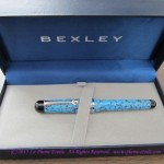
I haven’t had a pen review for you for a while, so today’s review is of the new Bexley Admiral fountain pen in Reef Blue.
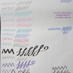
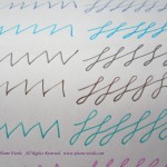
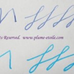
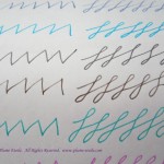
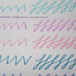
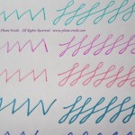
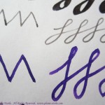
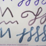
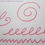
The ink used for this pen test is J. Herbin’s Eclat de Saphir (my review here).
I would like to express thanks to Howard Levy of Bexley Pens for loaning me this pen to review. I have some mixed feelings about this pen, all of which I have discussed with Howard. I will express all my opinions to you because I feel the honesty and integrity of La Plume Etoile and my reviews are of the utmost importance. Also, please note that my current layout is chopping the photos, so please click on the photos for a full view.
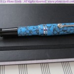
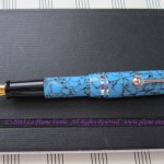
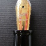
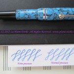
Appearance: The pen has a nice overall appearance. I personally was not a fan of the Reef Blue crackle pattern because I thought it looked “plasticky,” but that is just personal preference. Reef Blue comes with rhodium plated accents, and the two cap rings are a nice touch. I also enjoyed the unique clip design that ends in a ball framed with a crescent shape.
-

-
Capped.
-

-
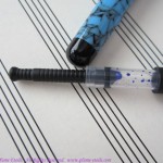
Uncapped.
-

-
Uncapped again.
-
-
and again
-
-
aaaand again.
-

-
Nicely detailed clip and rings.
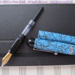
Body: The body is short in the hand, similar to vintage demi and junior sized pens. I have included one photo of the Admiral with a vintage demi-sized Parker Vacumatic for comparison.
Here are the Admiral’s measurements:
– 5.25″ posted
– 4.5″ body + section with nib (no cap)
– 3.5″ body + section without nib (no cap)
– just under 1″ for the nib by itself
– 2.5″ for the cap alone
– weight is just under 1 oz (about 0.8 oz) according to my food scale.
The width of the pen is fat, but not too fat. The pen body is made from solid body cast acrylic, but it is really lightweight and much too light for my taste. Frankly, I couldn’t tell the different between the solid body cast acrylic and thin plastic. Companies like MontBlanc use injection mold acrylic which makes for more substantial, yet more fragile pen, so the benefit of Bexley’s acrylic is that it will withstand dropping, etc. much better than other pens. However, I personally prefer a more expensive feeling pen and am careful to use more caution.

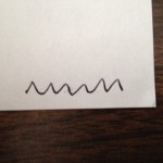
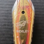
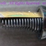
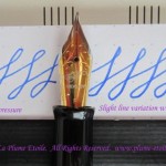
Nib: The nib I tested was a Fine. It is mostly stiff but does give a little if forced. There is slight variation as seen in the photos. The two-tone decorative nib is attractive, but too large for the pen. The choice of large nib by Bexley is due to inventory, as it is easier for the company to stock one size of nib than different sized nibs to fit different pens. Although it would be more difficult and expensive for the company, I think it would be better to stock different nib sizes so that the nibs are properly in proportion with each pen’s body size. However, for the price of the pen, you definitely get quite a lot of nib!
-
-
Nib extreme close up
-
-
Nib.
-
-
Side Nib
-
-
Side nib
-
-
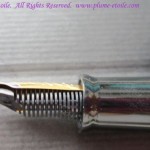
Back of nib/front of feed.
-
-
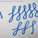
Yes, the figure 8’s are flipped, but you can see the difference between pressure and no pressure on the nib.
-
-
A closeup of the last image.
Using the Pen: As previously stated, the pen is very lightweight. This is good for long writing sessions and people with hand/wrist/arm issues, but I felt the lightness slighted the balance just a tad. The cap comes down too low so it rests in the crook of my hand when writing. If I didn’t post the cap securely, the movement of my hand would loosen it and keep knocking it off the end of the body. However, this can be avoided by post the cap tightly. Because the cap posts onto the pen body inside the top of the cap, there should not be a risk of cracking the lip of the cap. I found the weight a little too light when using unposted, but I did mostly write with it unposted because I didn’t like the cap position.

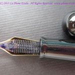
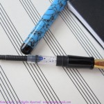
Converter: The Admiral takes mini-cartridges and comes with a Monteverde mini-converter. Admittedly, it took me three tries to fill this pen because I kept trying to twist the converter. Most converters operate by twist, so I thought this to be the same. This converter, however, does not twist. You just pull up the black plunger and it sucks up the ink like a vacuum. The good thing was that the operation of this conveter is easy. The bad is that is holds a VERY small amount of ink and it needed to be refilled after one evening and one morning of normal writing. The bonus was that cleaning the pen was one of the easiest I have ever cleaned. I removed the converter, sucked up and released water a few times and that part was done. I flushed the nib unit under the faucet and only had to drain it twice before there was no ink in the tissue. That was definitely a benefit!
-
-
Components
-
-
Monteverde mini-converter
-
-
Closeup of converter
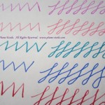
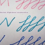
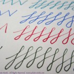
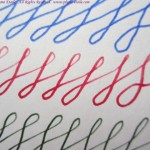
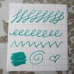
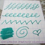
Performance: The best part of this pen was the performance. The nib was very smooth with no scratchiness. There was no specific sweet spot to the nib and it wrote well at all angles, except if you turned the nib completely on it’s side (which you wouldn’t do anyway). There was almost no skipping (a couple small skips on letter starts) and the ink flow was continuous. This could definitely be a daily workhorse pen if the body is comfortable for you and you like its weight.

Price: All pens in the Bexley Admiral Collection retail for $139. Richard Binder has it for $104.
Overall: I have been told the pen has been selling well and customers are very happy with it. At that price point, I was personally disappointed at the look, feel, and weight of the acrylic; the too-large nib; and the small converter. However, the performance was very steady and the acrylic is supposed to withstand breaking, so you might like it if you want a very lightweight pen that you could carry around with you and be a daily workhorse.
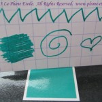
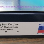
Here are a few miscellaneous photos for the box fans: