J. Herbin

Review: J. Herbin Vert Réséda Fountain Pen Ink

J. Herbin’s Vert Réséda has also been one of my favorite end of summer/beginning of fall inks.   The name translates as “reseda green” and the ink lives up to the quality I expect from J. Herbin.

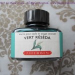
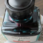
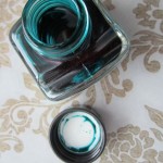
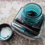
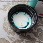
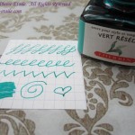
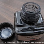
The Bottle:  Like all J. Herbin bottles, the bottle is compact and has a much appreciated pen rest.  One newer feature is that the cap is shiny black plastic, whereas previous bottles had more of a matte plastic cap.

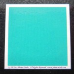
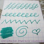
The Color:  This color is hard to describe, but it’s sort of a minty teal/turquoise.  It also matches one of my sealing waxes exactly, so that is a plus for someone like me who likes to color coordinate my writing accoutrements.

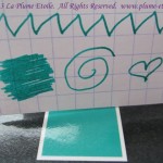
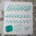
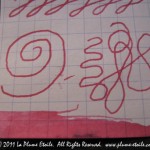
Consistency/Flow:  I found the flow to be moderate at first, but actually it got wetter the more I used it.  I started out testing the ink with an Esterbrook dip pen (nib 2442), and the flow was good.  Then I inked it in one of my vintage Vacumatics.  The flow started off just okay.  Now that I have refilled that pen several times with Vert Réséda, I have noticed that the flow has increased, the ink is wetter, and the color is slightly darker.  So this slightly darker color is what you see in the writing samples pictured, but note that you might experience the color to be a bit lighter and closer to the square on the top of the box.

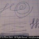
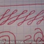
Shading, Feathering, and Other Characteristics: I have not experienced any feathering with Vert Réséda.  At first, there was barely any shading at all.  I was slightly disappointed, but liked the color so much that I planned to continue using it even without shading.  However, again through refills and continued use, the shading has also increased along with the flow and wetness as described above.  As you can see the writing sample, it now has a fairly decent amount of shading.  This development is much to my delight, although I do not know if these results are typical for all users.

Writing sample close-up to see shading.

Writing sample close-up to see shading.

Overall:  I really like this ink and plan on keeping it in my regular rotation.

Writing samples written on Rhodia mini graph pad.

Writing samples written on Rhodia mini graph pad.

Purchasing and Pricing:  A 30mL bottle runs between $7-12 depending on the retailer and is available at most online retailers catering to fountain pen and ink users.  You can also purchase from one of the links below to help support La Plume Etoile.


Ink Review: J. Herbin’s Encres Acidulees Effet Scintillant (Pearlescent Inks)

Thanks to Karen at Exaclair, I recently had the opportunity to try some very fun and fancy inks.  J. Herbin’s Encres Acidulees Effet Scintillant  are Herbin’s group of Pearlescent Inks.  These inks are NOT for fountain pens, they are for dip nibs only.  There are several colors, all of which have a shiny/glittery/pearlescent sheen.  I discuss each ink in the group below.

The Colors (listed in the same order as the sample photo)

Pink:  A lovely bubblegum pink color.  When the ink is thinning on the nib, it can be sheer.  Frequent dipping to have a lot of ink on your quill/nib is best.

Peach (Peach):  A lighter, less pink color with more orange to it.  Same properties as the pink.

Blue:   A dark royal blue color.  It was really nice and quite a surprise as I expected a sky blue color since the rest in the group are more pastel.  As you can see, it doesn’t show up well on the darker paper.  I suspect it would do fabulously on a lighter paper.

Yellow:  Bright!  Despite it’s brightness, the hue is more of a softer yellow rather than obviously neon.

Green:  Also quite bright.   Maybe a prime creamy avocado?

Consistency/On Paper:  This ink takes a little trial and error to get it right.  I had to try a few nibs, but then found it worked well with some of the very small Brause nibs (again from Karen and distributed through Exaclair) because the smaller nibs held the ink and allowed it to flow onto the paper best.  The bigger nibs didn’t let the ink flow down well enough to complete a line.  Even with the small nibs, I had to dip often to keep enough ink on the nib so that the ink stayed thick and didn’t thin out like you can see in part of the writing sample.  I also had to take care in my pressure on the nib to avoid the ink transferring too quickly to the paper and creating blobs, as is a concern with wet ink.  However, I found working with care and patience avoided this problem.  This is definitely an ink to play with when you have some relaxing time to devote your attention without rushing.
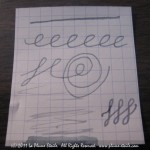
Paper choice was also an issue.  I’ll save you some time — you can avoid reaching for the cheap paper.  This ink needs sturdy, thicker, high quality paper to support the thickness and composition of these inks.  The brown paper in the photo is a sample of G.Lalo (again, distributed by Exaclair  – this paper is great and a review is forthcoming).   The inks were very happy to be paired with G. Lalo paper and you shouldn’t have a problem if you use G. Lalo or a similar high quality paper.
An additional note is to take care in handling your writing even after the ink has dried.  As you can see in the photo, the pearlescence tends to smear a bit.

Overall:   There have been some other blogs in the pen and ink world that have given these inks poor reviews.  However, I really enjoyed testing these inks and plan to use them for special occasion items such as when writing someone a special card.  I already used the yellow color to make an artistic name card for someone special (on grey G. Lalo paper in case you are interested – it was a lively combination!).  I will be using these in the future.  If you are interested in them , I would recommend giving them a chance and playing with the right nib and paper combinations.  I have not tried other calligraphy inks that may be similar to these, so I cannot compare them to other brands.  I also just learned there are a few colors (like coral red!) that I did not get to try.  I must have that coral red!

Purchasing and Pricing: A pack of 5 assorted 10ml will run you around $20, depending on the retailer.

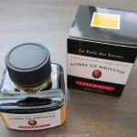
J. Herbin Ambre De Birmanie

Ambre De Birmanie means Amber in Burma according to Google Translator.  Is this what Amber looks like in Burma?  I have no idea.  However, I do know that this ink is awesome!

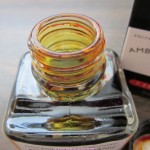
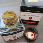
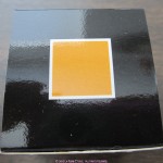
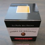
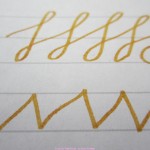
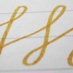
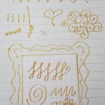
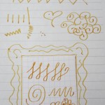
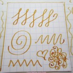
The Color: It reminds me of a goldenrod marker I had as a kid.  It’s a little darker and more orange than a gold color.  However, when I write with it I sort-of feel like I’m writing with liquid gold.

Consistency/On Paper: It’s very wet and has amazing shading.  So far, I have been using it exclusively with a 1.1mm italic nib because I’m obsessed with the shading!

Overall:  I love it!!!  The color is great and shows up well on paper.  The shading also gives it a very elegant character.  The only thing to watch out for is that because the ink is so wet, it will feather or look not as crisp on some cheaper papers.

Purchasing and Pricing: A 30mL bottle runs between $7-12 depending on the retailer and is available at most online retailers catering to fountain pen and ink users.

A Note on the Photos:  I started with some box and bottle photos.  On the doodle photos, the doodles inside the picture frame shape are on Rhodia graph paper (the good paper).  The frame and surrounding doodles are on cheaper notebook paper, for comparison.  Towards the end of the photos, I have included some close-up photos of Ambre on the cheaper paper so you can see some slight feathering.  However, even this cheaper paper handled the ink fairly well.

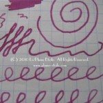
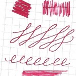
J. Herbin Rouge Opera – New review with corrections

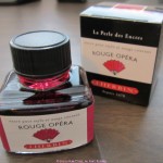
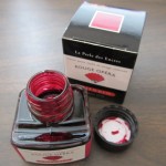
This post is both a review and a correction.  Back in this post, I said that Rouge Opera and Larmes de Cassis looked like almost the same color.  Well, the reason is that I think I somehow got a weird bottle of Rouge Opera!  The color is actually a lovely deep red and not like Larmes de Cassis.

The Color: It’s a lovely deep cranberry red.  It’s a great match for a vintage carmine Sheaffer Balance.

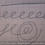
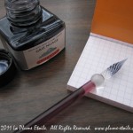
Consistency/On Paper: It’s of average wetness and consistency, not too wet or too dry.  The pen I’m using has a tiny amount of flex, so that allows for a little more wetness and some nice shading.  No feathering that I noticed.

Overall: A very pretty color and a reliable ink.  I was looking hard to find a match for a carmine-colored pen, and Rouge Opera fills that role more effectively than any of the other inks I was considering.  I’m very happy with it and it has earned a place in my regular rotation.

Purchasing and Pricing: A 30mL bottle runs between $7-12 depending on the retailer and is available at most online retailers catering to fountain pen and ink users.

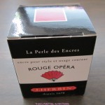
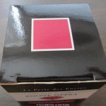
The first photo below if from my previous review of the outlier Rouge Opera bottle.  The second photo is of the new and TRUE Rouge Opera, along with some box and bottle shots.  Click on the thumbnails for larger versions.

J. Herbin Ink fix

Inkophile had a great post today about a letter from J. Herbin’s general manager regarding a few inks that had accumulated SITB (slime in the bottle).  While the ratio of inks with SITB was very small compared to the number of inks sold, J. Herbin did extensive research to remedy the problem.  I also learned that they made the materials in their inks more eco-friendly, which means they are better for the planet, your health and the health of the people mixing the inks.  Click here to read General Manager Thierry Cappe’s letter on the FPN, posted by Karen Doherty, V.P. of Exaclair, Inc.

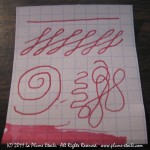
If you are a regular reader to La Plume Etoile, you know that I love J. Herbin inks.  This letter and quality at the company makes me love using their inks even more.  In fact, yesterday I got J. Herbin’s Rouge Bourgogne on my favorite white shirt.  Acting fast, I was able to wash it out quickly and you’d never know it was there.  This has happened to me several times and it is so reassuring to know it will wash out, in addition to it being safe for my pens.

La Plume Etoile + J. Herbin = Love.

Happy Valentines Day!

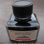
J. Herbin Gris Nuage

The Color: A lovely grey that is more blue-tinged than yellow-tinged.

Consistency/On Paper: Fairly wet and consistent, with no feathering and EXCELLENT shading.

Overall: A reliable ink with an elegant look.  I was originally unsure of using a grey ink, thinking it may look too washed out.  However, it shows up nicely and has become part of my regular rotation.

Purchasing and Pricing: A 30mL bottle runs between $7-10 depending on the retailer and is available at most online retailers catering to fountain pen and ink users.

J. Herbin Rouge Bourgogne

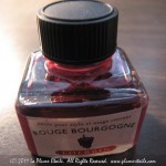
The Color: A beautiful cranberry red.

On Paper: Consistent with some very nice subtle shading.

Consistency: Saturated and performs well.

Overall: Another favorite from J. Herbin.  This is my most-used red ink that almost exactly matches my one of my pens in cranberry red celluloid.  It is beautiful, elegant and I love it.

Purchasing and Pricing: A 30mL bottle runs between $7-10 depending on the retailer and is available at most online retailers catering to fountain pen and ink users.

J. Herbin Rouge Opera

The Color: This color confuses me.  It is almost exactly the same as J. Herbin’s Larmes de Cassis.  It has more of a cranberry tinge to it, but my written samples of the colors are almost indistinguishable from each other.  I can’t figure it out!

Consistency/On Paper: Fairly wet and consistent, although can sometimes run a little thin.  This “thinness” does lead to some excellent shading.

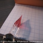
Overall: A very pretty color and a reliable ink.  This is another exquisite color that I don’t use enough.  More pens, anyone?  The photos below show Rouge Opera as written with a J. Herbin glass dip pen as well as an XF nib.

Purchasing and Pricing: A 30mL bottle runs between $7-10 depending on the retailer and is available at most online retailers catering to fountain pen and ink users.

opera1c opera2c

J. Herbin Larmes de Cassis

The Color: A very pretty purple, wine color.

On Paper: Wet, saturated and consistent.

Consistency: As previously stated, Larmes de Cassis is saturated and consistent.  It flows well.

Overall: A great ink in a pretty, unique color.  I really don’t use this one as often as I would like, as I tend to stick with certain inks in certain pens.  I guess this means I need a new pen!  The photos below show the ink as written with a J. Herbin glass dip pen and with an XF nib.

Purchasing and Pricing: A 30mL bottle runs between $7-10 depending on the retailer and is available at most online retailers catering to fountain pen and ink users.

cassis1c cassis2c