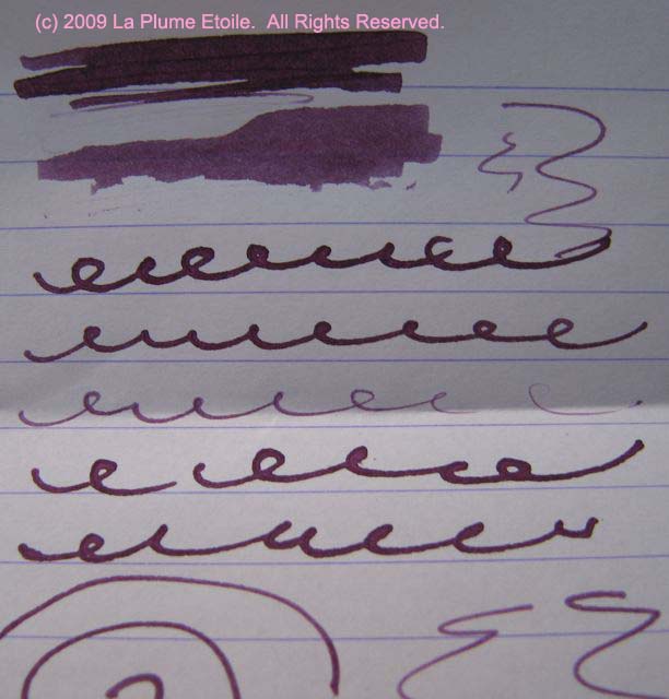

The Color: A bright, standard blue with purple undertones. It is quite similar to the color of the ink in many blue ballpoint pens.
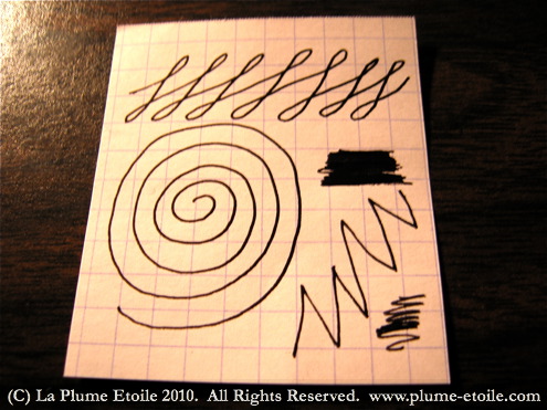
On Paper/Consistency: Very wet, saturated and consistent. This ink flows very well and is always reliable. I have never had a problem with it.
Overall: As a personal preference, it is not the type of blue I would normally buy. However, I had bought a vintage pen on eBay and when I cleaned the pen, Eclat de Saphir almost exactly matched the dried ink in the pen. The pen was from the 1950s, but I do not know the last time it had been inked. In any case, I decided to stick with that color in the pen as a homage to its past usage. Like I said, this ink is very reliable and it is a regular in my rotation.
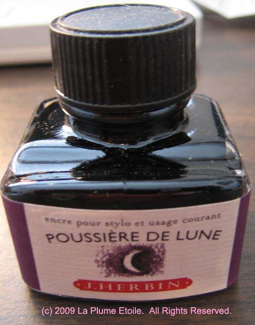
Purchasing and Pricing: A 30mL bottle runs between $7-10 depending on the retailer and is available at most online retailers catering to fountain pen and ink users.