

I was so excited about trying J. Herbin’s Poussiere de Lune ink and it has lived up to my expectations. Is it possible for me to have a new favorite J. Herbin ink?
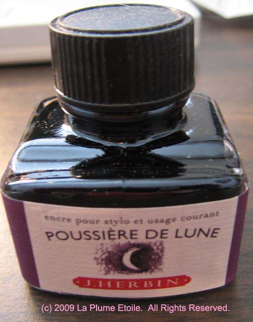
The Bottle: Same as all the other J. Herbin ink bottles
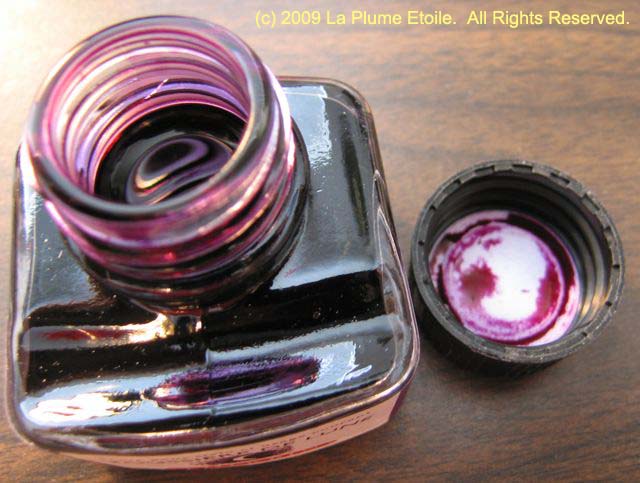
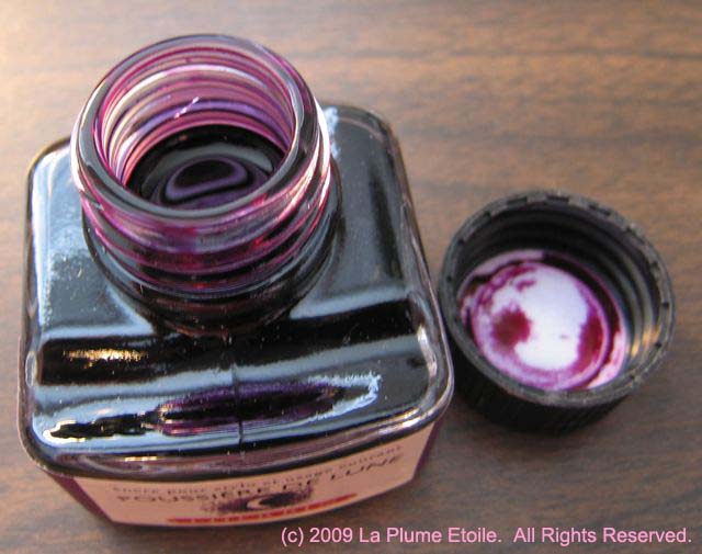
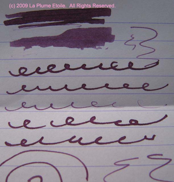
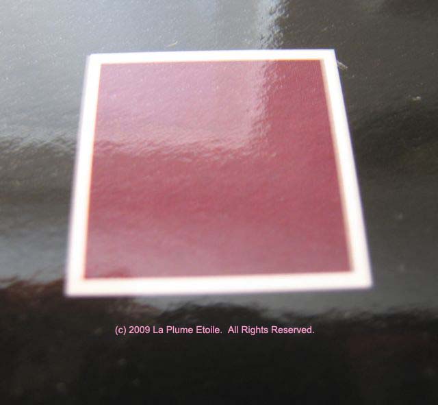
The Color: This color is best described as a dark plum color. However, it is more plum when wet and more of a dark purple when it dries. In French, Poussiere de Lune means “moon dust.” Even though the moon is not plum colored, “moon dust” is the perfect description for this color. I cannot explain it more than that; it is more of a feeling that accompanies the look of the color.
On Paper: This ink is pretty consistent on different papers. No feathering and very light to no shading. The writing sample in the photos was taken with a glass dip pen, so there is more shading than when writing with a fountain pen.
Consistency: Saturated and consistent. It flows well
Other Considerations: I realize this review is slightly shorter than normal, but I don’t know what to say about this ink other than I really love it! I am consistently excited to use it and have to resist filling all my pens with it in order to give some of my other ink colors a chance.


Thanks for the great review! What was your favorite Herbin color before this one (possibly) supplanted it? 🙂
That is such a tough question. I have liked all the J. Herbin inks so far. At first, Vert Olive was my favorite, but then I really loved Rose Cyclamen. Now I think maybe Rose Cyclamen and Poussiere de Lune are the top two. It really depends on my color mood.
This is a wonderful color! I have been using it for a few weeks now and love the deep purple that you get when it dries. Great review! Nr
Thank you for an excellent concise review of a beautiful ink. I can understand your enthusiasm. It must look wonderful on cream or off-white stationery. It appears to bear a close resemblance to FPN Tulipe Noire, though perhaps a shade lighter.