
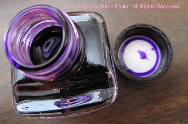
The Color: This color is a true violet color, with more blue tendencies than pink.
On Paper: This ink shows up well on paper. It is not bright, but more bright than dull. It is just right.
Consistency: Saturated and consistent. It flows well and shades with wetter-writing pens. The writing samples shown were with a glass dip pen (review coming soon) on Rhodia paper, but loaded in a Reform 1745, it can sometimes be a bit dry.
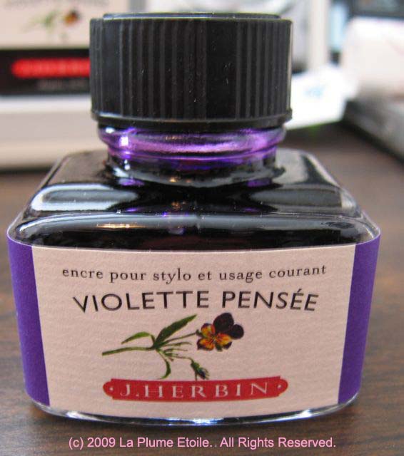
Other Considerations: I originally thought Violette Pensee meant “violet thought, which I thought was a nice sentiment.” It turns Pensee is also a flower, and that is this ink’s reference. (Thanks JFT.) Either way, this ink is pleasant, calm and attractive.
Here’s the flower:

The ink:


I could not have really asked for a more rewarding blog. You happen to be always at hand to provide excellent tips, going on to the point for simple understanding of your website visitors. You are undeniably a terrific specialist in this arena. Thanks for remaining there visitors like me.