
Here is another winner from my new favorite brand of ink, J. Herbin.
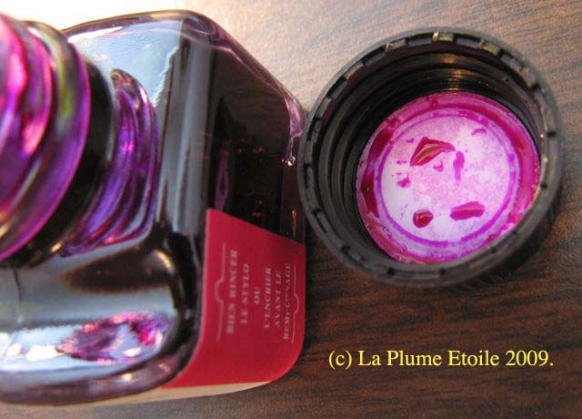
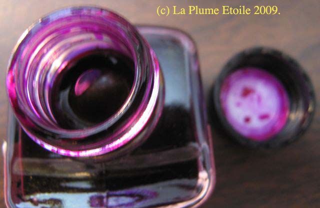
The Bottle: It’s just like the other J. Herbin bottles — small, cute, French and has a depression to rest your pen.
The Color: Rose Cyclamen is a bold magenta/fuschia color, much like the flower for which it was named. The ink color is almost exactly like the color of the flower below.

Photo by jam343
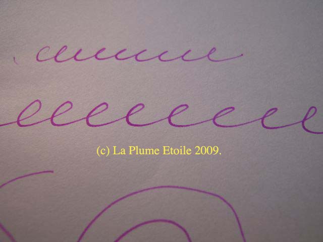
It has very little shading and feathering. If you examined your writing VERY closely, you might notice the slight feathering, but most people would not examine anything you wrote that closely. Unless, of course, they are ink-obsessed like us.
On Paper: It shows up well on all papers I have written, including plain white paper and a yellow legal pad. As to be expected, the ink has a brighter color on the white paper than the yellow.
Consistency: Unlike my last review of J. Herbin’s Vert Empire, Rose Cyclamen is bright, bold and saturated. It is not thin or like a watercolor.
Other Considerations: According to this site, the Cylamen flower symbolizes resignation and goodbye. This is a sad sentiment that does not match the cyclamen’s bright color. Aside from this symbolism, J. Herbin’s Rose Cyclamen is fun, bold and cheerful. I would also guess this is a woman’s ink, as I don’t know many men who would use this color.
Rose Cyclamen is definitely a new favorite! Photos are below.

Colour looks lovely and your view makes me think, “do I need another ink.”
Thanks.