
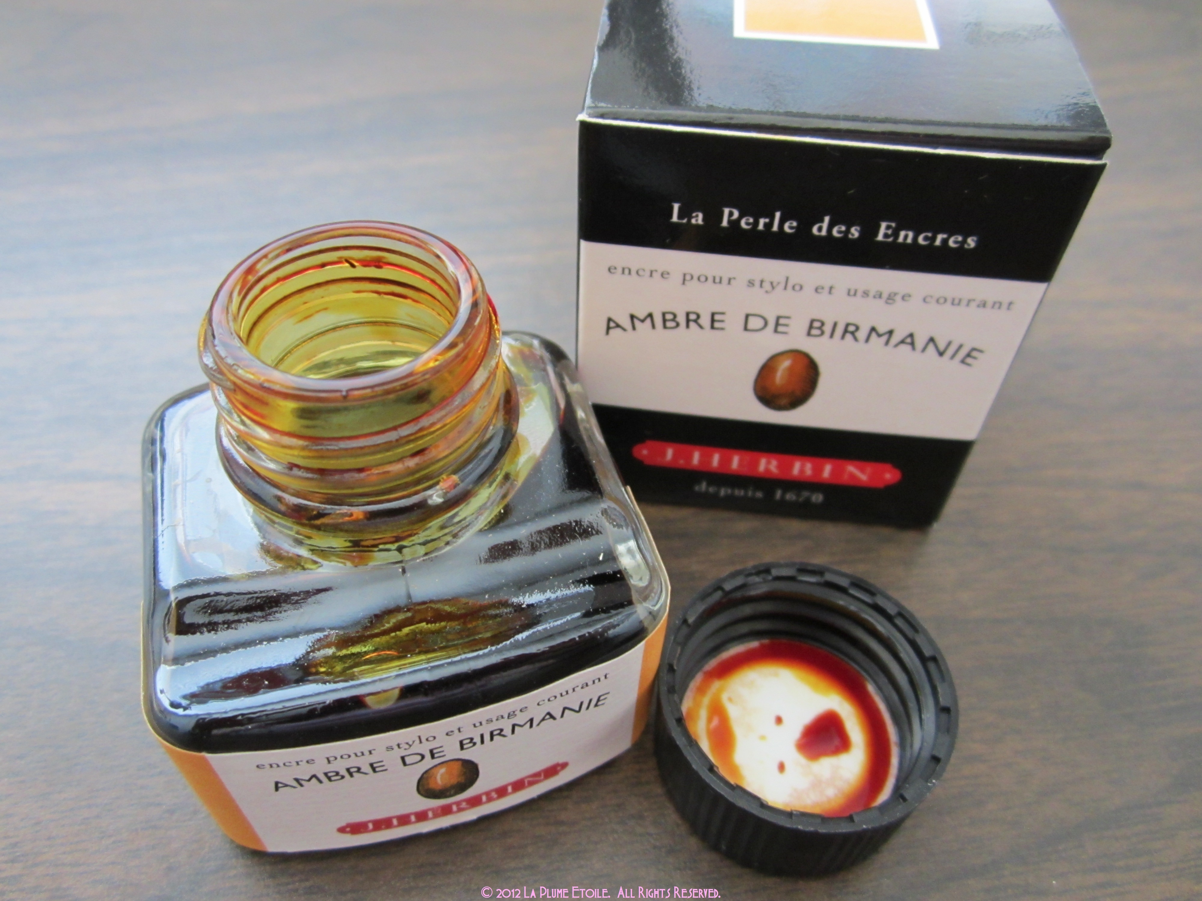
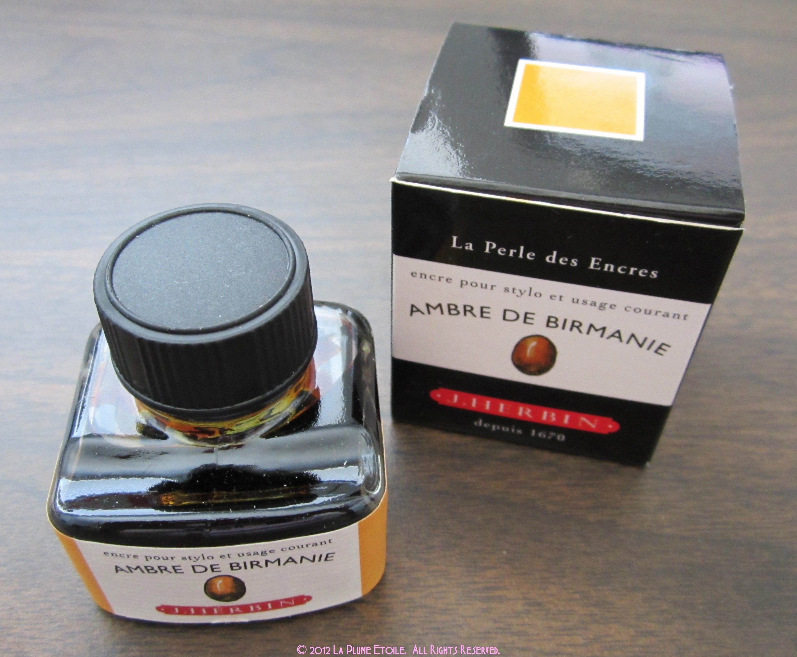
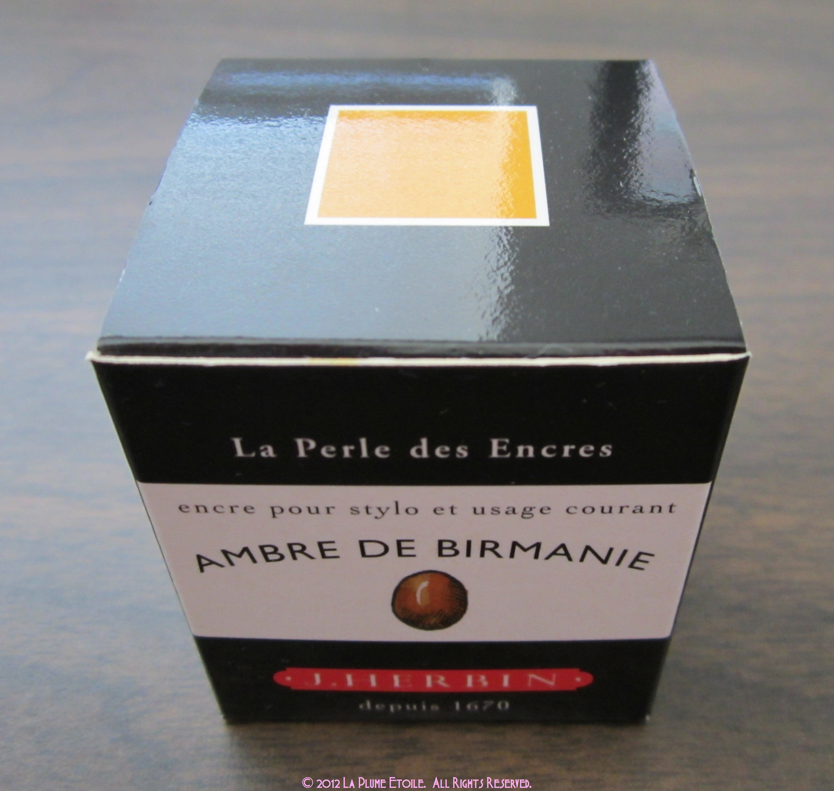
Ambre De Birmanie means Amber in Burma according to Google Translator. Is this what Amber looks like in Burma? I have no idea. However, I do know that this ink is awesome!
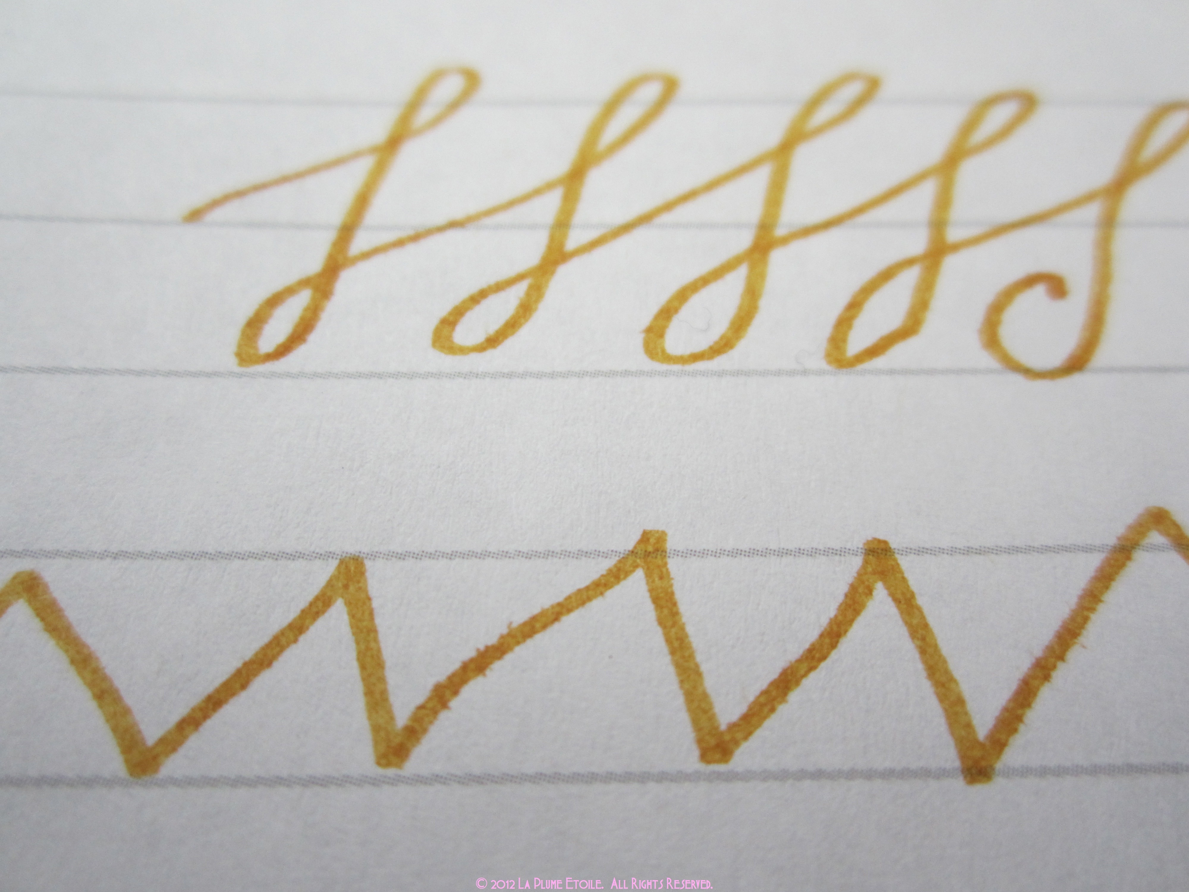
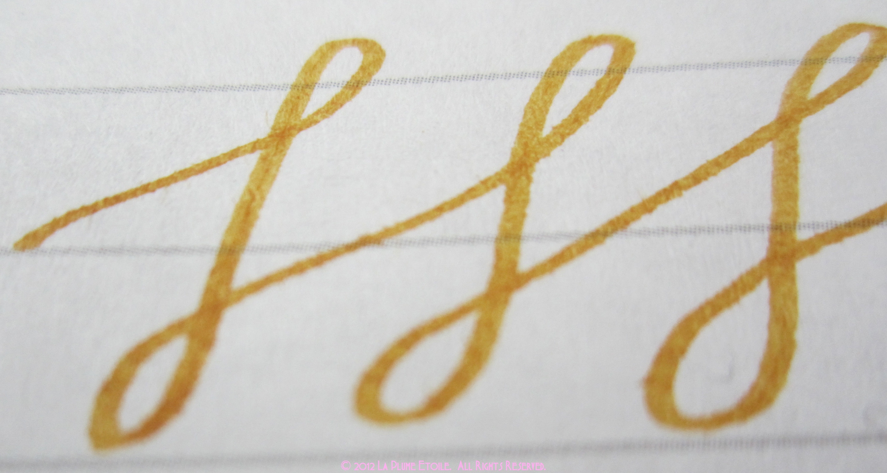
The Color: It reminds me of a goldenrod marker I had as a kid. It’s a little darker and more orange than a gold color. However, when I write with it I sort-of feel like I’m writing with liquid gold.
Consistency/On Paper: It’s very wet and has amazing shading. So far, I have been using it exclusively with a 1.1mm italic nib because I’m obsessed with the shading!
Overall: I love it!!! The color is great and shows up well on paper. The shading also gives it a very elegant character. The only thing to watch out for is that because the ink is so wet, it will feather or look not as crisp on some cheaper papers.
Purchasing and Pricing: A 30mL bottle runs between $7-12 depending on the retailer and is available at most online retailers catering to fountain pen and ink users.
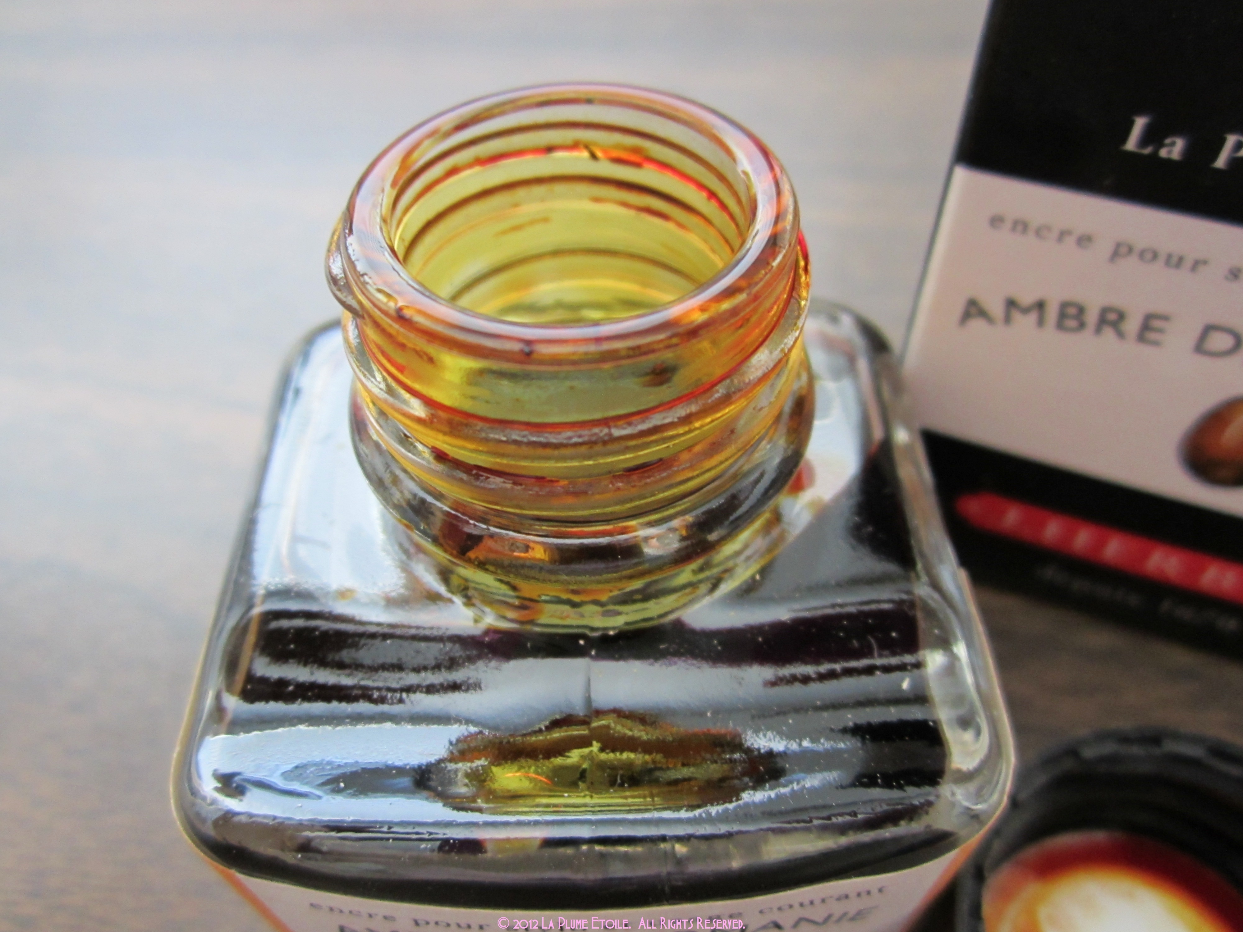
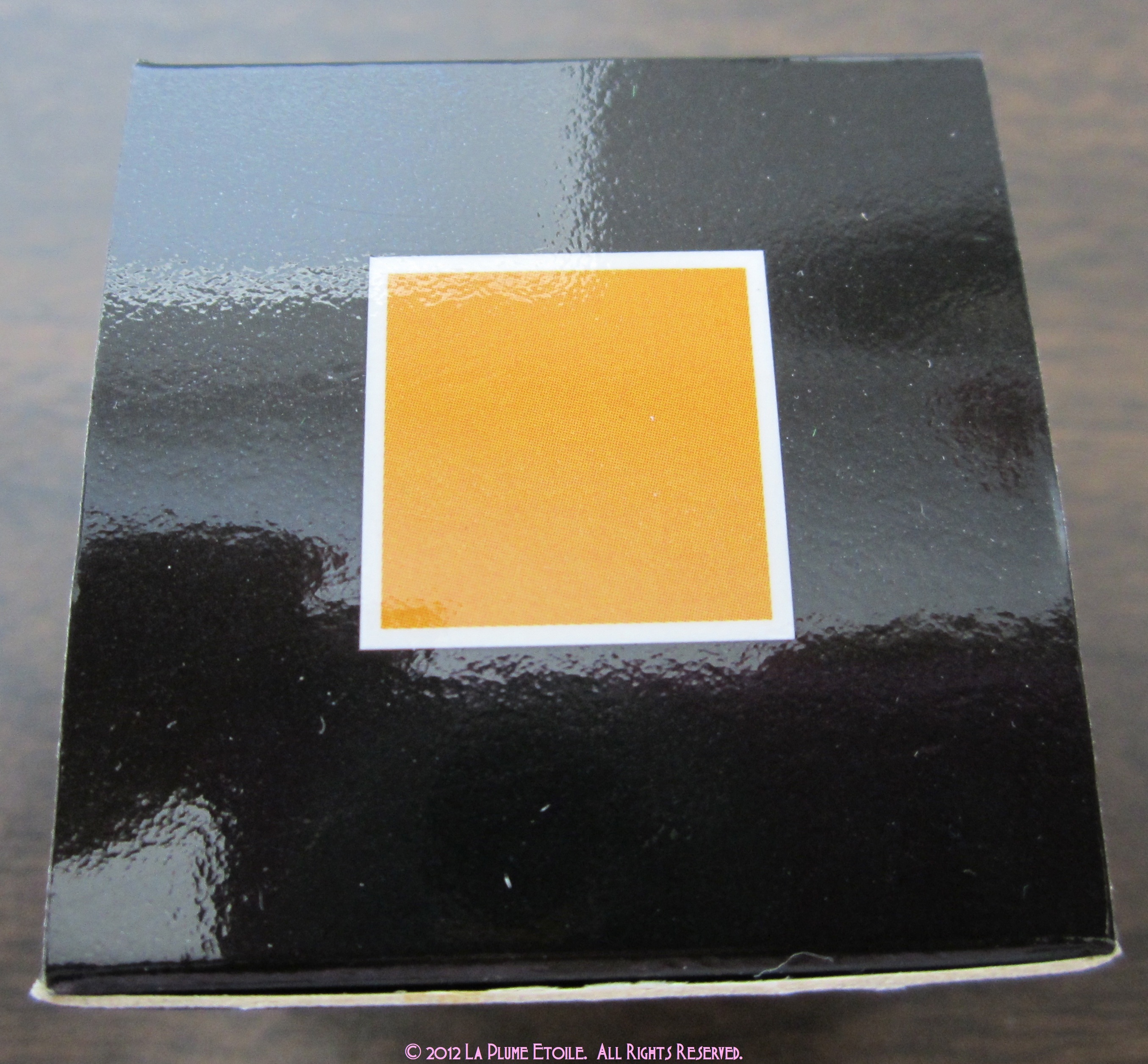
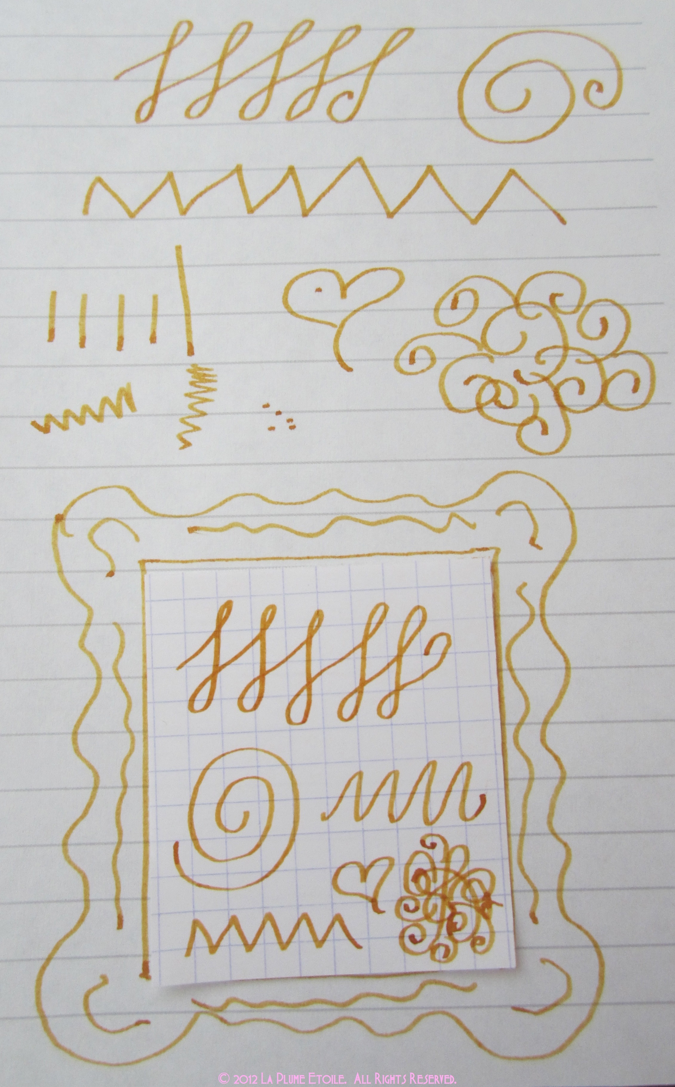
A Note on the Photos: I started with some box and bottle photos. On the doodle photos, the doodles inside the picture frame shape are on Rhodia graph paper (the good paper). The frame and surrounding doodles are on cheaper notebook paper, for comparison. Towards the end of the photos, I have included some close-up photos of Ambre on the cheaper paper so you can see some slight feathering. However, even this cheaper paper handled the ink fairly well.


Wow, that looks like one gorgeous color! I have recently revisited J. Herbin ink and appreciated their great shading quality. Does it work well on normal paper? Bleu Pervenche I have is pretty picky when it comes to paper.
It’s a great color! It usually does work well on normal paper. I’ve really only had the feathering problem with cheap paper, so it should be fine. It’s one of my faves!