Archives

New Iroshizuku Mini Ink Bottles are coming!

Just got word from the folks at JetPens.com that they will soon be getting in mini-sized bottles of Iroshizuku inks. No word yet on ounces or pricing, but I find this to be very exciting news for those looking to try some Iroshizuku colors without committing to the large bottle and hefty price tag.  More info as it’s released…

Montblanc Releases New Princesse Grace de Monaco Fountain Pen

Montblanc has just announced a New Princesse Grace de Monaco Writing Instrument.   This fountain pen features an ivory resin body with platinum plated fittings and a pink topaz stone.  It seems to only come with fine or medium nibs, which is a bit disappointing to those who like fancier nibs.  However, this pen does not seem like a “creative nib” kind of pen to me, so I think the fine or medium choice is fitting.

Photo via Montblanc.

This pen is very similar to the previous Princess Grace edition which featured the same stone and styling, but with a deep purple resin body.   I feel like the ivory body fits Princess Grace more than the deep purple, although a light baby blue would have also complimented her essence nicely.

I have not written with this pen, but my guess is that you will probably like it if you have and like other Montblanc pens.  I tried the Montblanc Ingrid Bergman pen (review here) a few years back, and was disappointed with a dragging nib.  Just based on looks alone, this new Princess Grace pen is a winner as it completely compliments my style.

The new Princess Grace de Monaco Fountain Pen retails at $1,035 at Montblanc’s website and stores.

Review: Levenger True Writer Obsidian Fountain Pen

It’s been a little while since I’ve posted a pen review, but I’m now happy to tell you about one of my new favorite pens, the Levenger True Writer in Obsidian.

Appearance:  This is a nice looking pen!  This True Writer (“TW”) is black with “silver” accents.  I say “silver” because it is unclear from the product information whether the rings and clip are chrome or some other type of silver-colored metal.  The cap is black with a “silver” contoured clip and ring and then pen also has a cap ring engraved with “Levenger” and “True Writer.”  The body has another “silver” ring at the bottom and both the cap and bottom end of the pen have black jewels to match the body.  The section is also black.  The photo on the pen’s product page makes the black look more matte, but it’s actually very glossy.

LPE-TWinbox

LPE-TWjewel

Body:  The pen measures 5 1/2″ in length, 5/8″ diameter and weighs 0.77 oz.

I normally prefer thinner/medium pens over fat pens, and upon first use I felt the body/section was a little too wide.  However, after using the TW for only a few minutes I got used to the the width and now I barely notice it — even after switching between the TW and thinner pens.  It’s actually nice to have a bit of a fatter pen on certain days as it is quite comfortable to hold and use.

Nib:  Levenger nibs (this one included) are stainless steel and interchangable.  I requested a fine nib for this pen, but was sent a medium.  I was initially disappointed at this oversight, but upon first test my disappointment turned to pleasant surprise as this particular medium is on the fine side of medium and is actually just about the width for which I was hoping.  Levenger nibs have a tendency to be inconsistent in their widths, meaning some fines are finer than others, some mediums are more fine or more broad, etc.  It really just depends on which nib you get.  The nibs unscrew at the bottom of the section and thus can be exchanged with any other Levenger nib.  I had a slight problem with the converter/section/nib combo where the nib started unscrewing on its own and the ink leaked onto my fingers.  However, once I tightened it all was well again.

On first test the nib also seemed really stiff, however, I flexed it a little to spread the tines and after that the nib has been springy and very comfortable to use.

Caution:  be careful if you flex the tines on your Levenger nib because these nibs are not flex nibs.

LPE-TWnibcloseLPE-TWpiecesboxLPE-TWuncapped

Performance:  Some TW users recommend cleaning or soaking the nib to remove any factory oils that may be present, but I decided to try it as is and see how it performed.  The flow was great from the first touch of nib to paper and the nib was perfectly smooth.  I filled the converter only part way the first time, and the nib started drying out close to the end of the ink reservoir, but before the pen was actually out of ink.  Concerned, I filled it again so it was full and while I did have one more dry nib issue, it has been performing reliably since then.

This pen comes with one mini-cartridge and one converter.  I chose to use the converter so I could pick my ink of choice.  I initially inked the TW with Iroshizuku Ku-Jaku (review forthcoming) and they have been great friends.  The flow is wet, although I think that is due to both the pen and the ink, as Ku-Jaku tends to have excellent flow.

levengertw-writingsampleLPE-TWbox2

Overall:  The Levenger TW is now one of my new favorite pens, and definitely my favorite modern pen so far.  It is visually sleek, well-balanced, comfortable to use, and reliable.   I would definitely recommend this pen.

However, I did have some problems with the Levenger employees/customer service reps.  I had called the company’s toll-free number for some information and both people I spoke to were extremely rude to me and refused to answer my questions.  For that reason I am hesitant to support the Levenger company itself with my hard-earned money.  I found this to be unfortunate, as it seems they make good products and I was hoping to become a regular Levenger customer.

***UPDATE 4/7/14****  I was contacted by Levenger’s Director of Marketing to find out about my bad customer service experience.  He was quite apologetic and the company has already taken steps to handle the conduct of the employees.  It seems my experience was rare and now I feel much more comfortable endorsing Levenger’s commitment to excellent customer service.  The company really does care about their products and reputation, so I am glad this situation was corrected. I am happy to continue to support Levenger and will bring you more reviews of Levenger products in the future.

Price:  The pen retails for $59 on Levenger.com.  Also available on Amazon – medium nib here and fine nib here.

Here’s a bonus box shot for those of you who love the boxes!

LPE-TWbox

Review: J. Herbin Vert Réséda Fountain Pen Ink

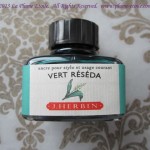
J. Herbin’s Vert Réséda has also been one of my favorite end of summer/beginning of fall inks.   The name translates as “reseda green” and the ink lives up to the quality I expect from J. Herbin.

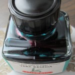
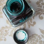
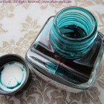
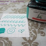
The Bottle:  Like all J. Herbin bottles, the bottle is compact and has a much appreciated pen rest.  One newer feature is that the cap is shiny black plastic, whereas previous bottles had more of a matte plastic cap.

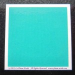
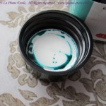
The Color:  This color is hard to describe, but it’s sort of a minty teal/turquoise.  It also matches one of my sealing waxes exactly, so that is a plus for someone like me who likes to color coordinate my writing accoutrements.

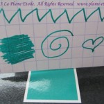
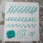
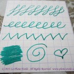
Consistency/Flow:  I found the flow to be moderate at first, but actually it got wetter the more I used it.  I started out testing the ink with an Esterbrook dip pen (nib 2442), and the flow was good.  Then I inked it in one of my vintage Vacumatics.  The flow started off just okay.  Now that I have refilled that pen several times with Vert Réséda, I have noticed that the flow has increased, the ink is wetter, and the color is slightly darker.  So this slightly darker color is what you see in the writing samples pictured, but note that you might experience the color to be a bit lighter and closer to the square on the top of the box.

Shading, Feathering, and Other Characteristics: I have not experienced any feathering with Vert Réséda.  At first, there was barely any shading at all.  I was slightly disappointed, but liked the color so much that I planned to continue using it even without shading.  However, again through refills and continued use, the shading has also increased along with the flow and wetness as described above.  As you can see the writing sample, it now has a fairly decent amount of shading.  This development is much to my delight, although I do not know if these results are typical for all users.

Writing sample close-up to see shading.

Writing sample close-up to see shading.

Overall:  I really like this ink and plan on keeping it in my regular rotation.

Writing samples written on Rhodia mini graph pad.

Writing samples written on Rhodia mini graph pad.

Purchasing and Pricing:  A 30mL bottle runs between $7-12 depending on the retailer and is available at most online retailers catering to fountain pen and ink users.  You can also purchase from one of the links below to help support La Plume Etoile.


Review: Bexley Admiral Fountain Pen

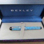
I haven’t had a pen review for you for a while, so today’s review is of the new Bexley Admiral fountain pen in Reef Blue.

The ink used for this pen test is J. Herbin’s Eclat de Saphir (my review here).

I would like to express thanks to Howard Levy of Bexley Pens for loaning me this pen to review.  I have some mixed feelings about this pen, all of which I have discussed with Howard.  I will express all my opinions to you because I feel the honesty and integrity of La Plume Etoile and my reviews are of the utmost importance.  Also, please note that my current layout is chopping the photos, so please click on the photos for a full view.

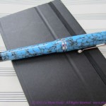
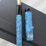
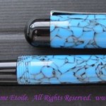
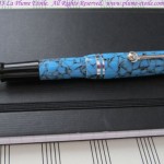
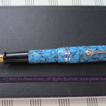
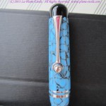
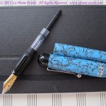
Appearance:  The pen has a nice overall appearance.  I personally was not a fan of the Reef Blue crackle pattern because I thought it looked “plasticky,” but that is just personal preference.  Reef Blue comes with rhodium plated accents, and the two cap rings are a nice touch.  I also enjoyed the unique clip design that ends in a ball framed with a crescent shape.

Body:  The body is short in the hand, similar to vintage demi and junior sized pens.  I have included one photo of the Admiral with a vintage demi-sized Parker Vacumatic for comparison.

Here are the Admiral’s measurements:

–  5.25″  posted

– 4.5″  body + section with nib (no cap)

– 3.5″  body + section without nib (no cap)

–  just under 1″  for the nib by itself

– 2.5″  for the cap alone

– weight is just under 1 oz (about 0.8 oz) according to my food scale.

The width of the pen is fat, but not too fat.  The pen body is made from solid body cast acrylic, but it is really lightweight and much too light for my taste.   Frankly, I couldn’t tell the different between the solid body cast acrylic and thin plastic.  Companies like MontBlanc use injection mold acrylic which makes for more substantial, yet more fragile pen, so the benefit of Bexley’s acrylic is that it will withstand dropping, etc. much better than other pens.  However, I personally prefer a more expensive feeling pen and am careful to use more caution.

bexleyandparker

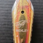
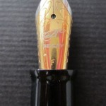
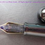
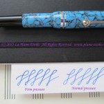
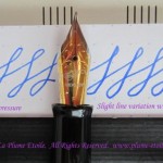
Nib:   The nib I tested was a Fine.  It is mostly stiff but does give a little if forced.  There is slight variation as seen in the photos.  The two-tone decorative nib is attractive, but too large for the pen.  The choice of large nib by Bexley is due to inventory, as it is easier for the company to stock one size of nib than different sized nibs to fit different pens.  Although it would be more difficult and expensive for the company, I think it would be better to stock different nib sizes so that the nibs are properly in proportion with each pen’s body size.  However, for the price of the pen, you definitely get quite a lot of nib!

Using the Pen:  As previously stated, the pen is very lightweight.  This is good for long writing sessions and people with hand/wrist/arm issues, but I felt the lightness slighted the balance just a tad.  The cap comes down too low so it rests in the crook of my hand when writing.   If I didn’t post the cap securely, the movement of my hand would loosen it and keep knocking it off the end of the body.   However, this can be avoided by post the cap tightly.  Because the cap posts onto the pen body inside the top of the cap, there should not be a risk of cracking the lip of the cap.   I found the weight a little too light when using unposted, but I did mostly write with it unposted because I didn’t like the cap position.

penwith8s-2

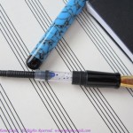
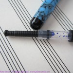
Converter:  The Admiral takes mini-cartridges and comes with a Monteverde mini-converter.  Admittedly, it took me three tries to fill this pen because I kept trying to twist the converter.  Most converters operate by twist, so I thought this to be the same.  This converter, however, does not twist.  You just pull up the black plunger and it sucks up the ink like a vacuum.  The good thing was that the operation of this conveter is easy.  The bad is that is holds a VERY small amount of ink and it needed to be refilled after one evening and one morning of normal writing.  The bonus was that cleaning the pen was one of the easiest I have ever cleaned.  I removed the converter, sucked up and released water a few times and that part was done.  I flushed the nib unit under the faucet and only had to drain it twice before there was no ink in the tissue.  That was definitely a benefit!

Performance:   The best part of this pen was the performance.  The nib was very smooth with no scratchiness.  There was no specific sweet spot to the nib and it wrote well at all angles, except if you turned the nib completely on it’s side (which you wouldn’t do anyway).  There was almost no skipping (a couple small skips on letter starts) and the ink flow was continuous.  This could definitely be a daily workhorse pen if the body is comfortable for you and you like its weight.

figure8s

Price:  All pens in the Bexley Admiral Collection retail for $139.  Richard Binder has it for $104.

Overall:  I have been told the pen has been selling well and customers are very happy with it.   At that price point, I was personally disappointed at the look, feel, and weight of the acrylic; the too-large nib; and the small converter.  However, the performance was very steady and the acrylic is supposed to withstand breaking, so you might like it if you want a very lightweight pen that you could carry around with you and be a daily workhorse.

Here are a few miscellaneous photos for the box fans:
I Am a Nibmeister!

Okay, well I would not put myself in the same category as some of the renowned nibmeisters and modifiers known throughout the fountain pen community.  However, today was a very exciting day for me.  I ground my own custom oblique nib!

I have a vintage Lady Sheaffer from the 1970s and the nib was never quite right.  It was a decent fine nib, but always a little scratchy.  I had used some fine grit emery paper on the nib before to smooth it out, but it was still never quite right.  I decided to take another shot at smoothing it out today, but had no intention of a full nib modification.  When using emery paper on a nib, one minor adjustment is actually huge.  If you change one little thing, it throws off the whole balance of the nib and you have to keep grinding it to get it back to a comfortable state.  After continually grinding the nib down for what must have been about an hour, I ended up with a slanted, oblique nib.  And now, the nib is actually smoother than it’s ever been and it’s oblique!

I don’t really have a tutorial on which way to grind the nib, I just kept grinding it and it sort of happened organically.  I’ll just let the photos speak for themselves.  (The writing sample was made with J. Herbin’s Ambre de Birmaine.)

Review: Sula Jane and Earl Pen Sleeves

More goodies from Sula Jane and Earl!  The next products are the Single Pen Sleeve and Shorty Single Pen Sleeve.  Again, a wide variety of colors are available.  The leather is the same quality as the previously reviewed Calling Card Sleeve, so I won’t go into the same specifics.  The sleeve is cut and stitched well and seems like it will hold up to many uses.

The Single Sleeve measures Approximately 6.5″ H X 1.75″ W and mine is in “Scarlet,” a lovely deep red color. I couldn’t get the color right on the screen, as I think the photo made the color appear brighter than it in actuality.  The color is actually a little darker and not as bright as the photo.  For reference purposes, I photographed the sleeve with a full sized Pilot Varsity disposable fountain pen, as I thought most people would be familiar with those pens and could get a good idea of the sleeve size in reference to the Varsity. I didn’t slide the pen all the way in for the photo, but a Varsity will actually slide all the way in and leave about 0.5” of room at the top.  The Single Sleeve is available for $24.


 The Shorty Sleeve is the same as the Single Sleeve, except shorter!  The Shorty measures approximately 5″ H X 1.50″ W, which is perfect for my demi and junior sized pens.  These smaller pens will fit fully inside the sleeve without sticking out of the top much or at all.  My Shorty is pictured below in Plum, and the Plum in my Shorty features a slightly different leather pattern/texture than the Single Sleeve.   The Shorty Sleeve is available for $21.


Ink Review: J. Herbin’s Encres Acidulees Effet Scintillant (Pearlescent Inks)

Thanks to Karen at Exaclair, I recently had the opportunity to try some very fun and fancy inks.  J. Herbin’s Encres Acidulees Effet Scintillant  are Herbin’s group of Pearlescent Inks.  These inks are NOT for fountain pens, they are for dip nibs only.  There are several colors, all of which have a shiny/glittery/pearlescent sheen.  I discuss each ink in the group below.

The Colors (listed in the same order as the sample photo)

Pink:  A lovely bubblegum pink color.  When the ink is thinning on the nib, it can be sheer.  Frequent dipping to have a lot of ink on your quill/nib is best.

Peach (Peach):  A lighter, less pink color with more orange to it.  Same properties as the pink.

Blue:   A dark royal blue color.  It was really nice and quite a surprise as I expected a sky blue color since the rest in the group are more pastel.  As you can see, it doesn’t show up well on the darker paper.  I suspect it would do fabulously on a lighter paper.

Yellow:  Bright!  Despite it’s brightness, the hue is more of a softer yellow rather than obviously neon.

Green:  Also quite bright.   Maybe a prime creamy avocado?

Consistency/On Paper:  This ink takes a little trial and error to get it right.  I had to try a few nibs, but then found it worked well with some of the very small Brause nibs (again from Karen and distributed through Exaclair) because the smaller nibs held the ink and allowed it to flow onto the paper best.  The bigger nibs didn’t let the ink flow down well enough to complete a line.  Even with the small nibs, I had to dip often to keep enough ink on the nib so that the ink stayed thick and didn’t thin out like you can see in part of the writing sample.  I also had to take care in my pressure on the nib to avoid the ink transferring too quickly to the paper and creating blobs, as is a concern with wet ink.  However, I found working with care and patience avoided this problem.  This is definitely an ink to play with when you have some relaxing time to devote your attention without rushing.

Paper choice was also an issue.  I’ll save you some time — you can avoid reaching for the cheap paper.  This ink needs sturdy, thicker, high quality paper to support the thickness and composition of these inks.  The brown paper in the photo is a sample of G.Lalo (again, distributed by Exaclair  – this paper is great and a review is forthcoming).   The inks were very happy to be paired with G. Lalo paper and you shouldn’t have a problem if you use G. Lalo or a similar high quality paper.

An additional note is to take care in handling your writing even after the ink has dried.  As you can see in the photo, the pearlescence tends to smear a bit.

Overall:   There have been some other blogs in the pen and ink world that have given these inks poor reviews.  However, I really enjoyed testing these inks and plan to use them for special occasion items such as when writing someone a special card.  I already used the yellow color to make an artistic name card for someone special (on grey G. Lalo paper in case you are interested – it was a lively combination!).  I will be using these in the future.  If you are interested in them , I would recommend giving them a chance and playing with the right nib and paper combinations.  I have not tried other calligraphy inks that may be similar to these, so I cannot compare them to other brands.  I also just learned there are a few colors (like coral red!) that I did not get to try.  I must have that coral red!

Purchasing and Pricing: A pack of 5 assorted 10ml will run you around $20, depending on the retailer.