Ink

J. Herbin Bleu Pervenche

The Color: This color is a great blue-turquoise color, but definitely more blue than turquoise. It reminds me of cheerful, summery blue that painters will often use to depict the ocean. It also looks exactly like the swatch on the box and as shown in the bottle.

On Paper: Like most J. Herbin inks, it looks great on paper and lives up to its expectations. If you have tried the disposable Pilot Varsity in the similar color, Bleu Pervenche is just a bit lighter and less saturated.

Consistency: Fairly saturated and consistent. It flows well and exhibits some slight shading. The first writing sample shown was written with my J. Herbin glass dip pen on Rhodia paper.

glassdipwrite

I wrote the next sample with a Pilot Varsity refilled with Bleu Pervenche on card stock.

writevarsity

The photo editing makes these writing samples look a bit washed out.  They are brighter and more vibrant in reality.

Other Considerations: Bleu Pervenche means Blue Periwinkle in French. Using this ink in business is “iffy” because on the one hand it is blue, but on the other hand, it’s a bit more fun. This one stays in my personal rotation and is a great, cheerful alternative to blue.

bponglassnib bottlefront

openbottle2 openbottle

boxtop box

Restoring my new vintage inkwell

My friend Ian recently gave me an Esterbrook No. 427 Dipless inkwell.  I believe it belonged to his parents and it has been sitting unused for quite some time.

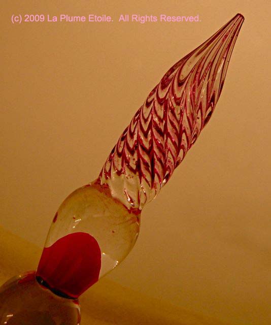
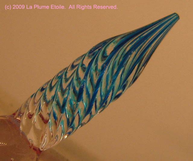
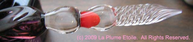
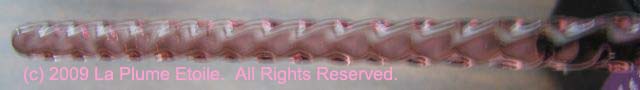
About the inkwell: There is not much information about this kind of inkwell online and it seems to be somewhat rare.  I have learned they were produced roughly between 1940 and 1952.  The base is made of bakelite, which is one of the first plastics made from synthetic compounds.  Bakelite has been used for radio casings, jewelry and other items.  The “dipless” type of Esterbrook inkwells does not mean that you don’t have to dip the pen.  The construction of the inkwell allows for a resavoir of ink where the pen inserts, so the pen needs to be dipped less often. These inkwells also came with chrome clips that fit on the grooves of the glass, but these clips were missing on mine.

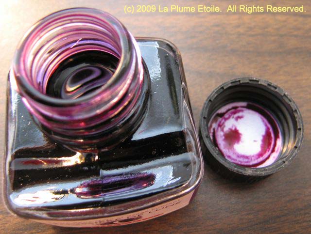
The Beginning: Here is a photo (using the flash) of my inkwell when I received it.  The glass wells are upside down here and, as you can see, the entire inkwell is caked in dirt.

dirtyflash

Here is a shot without using the flash:

dirtynoflash

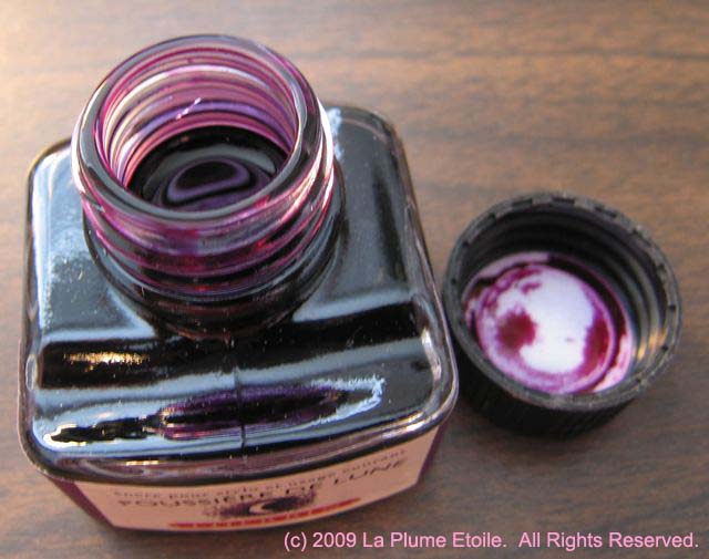
Cleaning: I filled a bucket with water and dish soap.  I rinsed all parts with water, and let the parts soak in the bucket while I worked on each piece individually.  There was still some very old ink inside the well and I was surprised to see it flowing out when I rinsed the well.  I carefully scrubbed the glass wells and rubber stoppers with a toothbrush and the soapy water.  Next, I did the same with the base portion, however, I also had to use a hard bristle cleaning brush because the remaining dirt was firmly stuck to the base.  Here is the result after cleaning it as best I could:

midflash

As you can see, there was still a bit of grime on it and the finish is very dull.

Polishing: After doing some online research and asking around, I learned the best product to restore and polish bakelite is a polish called Simichrome.  Simichrome is also used for silverware and, you guessed it, chrome.  The problem with this product is that it is extremely hard to find in brick-and-mortar stores.  I called eight stores before finding it in a local hardware store.  Simichrome is available on Amazon.com and various online retailers, but I much prefer buying products at a physical store. After finally buying a tube of Simichrome, I used it with a soft cloth to polish the base.  I used a car polishing cloth, but you can also use a soft old t-shirt.  First, apply a tiny amount of Simichrome on the cloth.  Second, rub Simichrome on the bakelite in circular motions, then buff it off with a clean portion of the cloth.  At first, the bakelite didn’t look much shinier than before.  Then I discovered that the magic really happens in the buffing portion.  Slowly, the bakelite started getting shiny. After buffing, the bakelite looked good.  However, I decided I wanted the bakelite even shinier.  I came to terms with the fact it would not be as shiny as if it had a clear-coat on it, but I wanted it to be as shiny as possible.  I then used Turtle Wax car polish and rubbed it on/buffed it out in the same manner as I did with the Simichrome.  The Turtle Wax I used was the paste version in the tub and it really helped to bump the shine up a notch.

Disclaimer: Using Turtle Wax was my own decision, as nobody recommended it to me for restoring bakelite.  I do not know if Turtle Wax is good for bakelite in the long term.  However, it worked really well, with no apparent damage to the bakelite.

Final result: In bright light, as seen below with the flash, you can still see some scratches in the bakelight:

finalflash

Without flash, you can see how the bakelite really shines.  This is how it looks in reality:

finalnoflash

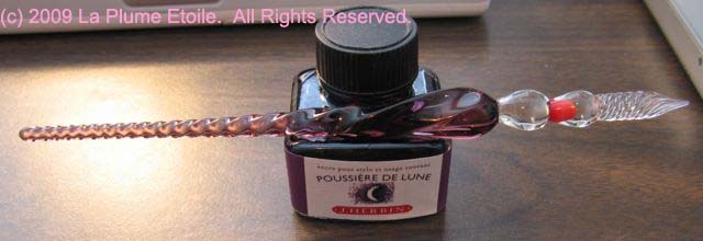
Here are two more shots, with flash and without flash respectively, as to how the inkwell looks on my desk:

ondeskflash

ondesknoflash

I am really happy with how beautiful this inkwell looks now!  I am also happy to be able to give it new life and a good home.

I am happy to answer further questions about this restoration and comments are  welcome!

Diamine Ink: Poppy Red

The Bottle: A small rectangle plastic bottle. I think this is just for sampling purposes.

The Color: This is a true red color. It skews more orange-red than blue-red, but it is just a great red color.

Consistency: Saturated and consistent. It normally flowed well, although sometimes it would get clogged in the nib and flow a little thin. I know others use this ink without any problems, so my problems may have been partially caused by the pen or the paper I was using. However, these problems have been reduced when using other inks in the same pen.

Other Considerations: As much as I liked the color of this ink, it stains. I realize most inks will stain clothing, fingers, etc. However, this ink also stained the interior of my pen. I tested the ink in a modified Pilot Varsity, so I was not using a converter or sac. After rinsing the pen, the plastic barrel was stained a light red color, which is something I have not often seen with other inks.

I have to say I would be very hesitant to use this ink in any of my vintage pens and would only use it in something disposable like a modified Pilot Varsity.  Like I said, I know other people have used this ink with no problems, so my experience may be an isolated incident.  If you like the color, try it and see how it works for you!

J. Herbin Glass Dip Pen

Appearance: This pen is BEAUTIFUL!  It is an intricately crafted spiral and a lovely darker purple that matches J. Herbin’s Poussiere de Lune ink.  While the tip is clear, it does sometimes reflect the violet color of the body.

Weight: Comfortable and well balanced.

Functionality: The spiral in the lower body (near the tip) functions almost like a grip.  The grooves in the tip beautifully hold the ink and writes between two and three lines before having to dip again.   The pen does need to be rotated while writing to get the most longevity out of each dip.

This pen provides wetter and more saturated lines than most fountain pens, and I have been using it to test all my new inks.  It provides a quick and easy way to test inks, especially when I am anxious to try a new one!   Because of the increased wetness, the inks appear darker and have more shading than they do when loaded in a fountain pen.

This is a gorgeous pen and I am happy to have it as part of my collection.  Now I want more…

Please see below for detailed photographs of the pen and ink on the tip of the pen.  Click on the thumbnails for full size shots.

J. Herbin Violette Pensee

The Color: This color is a true violet color, with more blue tendencies than pink.

On Paper: This ink shows up well on paper. It is not bright, but more bright than dull. It is just right.

Consistency: Saturated and consistent. It flows well and shades with wetter-writing pens. The writing samples shown were with a glass dip pen (review coming soon) on Rhodia paper, but loaded in a Reform 1745, it can sometimes be a bit dry.

Other Considerations: I originally thought Violette Pensee meant “violet thought, which I thought was a nice sentiment.”   It turns Pensee is also a flower, and that is this ink’s reference.  (Thanks JFT.)  Either way, this ink is pleasant, calm and attractive.

Here’s the flower:

The ink:

J. Herbin Poussiere de Lune

I was so excited about trying J. Herbin’s Poussiere de Lune ink and it has lived up to my expectations. Is it possible for me to have a new favorite J. Herbin ink?

The Bottle: Same as all the other J. Herbin ink bottles

The Color: This color is best described as a dark plum color. However, it is more plum when wet and more of a dark purple when it dries. In French, Poussiere de Lune means “moon dust.” Even though the moon is not plum colored, “moon dust” is the perfect description for this color. I cannot explain it more than that; it is more of a feeling that accompanies the look of the color.

On Paper: This ink is pretty consistent on different papers. No feathering and very light to no shading. The writing sample in the photos was taken with a glass dip pen, so there is more shading than when writing with a fountain pen.

Consistency: Saturated and consistent. It flows well

Other Considerations: I realize this review is slightly shorter than normal, but I don’t know what to say about this ink other than I really love it! I am consistently excited to use it and have to resist filling all my pens with it in order to give some of my other ink colors a chance.

Review: J. Herbin Rose Cyclamen

Here is another winner from my new favorite brand of ink, J. Herbin.

The Bottle: It’s just like the other J. Herbin bottles — small, cute, French and has a depression to rest your pen.

The Color: Rose Cyclamen is a bold magenta/fuschia color, much like the flower for which it was named. The ink color is almost exactly like the color of the flower below.

Photo by jam343

Photo by jam343

It has very little shading and feathering. If you examined your writing VERY closely, you might notice the slight feathering, but most people would not examine anything you wrote that closely. Unless, of course, they are ink-obsessed like us.

On Paper: It shows up well on all papers I have written, including plain white paper and a yellow legal pad. As to be expected, the ink has a brighter color on the white paper than the yellow.

Consistency: Unlike my last review of J. Herbin’s Vert Empire, Rose Cyclamen is bright, bold and saturated. It is not thin or like a watercolor.

Other Considerations: According to this site, the Cylamen flower symbolizes resignation and goodbye. This is a sad sentiment that does not match the cyclamen’s bright color. Aside from this symbolism, J. Herbin’s Rose Cyclamen is fun, bold and cheerful. I would also guess this is a woman’s ink, as I don’t know many men who would use this color.

Rose Cyclamen is definitely a new favorite! Photos are below.

Review: J. Herbin Vert Olive

I LOVE THIS INK.

The wonderful Karen at Quo Vadis sent me some J. Herbin inks to review. The first one is Vert Olive. I had read BiffyBeans‘ review of the ink and it’s color immediately intrigued me. I had high expectations for loving Vert Olive and I am not disappointed.

The Bottle: The J. Herbin bottles are cute and small. You can also rest your pen in the depression in the glass!

The Color: I had a hard time getting the color of the ink to show up correctly through my scanner and camera. However, I also took photos of the box and the ink is almost exactly like the square on the box lid. It reminds me of the color of grass stains and green olives.

On Paper: The ink’s color varied in intensity depending on what paper I used. On some cheaper/fibrous/off-white paper, the ink was very light and hard to read. Conversely, it showed up very well on white printer paper. I also used it to take some marginal notes in a textbook, which had the shiny, semi-glossy paper typical of textbooks. The ink was bright and brilliant on that paper. In short, you may have to experiment on different kinds of paper, but I have found it shows up best on bright white paper.

Consistency: Vert Olive is clear and solid. It is not watery, even though it seems like a thinner ink. I did not notice any feathering.

Other considerations: Vert Olive is a very gentle ink. I got it on my hands, it only lightly stained my fingertips and completely washed off by the next day. The drops I spilled in my sink and on my counter top were easily cleaned by wiping with a tissue.

Be aware that this ink is not waterproof. I spilled a drop of water on something I had just written, and the ink almost disappeared!

In conclusion, I refer you back to my first sentence — I love this ink. I will be using it often.

Review: Monteverde Mini Jewelria

Thanks to Monteverde and some luck, I recently won one of their Mini Jewelria pens in green. Here is my review.

Appearance: This is a fantastic looking pen. The green striation area is pretty. The whole pen looks to be high-quality and well made. The iridium nib also has some engraved swirls for extra visual aesthetics. One feature I really like is that not only does the pen cap screw on to cap it, it screws on the top of the pen to post it. This insures the cap will not fly off or flop around when writing.

Size/Weight: When capped, this pen is quite small. When uncapped and unposted, it is tiny. I think the only way to use this pen is posted. I like light pens and this pen is quite substantial. It is not as heavy as some of the larger high-end pens, but it does hold its own in your hand. Depending on the day, my arm may tire after a few pages, although I have written many pages with it before.

Writing: My pen is a medium nib, which is definitely medium. I prefer Fine points, so this is different for me. The pen lays down a smooth wet line — most of the time. The pen often stops writing and I have to scribble with it for a minute until the ink starts flowing again. This is quite annoying when trying to write continuously. I’m not sure why it does this, but I wish it didn’t. I also do not know if this is typical of these pens or if it is my pen in particular.

Ink: This pen only uses Monteverde mini-cartridges, which I find disappointing. Monteverde sells these mini-cartridges in many colors, but I prefer to have bottled inks that usually offer more color variety than cartridges. Black cartridges came with my pen and depending on the paper, it often seems to be more of a black-brown than a pure black.

Overall: The best feature of this pen is its appearance. I do wish it didn’t skip, took a converter and was a bit lighter in weight. With that said, I do like it very much and it is in my rotation. I am very happy and grateful to have won it.