Daycraft Planners and Journals

Daycraft is a company whose products are designed in Hong Kong and made in China.  They make a WIDE variety of planners and journals in various styles and sizes.

The Covers: The covers are sturdy and well bound.  Planners and journals are available in both hard and soft covers, depending on the model you choose.

Size: Again, this varies from pocket-sized to “normal” journal size.

Paper: I’m not sure of the weight of the paper.  It is fairly thin, but not tissue-paper thin.  You can see writing on the other side of the paper, but there is not much bleed-through at all.   The pages are a very nice ivory color, smooth and fountain pen friendly.   The planners are dated and lined, while the journals are just lined.

Some notes on each product I tried: All the planners have some Chinese writing, maps and holidays, which don’t serve much use for users outside of China.  However, each planner does feature some extra blank pages for notes and each month begins with a full color page featuring and inspirational quotation (in English), which I thought was a really nice touch.

Signature Diary – Mini size in light pink (h83 x h125 mm): This is a great little planner to carry with you in a pocket, backpack or purse.  Of course, writing space is smaller because it is the mini size, but it’s lightweight and compact for transporting!   This planner also sports a harder cover for durability.  My sample was light pink, so how could I not love it?

img_4512img_4513

Executive Diary in Pink (w108 x h149mm): Another pink planner — love it!  This one has a hard cover and an elastic closer to hook on a metal button on the front cover.  This was probably my favorite planner as it was simple, chic, a good size with a nice amount of writing space.

img_4504img_4505img_4510img_4507

Chromatic Days in Blue (w106 x h150mm): This is a nice small and thin journal.  The edges of the pages are rainbow!  Its a nice journal with a soft cover.  Not my preference, but great if you like a soft cover!

img_4497img_4502img_4500img_4498

Feminique Journal in Purple (w107 x h152mm): This is a great little journal.  It is compact with a hard cover and good paper.  Because its size is smaller, you will use a lot of pages if you have a lot to say, but I use it for short happenings I need to write down.  It was supposed to have a scratch and sniff scent of lavender, but I could not smell it.

Cool Notebook with the Film Projector cover (w106 x h153mm): I haven’t used this one yet, but expect it will be just as good as the Feminique!

I can’t find the model of the grey planner with cool black plastic decoration, but that one is cool too!!

img_4517img_4519img_4521

Overall: A great line of planners and notebooks.  I would recommend these, espeicially if you want something different than all the standard planners available in the office supply stores.  I want the Vogue planner in white!

Daycraft also makes sketchbooks for you artists and doodlers out there!  Check out the entire Daycraft line at www.daycraft.com.hk.  As their website says, they “make your day.”
New year, new planner, new journal?

It’s just about time for another new year, which means the start of a new planner.  The last year I used Exacompta’s Space 24 and loved it.  It features Clairefontaine paper — the best paper in the world.  It was a joy to write with my glorious fountain pen inks on the smooth white paper.  However, I decided I needed more space in the time-slots.  So this year, I am trying Exacompta’s Journal 21.  There is more space to write per timeslot, but it is a daily format instead of a weekly format.  I am not used to the daily format, so we will see how it goes.

I love starting the new year with a new planner.  Its blank, smooth, bright white pages are waiting to be filled with wonderful plans for a whole year.  It’s really quite exciting. To prep for the new year, I like to write in birthdays and regularly occurring items.  I tear off the little bottom tabs of the pages before January 1st that I don’t need, and I make sure to use some pretty and bright inks for that extra oomph.  Currently I have used J. Herbin’s Rose Cyclamen, Vert Olive and Bleu Myosotis, along with Private Reserve’s DC Supershow Blue (blotter needed for this one!).

I am not starting a new journal yet, but some of you might be starting a new journal along with the new year.  I feel the same about new journals as I do with new planners; there is so much potential in thoughts and writings to fill the calm white pages.

Do you have any rituals that you do to begin a new planner or journal?  Do you feel the same sense of hope and excitement as I do when starting these new books?  I’d love to hear your thoughts.

More posts to come in 2011.  I still have some in the backlog list and I will try to post more regularly this year.  Happy New Year and thanks for reading!

Writing makes you live longer

Today on The Dr. Oz Show, audience members participated in a quiz about longevity.  One of the questions was whether typing on a computer or writing is more beneficial to longevity.  The answer?  Writing!

Writing contributes to longevity because it gives your brain a workout, which keeps you sharp and helps prevent diseases like Alzheimer’s.

Of course, fountain pens are perfect for this task!  Yay for writing!

J. Herbin Rouge Opera

The Color: This color confuses me.  It is almost exactly the same as J. Herbin’s Larmes de Cassis.  It has more of a cranberry tinge to it, but my written samples of the colors are almost indistinguishable from each other.  I can’t figure it out!

Consistency/On Paper: Fairly wet and consistent, although can sometimes run a little thin.  This “thinness” does lead to some excellent shading.

Overall: A very pretty color and a reliable ink.  This is another exquisite color that I don’t use enough.  More pens, anyone?  The photos below show Rouge Opera as written with a J. Herbin glass dip pen as well as an XF nib.

Purchasing and Pricing: A 30mL bottle runs between $7-10 depending on the retailer and is available at most online retailers catering to fountain pen and ink users.

opera1c opera2c

J. Herbin Larmes de Cassis

The Color: A very pretty purple, wine color.

On Paper: Wet, saturated and consistent.

Consistency: As previously stated, Larmes de Cassis is saturated and consistent.  It flows well.

Overall: A great ink in a pretty, unique color.  I really don’t use this one as often as I would like, as I tend to stick with certain inks in certain pens.  I guess this means I need a new pen!  The photos below show the ink as written with a J. Herbin glass dip pen and with an XF nib.

Purchasing and Pricing: A 30mL bottle runs between $7-10 depending on the retailer and is available at most online retailers catering to fountain pen and ink users.

cassis1c cassis2c

J. Herbin Eclat de Saphir

The Color: A bright, standard blue with purple undertones.  It is quite similar to the color of the ink in many blue ballpoint pens. 

On Paper/Consistency: Very wet, saturated and consistent.  This ink flows very well and is always reliable.  I have never had a problem with it.

Overall: As a personal preference, it is not the type of blue I would normally buy.  However, I had bought a vintage pen on eBay and when I cleaned the pen, Eclat de Saphir almost exactly matched the dried ink in the pen.  The pen was from the 1950s, but I do not know the last time it had been inked.  In any case, I decided to stick with that color in the pen as a homage to its past usage.  Like I said, this ink is very reliable and it is a regular in my rotation.

Purchasing and Pricing: A 30mL bottle runs between $7-10 depending on the retailer and is available at most online retailers catering to fountain pen and ink users.

eclatsaphir2c

eclatsaphir2c

J. Herbin Rouge Caroubier

The Color: It is definitely red, but there are orange-toned reds and blue-toned reds and this red definitely skews on the orange side.  

Consistency: Mostly, very dry in flow and watery in saturation.  However, the color was quite vivid at more saturated moments.

Overall: Le sigh.  I love (LOVE!) J. Herbin inks, but I just do not like this one. While I normally prefer blue-toned reds to orange-toned reds, I could still like this color if not for the flow and saturation problems.  This ink is just too dry and doesn’t flow well.

Purchasing and Pricing: A 30mL bottle runs between $7-10 depending on the retailer and is available at most online retailers catering to fountain pen and ink users.

rc1c rc2c

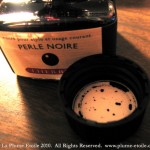
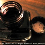
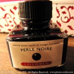
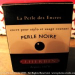
Ink Review: J. Herbin Perle Noir

I am terribly behind in reviews and I apologize.  I will try to post more regularly, as I have a lot of reviews waiting to be posted.

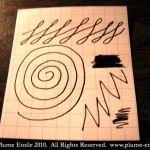
The Color: BLACK.  It’s fantastic.  A black ink should be very black and a black-black rather than a bluish or greenish-black.  Perle Noir (“Black Pearl”) is exactly that.  If I had to say this black had a tinge of another color, it would be a purple or eggplant. 

On Paper: Wet, black and consistent.

Consistency: Very saturated, yet safe and gentle for pens — like all other J. Herbin inks.

Overall: Another favorite from J. Herbin.  This is THE black ink in my rotation.  Not only is it the perfect black color, but it is also safe for my vintage pens.  J. Herbin always flows well and I don’t have to worry about “gunk” building up in the pen or the nib.

Purchasing and Pricing: A 30mL bottle runs between $7-10 depending on the retailer and is available at most online retailers catering to fountain pen and ink users.

J. Herbin Rose Tendresse

I love pink.  What can I say?

The Color: Rose Tendresse is a perfect, feminine, light bubblegum pink.  It’s soft and girly, just as pink should be. 

On Paper: Somewhat wet, with lovely subtle shading.

Consistency: Saturated, yet gentle, like all other Herbin inks.  I first tried Rose Tendresse in a Reform 1745 and it was VERY dry.  I now have it loaded in my pink Esterbrook (!) and have used it with a 2314-M nib and a modified 1555 Gregg nib.  Rose Tendresse flows extremely well from both of these nibs, which makes me think the Reform might have been the problem instead of the ink in my first trial.

Other Considerations: Rose Tendresse translates to rose tenderness.  Just another reflection of this ink’s soft and feminine qualities.

Overall: Another favorite from J. Herbin.

Purchasing and Pricing: A 30mL bottle runs between $7-10 depending on the retailer and is available at most online retailers catering to fountain pen and ink users.

sample11

sample21

sample3

box1

boxtop1

openbottle1

bottle1

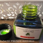
Ink Review: J. Herbin Vert Pre

The Quo Vadis blog had another green and orange ink giveaway for St. Patrick’s Day.  This giveaway is a bit special because I was sent J. Herbin’s Vert Olive at last year’s giveaway, which was my first review on La Plume Etoile.  Karen sent me Vert Pre to try this year.

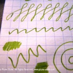
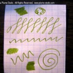
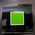
The Color: Vert Pre is a bright and cheerful green that instantly evokes images of spring and summer.  It is similar to Vert Olive, but brighter and more casual.  Vert Olive has more of a yellow tone and has a more formal feel.

On Paper: The swatch below was done with an Esterbrook 2442 nib in a dipless set. Its flow quality is in the middle of the wet/dry spectrum.  Vert Pre’s shading really impressed me and I was able to get noticeable shading on different types of paper.

Consistency: Saturated, yet gentle, like all other Herbin inks.

Other Considerations: Not much to report here – the ink performed wonderfully when I tested it and is consistent with the quality of other J. Herbin inks.  I have read complains from other reviewers that Vert Pre has poor flow; but I have not loaded it myself yet to make that determination.  I need more pens to fill!

Overall: Another great ink from my favorite ink brand.

Purchasing and Pricing: A 30mL bottle runs between $7-10 depending on the retailer and is available at most online retailers catering to fountain pen and ink users.