
The kind folks at Rohrer & Klinger Inks sent me their entire line of inks to try. Thank you, Johannes! Rather than doing a separate review for each ink, I thought I’d treat you to a lot of ink eye candy all at once!
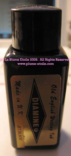
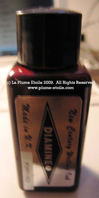
The Bottle: The bottles are glass with a white plastic ribbed top.
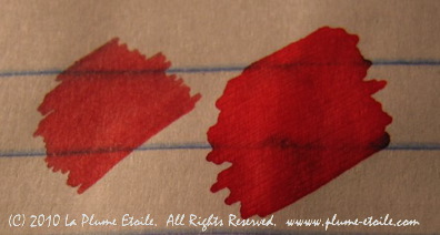
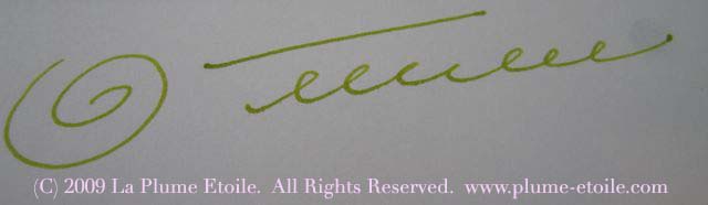
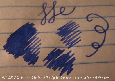
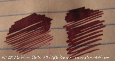
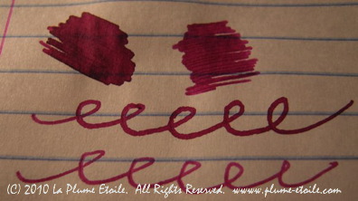
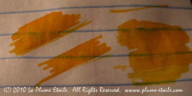
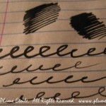
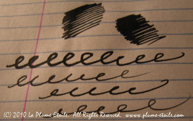
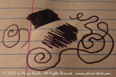
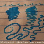
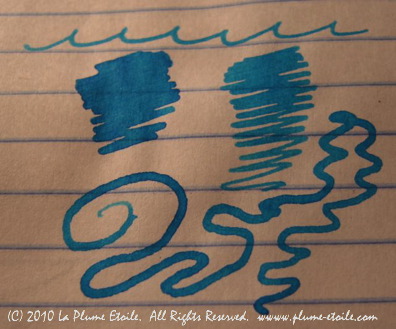
The Color: The colors are bright, rich and saturated. I’ll let you view the photos instead of describing each ink. There are a few that I will highlight: Morinea is one of my ideal shades of red – dark and blue based, but not too dark or burgundy; Heliannthus is a dark enough yellow to see on paper and could be good for highlighting purposes; Cassia is an ideal purple color and I love the blues of Konigslau and Blau Permanent (this one is permanent!); Verdigris is a dark teal type color – it reminds me of a teal color mixed with a charcoal grey; and Leipziger Schwarz is a very black black.
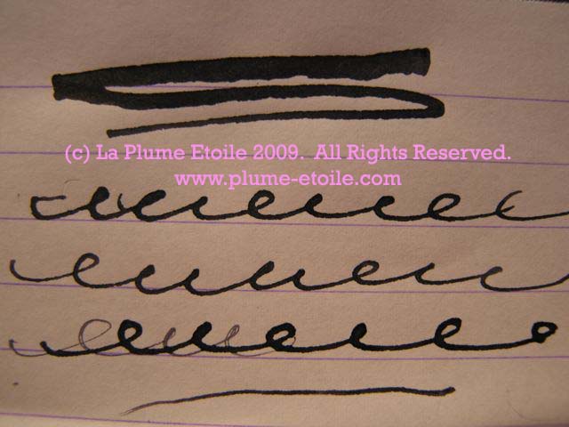
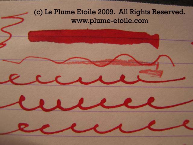
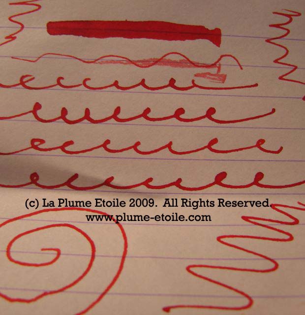
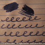
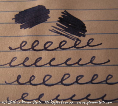
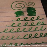
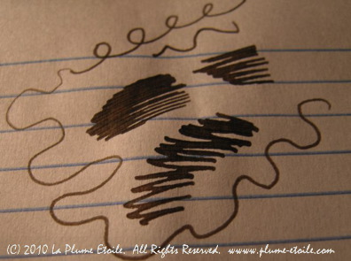
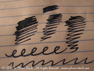
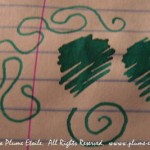
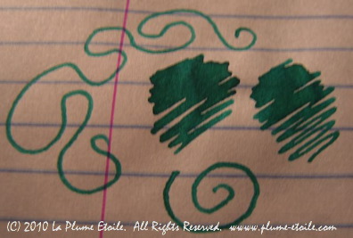
On Paper: All the swatches below were made with a glass dip pen, so I was putting a lot of ink on the paper at once. As you can see, still no feathering and minimal bleeding on the notebook paper lines. Even with the heavy use of the ink, there is minimal bleed through on the back of the paper sheets. A triumph indeed!
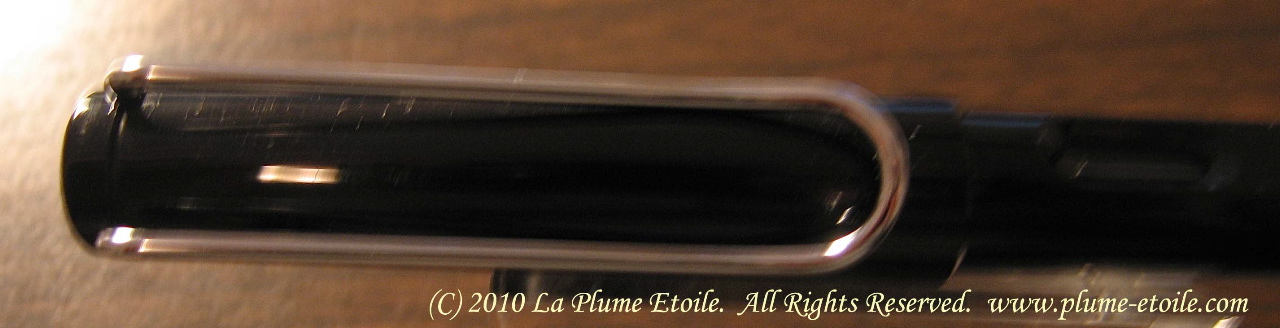
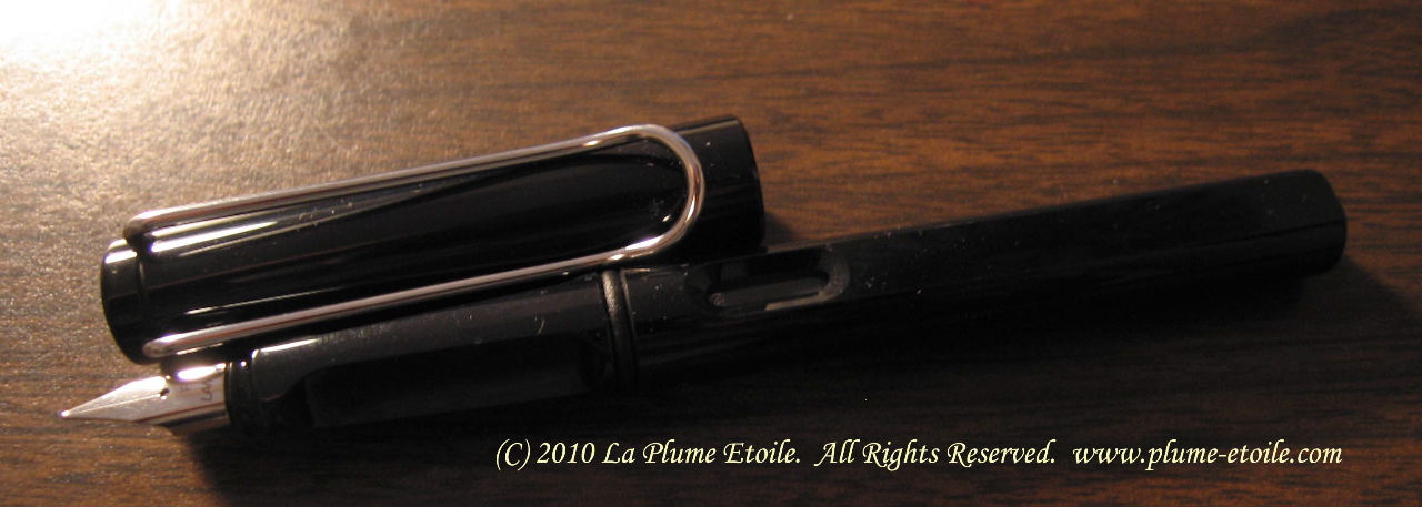
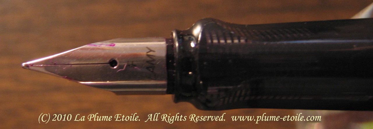
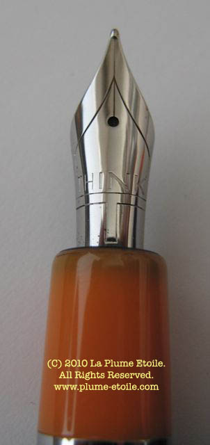
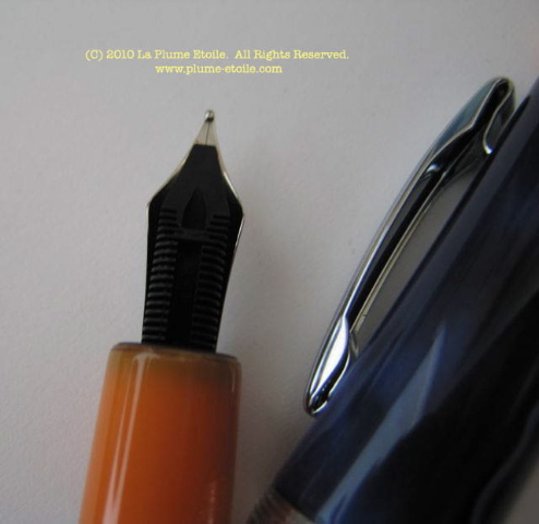
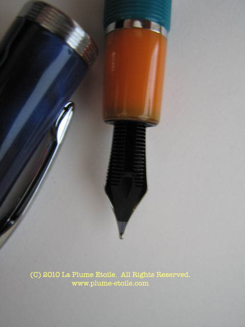
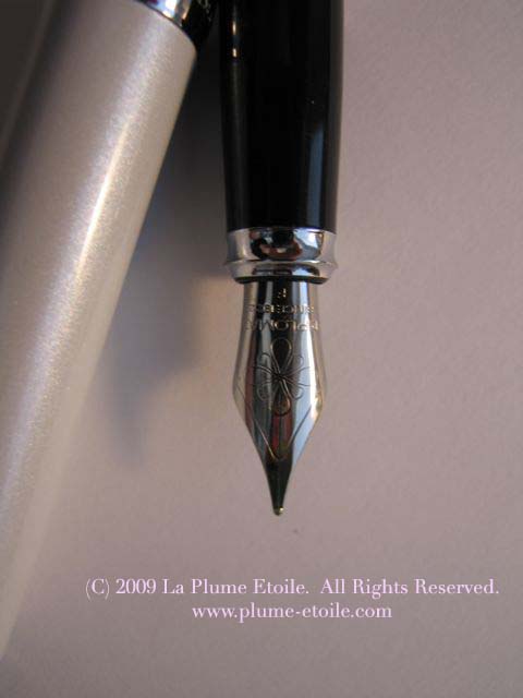
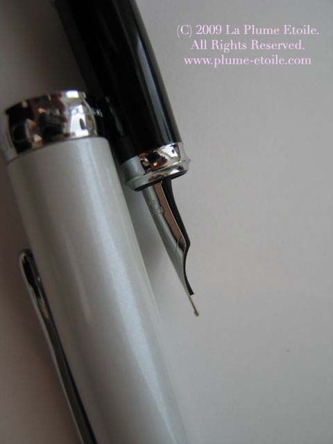
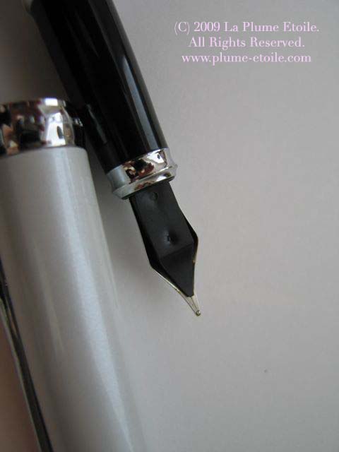
Consistency: I currently have Cassis in a refilled Pilot Varsity and am not having any problems with it. It’s flowing well and performing nicely.
Other Considerations: Something very cool about R&K inks is that all ink colors can be blended together to create your own combinations. I have not tried this, but this is what R&K told me. However, if you do blend the Sepia, be sure to wash the fountain pen after use. Scabiosa and Salix are both iron gull nut ink and R&K says they are safe for fountain pens, but you will definitely need to wash the fountain pen after use. From my learning of gull inks, the best choice may be to only use these with dip pens instead of loading them, as they have a higher tendency to clog pens.
Crystals could separate from the water component of the ink in airline shipment due to pressure, but I have been told this is not normal.
Overall: R&K produces a set of very lovely colors to enhance your collection.
Purchasing and Pricing: Learn more about R&K at http://www.rohrer-klingner.de. You can buy bottles of R&K from your favorite retailers like Pendemonium and others. Bottles retail for about $10-12.
-

- Blau-Permanent

-

- Konigsblau
-

- Cassia

-
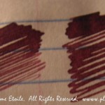
- Alt-Bordeaux
-

- Solferino
-

- Magenta
-

- Helianthus
-
- Leipziger-Schwarz
-

- Morimba

-
- Elsen-Gallus-Tirob-Salix
-

- Elsen-Gallus-Tinte-Scabiosa
-
- Verdura

-

- Sepia
-

- Alt-Goldgrun

-

- Verdigris
-
- Blu-Mare
-
- Smaragdgrun
-

- Schreibtinte-Fernambuk