New reviews soon

Aside from a long queue of reviews I have in draft form, I am due to receive many exciting products in the mail soon for review! Stay tuned because there is going to be a steady stream of reviews on the way.

Thank you for your continued support in reading La Plume Etoile.

Review: J. Herbin Rose Cyclamen

Here is another winner from my new favorite brand of ink, J. Herbin.

The Bottle: It’s just like the other J. Herbin bottles — small, cute, French and has a depression to rest your pen.

The Color: Rose Cyclamen is a bold magenta/fuschia color, much like the flower for which it was named. The ink color is almost exactly like the color of the flower below.

Photo by jam343

Photo by jam343

It has very little shading and feathering. If you examined your writing VERY closely, you might notice the slight feathering, but most people would not examine anything you wrote that closely. Unless, of course, they are ink-obsessed like us.

On Paper: It shows up well on all papers I have written, including plain white paper and a yellow legal pad. As to be expected, the ink has a brighter color on the white paper than the yellow.

Consistency: Unlike my last review of J. Herbin’s Vert Empire, Rose Cyclamen is bright, bold and saturated. It is not thin or like a watercolor.

Other Considerations: According to this site, the Cylamen flower symbolizes resignation and goodbye. This is a sad sentiment that does not match the cyclamen’s bright color. Aside from this symbolism, J. Herbin’s Rose Cyclamen is fun, bold and cheerful. I would also guess this is a woman’s ink, as I don’t know many men who would use this color.

Rose Cyclamen is definitely a new favorite! Photos are below.

Donate Pens to Help Kids

I just packed a box of ballpoints I do not use. I am sending them to help kids in Africa with their education. So can you.

There is a charity called Pens for Kids. They accept new and used pens in good, working condition. They take these pens and give them to kids in Africa to assist them in furthering their education. You can either send the pens to PFK’s U.S. branch and then they will ship them to Africa, or you can ship the pens directly to their branch in Africa.  If you don’t have any pens to donate, you can send them a monetary donation, which helps them pay shipping costs for the pens going to Africa.

I think education is extremely important and rather than letting those crappy pens from meetings and conventions sit in a drawer, I’m helping kids in Africa increase their knowledge.   Go to  www.pensforkids.com.

Review: J. Herbin Vert Empire

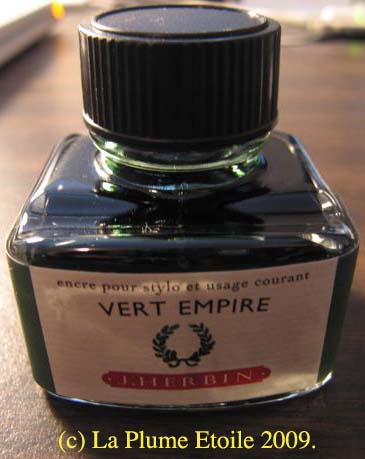
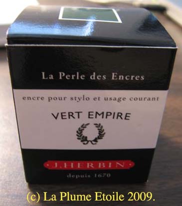
So far, I really like J. Herbin inks. They are gentle on pens and come in a wide variety of colors. My second experience with J. Herbin inks involved Vert Empire, a darker green color.

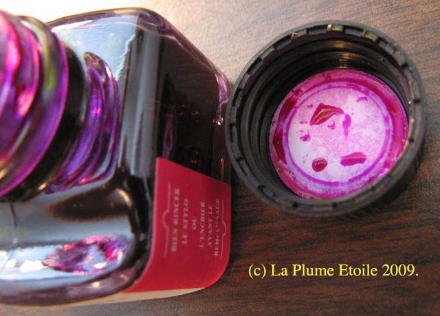
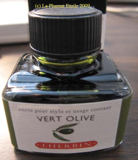
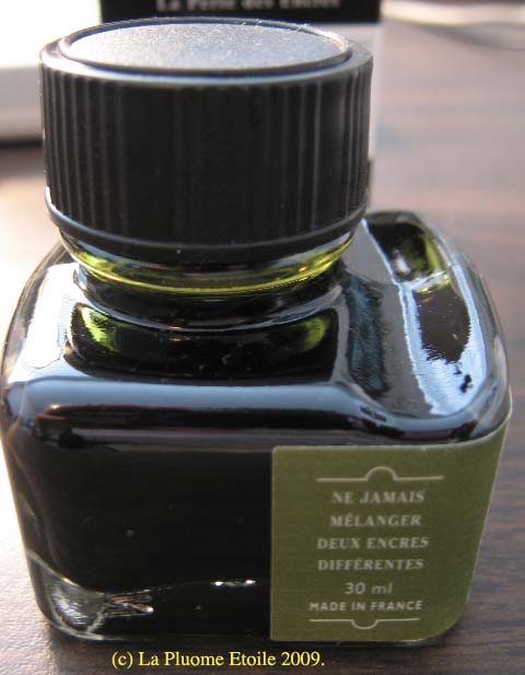
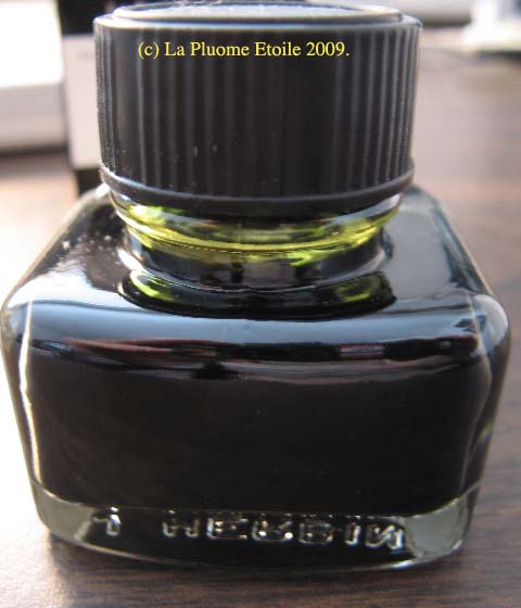
The Bottle: If you are interested in the bottle’s features, please see my last review of J. Herbin’s Vert Olive.

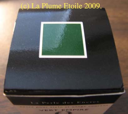
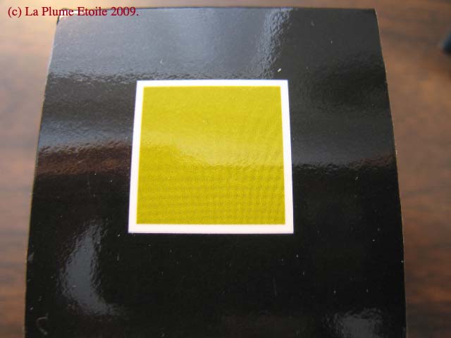
The Color: The box and ink residue inside the bottle cap indicated it was more of a dark emerald color. However, upon testing the ink, it was duller and more watery than I had expected. It has a faded antique quality, which may match your preference. If you prefer something bolder, this might not be the right ink color for you. For some reason, Vert Empire makes me think of old bank records, although I doubt if banks even used green ink to keep their records.

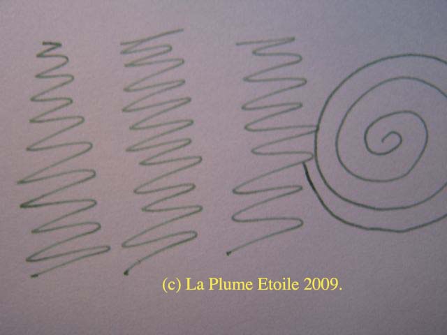
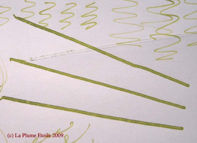
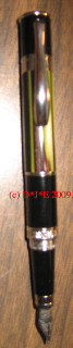
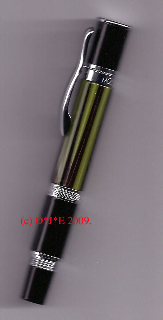
On Paper: Vert Empire shows up fairly well on paper, but is best on bright white paper. The contrast makes the ink look a bit darker.

Consistency: Unlike the bright Vert Olive, Vert Empire is more of a watery ink. However, it is not like a watercolor or so transparent that it looks watered down.

Other Considerations: J. Herbin inks are from France and were first established in 1670. The subdued aspect of many Herbin colors, including Vert Empire, can take one back to that time. It is easy to imagine that your document was originally written in the late 1600’s and now you are reading it, the green ink faded, but the history still bold.

While blue and black are the standard colors for business, I think one might also use Vert Empire for business notes and comments on documents. It is subdued enough to be appropriate for the business setting.

Office Supply Geek got the color to show up quite well on his writing sample, so you may also want to check his review.

I like J. Herbin’s Vert Empire more each time I use it.

I have reviews of more items that I hope to post soon.

Review: J. Herbin Vert Olive

I LOVE THIS INK.

The wonderful Karen at Quo Vadis sent me some J. Herbin inks to review. The first one is Vert Olive. I had read BiffyBeans‘ review of the ink and it’s color immediately intrigued me. I had high expectations for loving Vert Olive and I am not disappointed.

The Bottle: The J. Herbin bottles are cute and small. You can also rest your pen in the depression in the glass!

The Color: I had a hard time getting the color of the ink to show up correctly through my scanner and camera. However, I also took photos of the box and the ink is almost exactly like the square on the box lid. It reminds me of the color of grass stains and green olives.

On Paper: The ink’s color varied in intensity depending on what paper I used. On some cheaper/fibrous/off-white paper, the ink was very light and hard to read. Conversely, it showed up very well on white printer paper. I also used it to take some marginal notes in a textbook, which had the shiny, semi-glossy paper typical of textbooks. The ink was bright and brilliant on that paper. In short, you may have to experiment on different kinds of paper, but I have found it shows up best on bright white paper.

Consistency: Vert Olive is clear and solid. It is not watery, even though it seems like a thinner ink. I did not notice any feathering.

Other considerations: Vert Olive is a very gentle ink. I got it on my hands, it only lightly stained my fingertips and completely washed off by the next day. The drops I spilled in my sink and on my counter top were easily cleaned by wiping with a tissue.

Be aware that this ink is not waterproof. I spilled a drop of water on something I had just written, and the ink almost disappeared!

In conclusion, I refer you back to my first sentence — I love this ink. I will be using it often.

Review: Monteverde Mini Jewelria

Thanks to Monteverde and some luck, I recently won one of their Mini Jewelria pens in green. Here is my review.

Appearance: This is a fantastic looking pen. The green striation area is pretty. The whole pen looks to be high-quality and well made. The iridium nib also has some engraved swirls for extra visual aesthetics. One feature I really like is that not only does the pen cap screw on to cap it, it screws on the top of the pen to post it. This insures the cap will not fly off or flop around when writing.

Size/Weight: When capped, this pen is quite small. When uncapped and unposted, it is tiny. I think the only way to use this pen is posted. I like light pens and this pen is quite substantial. It is not as heavy as some of the larger high-end pens, but it does hold its own in your hand. Depending on the day, my arm may tire after a few pages, although I have written many pages with it before.

Writing: My pen is a medium nib, which is definitely medium. I prefer Fine points, so this is different for me. The pen lays down a smooth wet line — most of the time. The pen often stops writing and I have to scribble with it for a minute until the ink starts flowing again. This is quite annoying when trying to write continuously. I’m not sure why it does this, but I wish it didn’t. I also do not know if this is typical of these pens or if it is my pen in particular.

Ink: This pen only uses Monteverde mini-cartridges, which I find disappointing. Monteverde sells these mini-cartridges in many colors, but I prefer to have bottled inks that usually offer more color variety than cartridges. Black cartridges came with my pen and depending on the paper, it often seems to be more of a black-brown than a pure black.

Overall: The best feature of this pen is its appearance. I do wish it didn’t skip, took a converter and was a bit lighter in weight. With that said, I do like it very much and it is in my rotation. I am very happy and grateful to have won it.

FP Filling Instructions

There is a great new tutorial on how to fill many different kinds of fountain pens over at Pendemonium.  Check the link here.

FPs on a multiple choice test?

I had to take a multiple choice test yesterday.  Like most mulitple choice tests, you had to darken the oval of your chosen answer with a No.2 pencil.  That was fine and I used my classic yellow pencil I blogged about earlier.

When the proctor was reading the instructions, he said we were to use No.2 soft-lead pencils and not to use a fountain pen.  I smiled to myself as I would have loved to use a FP on the test if it had erasable ink.  (Do they have erasable ink for fountain pens?  I have seen it for ballpoints.)

I found the test instructions to be charming and I bet most people in the room had never used a fountain pen in their lives.